We like to think Streamlit apps are beautiful out of the box (hopefully you do too!), but up until today it wasn't easy to change the look and feel to reflect your personal style or your company's visual branding. Streamlit Theming now allows you to easily change the color scheme and fonts in your app without ever having to touch any HTML or CSS.
In addition, for accessibility and user-friendliness, we're also giving app viewers the ability to toggle between light and dark themes.
Check out our video tutorial for more help and this sample app if you want to dive right in!
Introducing Dark Mode!
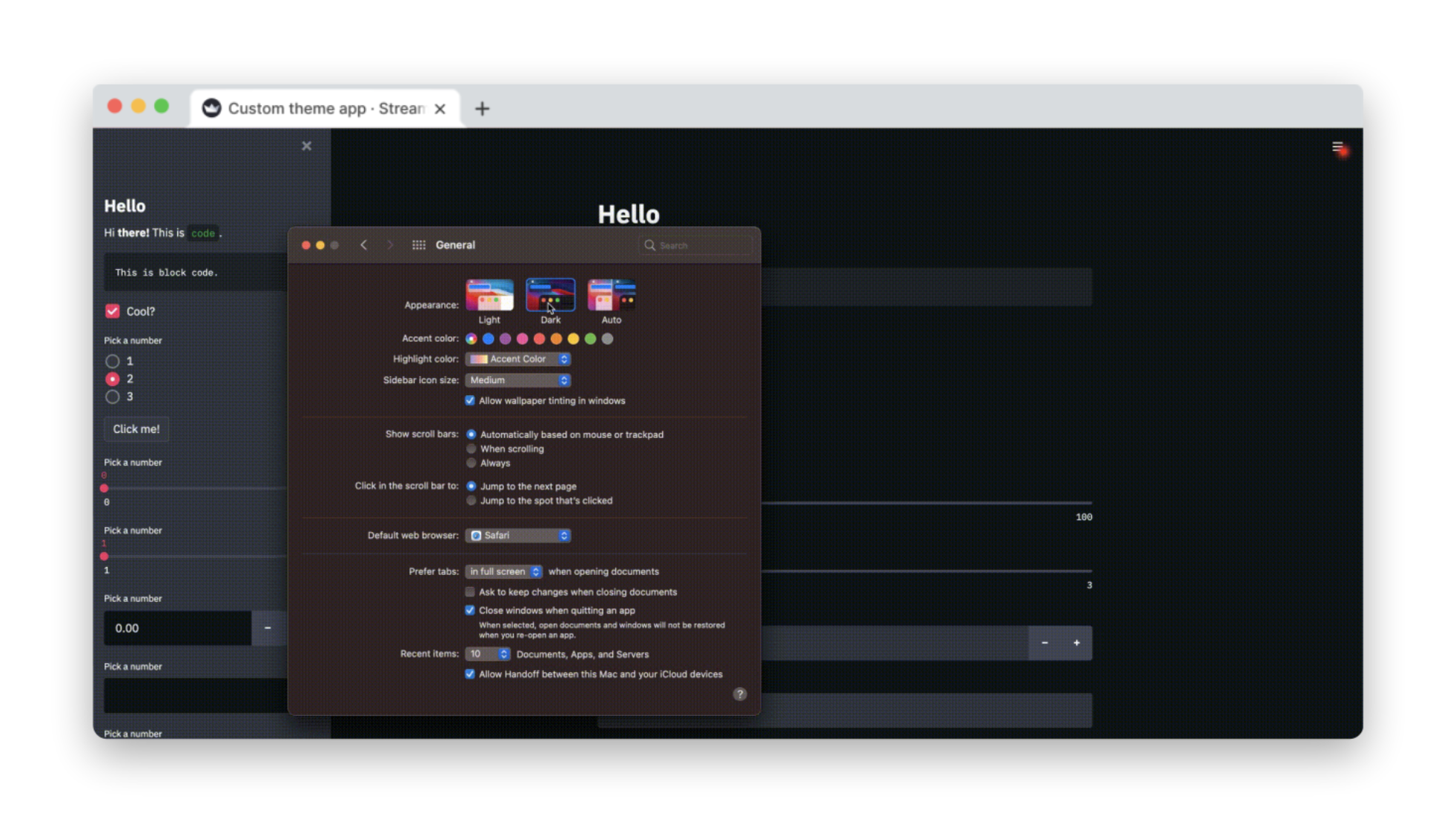
Before we get into custom themes, let's talk about dark mode.
By popular demand, we now provide app viewers the ability to customize how they'd like to experience your app. This is useful for people who are using the app in a dark environment, or for folks with accessibility needs, who want to override your app's custom theme.
To toggle between various themes, go to Menu on the top-right corner and choose Settings. There you'll see a redesigned Settings dialog that lets app users choose between different theme options:
- Light Mode: This is the Streamlit theme you already know and love
- Dark Mode: This is Streamlit's new dark theme. You'll love this too!
- Use system setting: Streamlit will automatically pick up your Operating System theme (light or dark) and change colors with your OS (Note: may not work for some browsers and Linux distros).
- Custom theme (only visible when provided by the app author): Use the theme provided by the app author. This is the default when provided. Otherwise, "Use system setting" is the default.

Creating custom themes
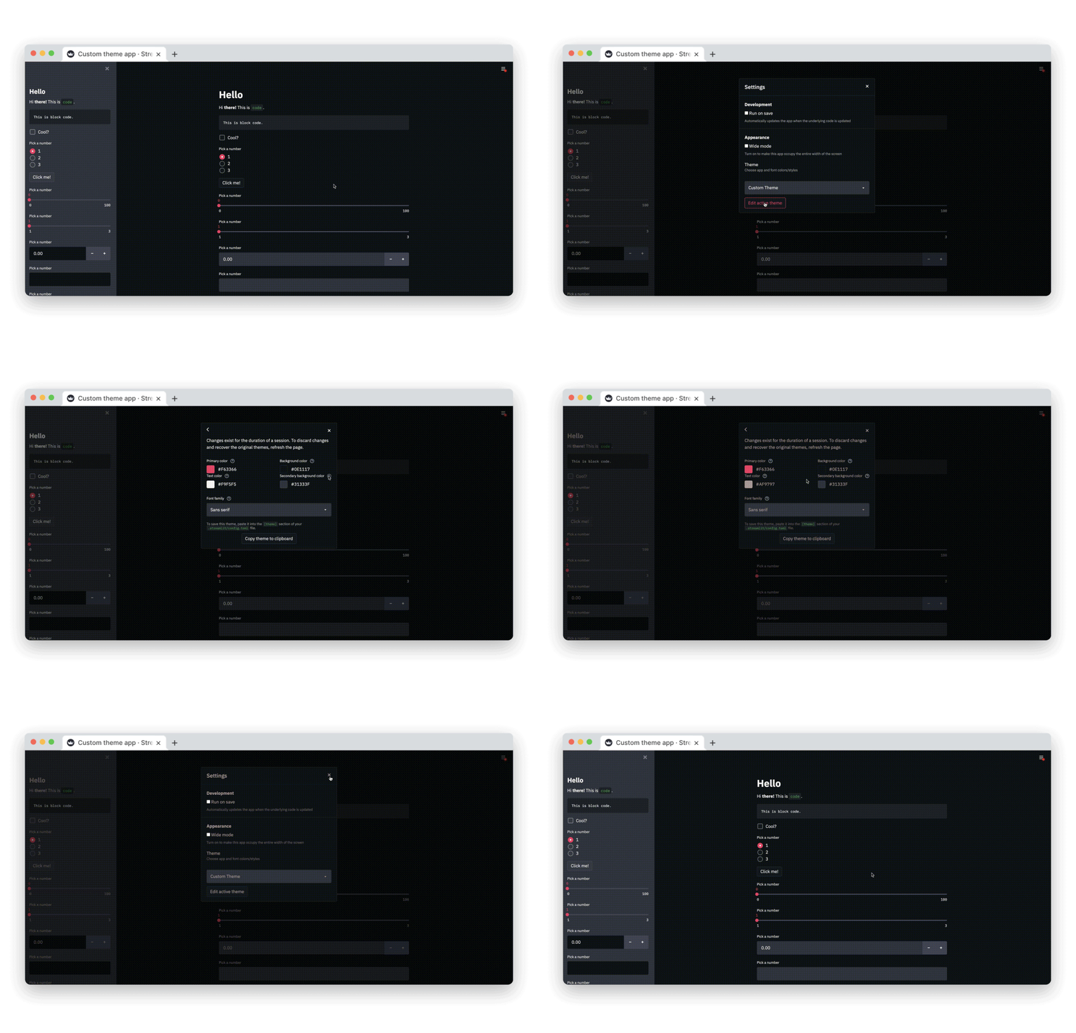
Themes are set via Streamlit's config system. You can either set the theme there directly, or you can use our fancy new theme editor interface to build a theme live and then copy it to your config.
Creating a theme with the theme editor
App developers can create a custom theme by simply going to Menu → Settings → Edit Active Theme.

Note: The theme editor menu is available only in local development. If you’ve deployed your app using Streamlit Sharing, the “Edit active theme” button will no longer be displayed in the “Settings” menu.
Creating a theme using config.toml directly
Custom themes can also be defined in the config file: ./.streamlit/config.toml
Under the [theme] section, colors variables can be defined to create a custom theme
[theme]

# Primary accent for interactive elements
primaryColor = '#7792E3'

# Background color for the main content area
backgroundColor = '#273346'

# Background color for sidebar and most interactive widgets
secondaryBackgroundColor = '#B9F1C0'

# Color used for almost all text
textColor = '#FFFFFF'

# Font family for all text in the app, except code blocks
# Accepted values (serif | sans serif | monospace)
# Default: "sans serif"
font = "sans serif"
(Note: you can only set one custom theme at a time)
Live updates from the Config file
You know how your Streamlit app live-updates when you change its source code? We now also do this when you update the app's config file! This way, editing the theme directly in the config file will cause your app to immediately display the new theme.
What each color setting does
Streamlit's theming system follows a global approach to applying color and fonts to an app. Color styles have semantic names and a simple way for doing color specification.
- Primary color: Accent color for interactive elements like
st.radio, button borders etc. By default, this is pink. - Background color: This is the background color for the main body of your app.
- Text color: Pretty self-explanatory! This is the text color for your app.
- Secondary background color: Used as the background for
st.sidebarand for several widgets.

Background color and Secondary background color are in a way "complementary" since they are used for elements placed "on" top of base elements to promote consistency and accessible contrast. This means that a st.number_input widget will use Secondary background color as its Background color when defined in the main body, but use Background color when defined in the sidebar. The image below illustrates this:

Themes and Custom Components
If you're a component author, we make it easy for you to read theme colors in your JS and CSS code. To get access to this new feature, install or update the newest version of streamlit-component-lib.
npm install streamlit-component-lib
Once this package is updated, the background and text colors of a component will automatically be changed to match that of the active theme. Additional theme properties are exposed to the component in two equivalent ways: the theme object or the theme style.
As a React prop
An object passed to the component via the theme prop has the following shape:
{
    "primaryColor": "someColor1"
    "backgroundColor": "someColor3",
    "secondaryBackgroundColor": "someColor4",
    "textColor": "someColor5",
    "font": "someFont",
}
As CSS variables
--primary-color
--background-color
--secondary-background-color
--text-color
--font
If you're not familiar with CSS variables, the TLDR version is that you can use them like this:
.mySelector {
  color: var(--text-color);
}
The two methods for exposing theme properties to a component contain the same information, so which one to use is a matter of personal preference. An example of making a custom component work with themes can be found here.
Find your favorite new theme
Here's our Mapping Demo, with a 'Quiet Light'-inspired theme:

[theme]

primaryColor="#6eb52f"
backgroundColor="#f0f0f5"
secondaryBackgroundColor="#e0e0ef"
textColor="#262730"
font="sans serif"
Here's an example of a 'Solarized'-inspired theme:

[theme]

primaryColor="#d33682"
backgroundColor="#002b36"
secondaryBackgroundColor="#586e75"
textColor="#fafafa"
font="sans serif"
Try out theming and let us know what you think!
To try out theming, simply upgrade to the latest version of Streamlit as usual:
$ pip install streamlit --upgrade
We can't wait to see the cool and amazing themes that the community will build. If you built a cool custom theme, we'd love to see it, so please tag @streamlit when you share on Twitter, LinkedIn or on our Forum.


Comments
Continue the conversation in our forums →