
Hey community! 👋
My name is Becky O’Connor, and I’m a Senior Solution Engineer at Snowflake. I’ve been working in the data and business intelligence field for nearly ten years, with a particular focus on geospatial data.
Geospatial data is ubiquitous and shouldn't be treated as a niche subject separate from other datasets. Tools such as Snowflake, Streamlit, Carto, and Tableau make it more accessible. Geospatial representations of space enable sophisticated calculations to be made against existing datasets. And with curated datasets readily available in the Snowflake Data Cloud, the possibilities are endless.
I’ve created an example geospatial app to display vehicle incident data in an easily understandable format:
In this post, I’ll walk you through:
- Tooling and platform access
- Creating a simple map using Folium using data retrieved through Snowpark
- Geospatial data engineering using Snowpark
- Embedding Tableau reports in Streamlit
- Leveraging CARTO analytic toolbox to work with geospatial indexes and clustering
- Using Streamlit to run a predictive model
Tooling and platform access
Snowflake access
If you don’t have access to a Snowflake account, sign up for a free trial. This is where you’ll store, process, and service your Streamlit app and get a live dataset for the embedded Tableau dashboards.
Streamlit Community Cloud
To make your app publically available, deploy it to the Streamlit Community Cloud.
Tableau Cloud
To display Tableau reports inside your app, you’ll need access to a Tableau Cloud account. For development and learning purposes, create your own personal Tableau Cloud site here.
GitHub account
To deploy your app to the Community Cloud, you’ll need a GitHub account. If you don’t have one, use this guide to create one.
Client tooling for coding
I recommend using Visual Studio Code, which has a great Snowflake add-in. It enables you to leverage Snowflake similarly to the Snowflake Online Tool (Snowsight). Additionally, a Jupyter Notebook extension lets you engineer data using Snowpark DataFrames. Finally, you can publish your files to GitHub using this tool.
Python libraries
In addition to the standard libraries, install the following libraries listed in the requirements.txt file in GitHub (this way, the Community Cloud will install them):
altair==4.2.2
contextily==1.3.0
folium==0.14.0
geopandas==0.12.2
matplotlib==3.7.0
snowflake-connector-python==3.0.1
snowflake-snowpark-python==1.5.1
streamlit-folium==0.11.1
snowflake-snowpark-python[pandas]
You’ll also need to install Streamlit to run the app in a local environment (when developing locally, you’ll need to install an Anaconda environment):
pip install streamlit
Data access
The data you’ll see within the app consists of the following:
Various GeoJSON files
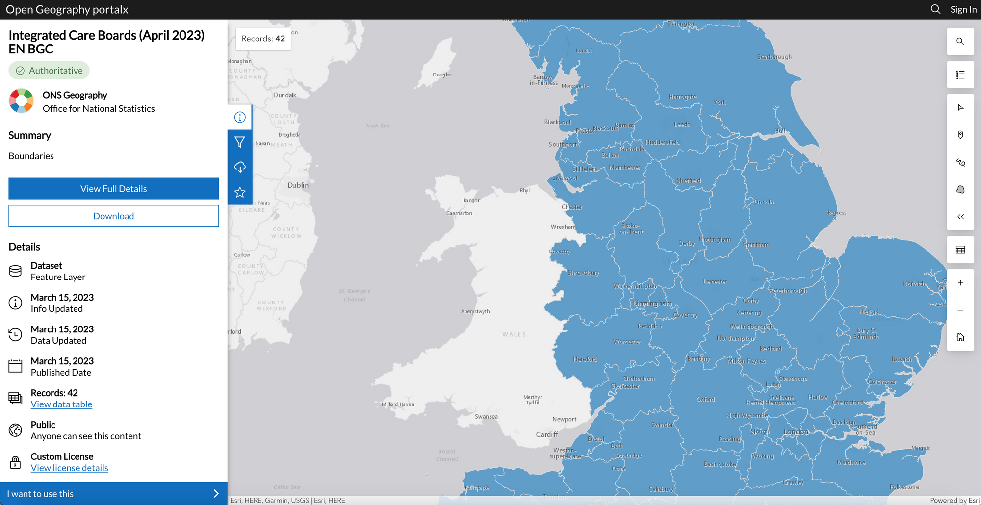
Here is an example of one of the GeoJSON files I utilized—GeoJSON File for Integrated Care Boards:
If you want, you can try some of the other GeoJSON files (the files I used were stored here).
When choosing a GeoJSON file, pick one of the generalized datasets available on the GeoPortal. I used the ones generalized to the nearest 20m. If you're dealing with a large GeoJSON file (more than 16MB), you must split it into separate polygons. This is especially necessary when dealing with GeoJSON files that contain thousands of polygons. Just use Python functions to split a GeoJSON file into rows.
Also, make sure that each polygon is no larger than 9MB. I'd question the need for a single polygon to have more than 9MB of coordinates. If you're dealing with larger polygons, consider splitting them into smaller ones or simplifying them.
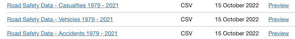
Data files for road incidents
I used the openly available data provided by www.data.gov.uk (find it here):
And I sued the following supporting document:

Creating a simple map with Folium using data retrieved through Snowpark
To showcase the seven worst driving locations in a Streamlit app, I used Folium. It helped visualize geospatial data stored in Snowflake on a map:

I had fun researching the best and worst places to drive in the U.K. and found a fascinating blog post with great information. It listed both good and bad places to drive. I manually selected the key facts and typed them into a JSON document. Although I could’ve used website scraping to automate the process, that wasn't my focus.
To accomplish this, I used Visual Studio Code and the Jupyter Notebook add-in:
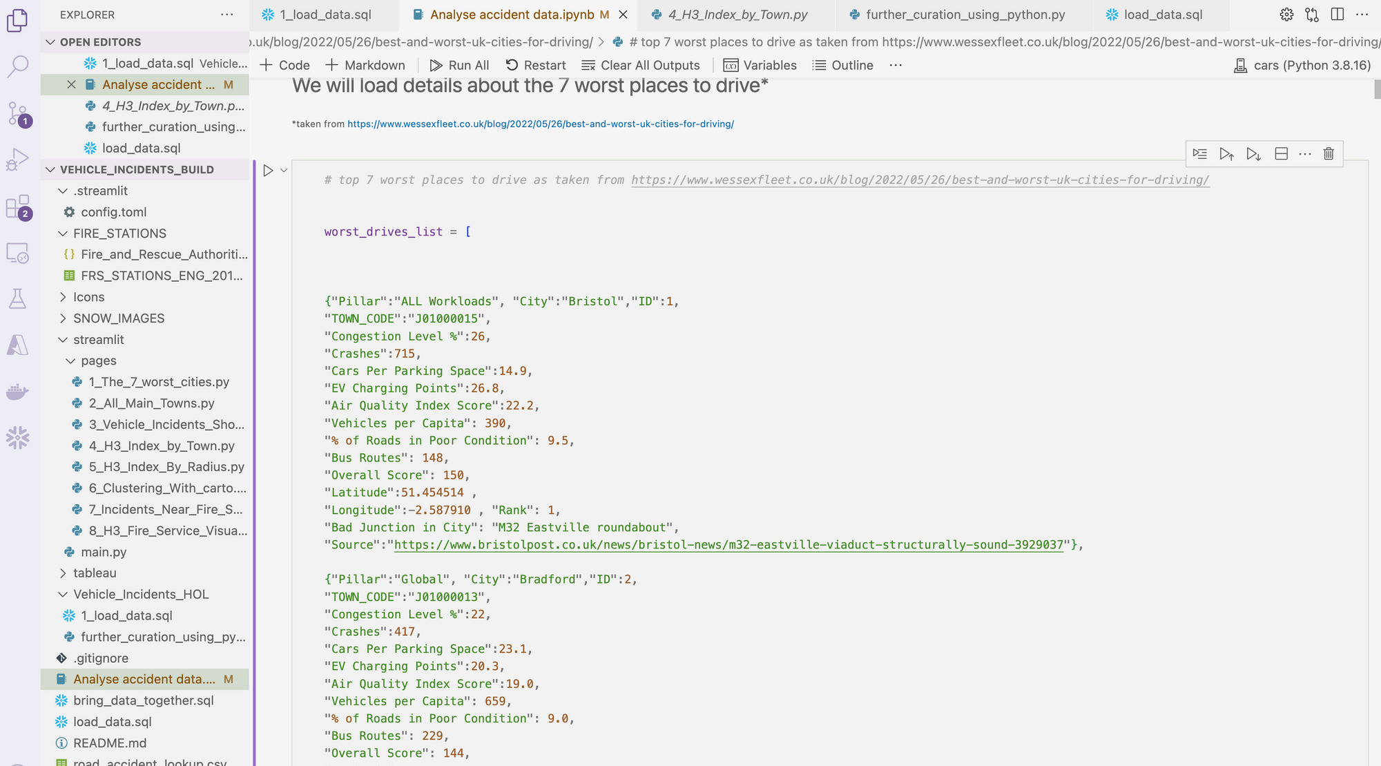
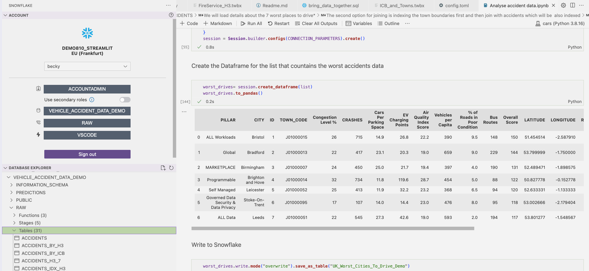
Loading this data into Snowflake was very easy. I pushed the list into a Snowpark Python DataFrame and loaded it into a Snowflake table.
Before starting, you’ll need to establish a Snowflake session.
from snowflake.snowpark import Session

CONNECTION_PARAMETERS = {
    'url': account,
    'ACCOUNT': account,
    'user': username,
    'password': password,
    'database': database,
    'warehouse': warehouse,
    'role': role,
    'schema': 'RAW'
}
session = Session.builder.configs(CONNECTION_PARAMETERS).create()
Next, create a Snowpark Python DataFrame from the previously created list:
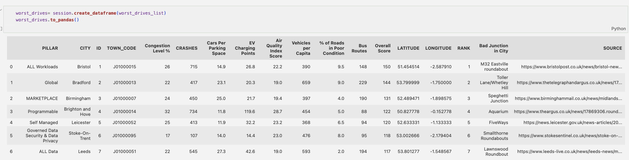
worst_drives = session.create_dataframe(worst_drives_list)
This effectively creates a temporary table inside Snowflake. Once the session ends, the table is removed. To view the table, simply write worst_drives.show(). To bring it back into pandas from Snowpark, write worst_drives.to_pandas().
Afterward, I committed it as a Snowflake table:
worst_drives.write.**mode**("overwrite")\\
.**save_as_table**("UK_Worst_Cities_To_Drive_Demo")
You can also use it to quickly copy table names into your notebook. Set the context to match what you specified in your notebook session, as this will result in a better experience.
Pictures in the tooltips:
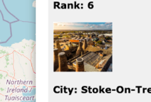
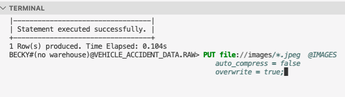
The pictures are stored in Snowflake instead of GitHub because, like geospatial data, images are considered data sources. To load them into a directory, use Snowflake's unstructured data capabilities—create a stage for the images. It's crucial to ensure that server-side encryption is utilized, as images won’t render otherwise.
To execute the necessary SQL, use the Snowflake add-in in VS Code:
create or replace stage IMAGES encryption = (type = 'SNOWFLAKE_SSE')
directory=(enable = TRUE);
To upload images into Snowflake, use Snow SQL from a terminal within VS Code:

Now you have the data and images to create the first page in Streamlit. Let's switch over to Streamlit.
For this visualization, use Folium to view multiple distinct markers with tooltips containing additional information about each town.
Loading the URLs for the images
@st.cache_data
def images_journeys():
    return session.sql('''SELECT  *,
GET_PRESIGNED_URL(@LOCATIONS,RELATIVE_PATH,172800)
URL FROM directory(@LOCATIONS) ORDER BY RELATIVE_PATH''').to_pandas()
Create a function that renders image icons using a secure URL generated by the GET_PRESIGNED_URL function. This generates a new URL every time data is refreshed, with the last variable specifying the number of seconds the URL is valid for (read more here).
To optimize performance, utilize Streamlit's caching capabilities to load URLs only once. This means that once the URLs are loaded into a pandas DataFrame, they won’t be loaded again unless you restart the app. If your images or URLs expire quickly, consider using the TTL variable within the st.cache_data function.
If you need to change the icons based on user interactions, you’ll need to parameterize the function. In that case, caching will refresh when the data changes.
To load the details of the city, use st.cache_data:
@st.cache_data
def retrieve_worst_cities():
    return df.sort(f.col('RANK').asc()).to_pandas()
This function will be used to retrieve the coordinates for each city which will be plotted on the map. In addition, it will retrieve information about each city which will feature in the tooltip.
Next, create your tabs:
tab1, tab2, tab3, tab4, tab5, tab6 = st.tabs(
    [
        "7 worst cities",
        "Main Towns in England",
        "Incidents within Care Boards",
        "City Details",
        "Details within X miles radius of city",
        "Incidents Within Fire Services",
    ]
)
Create a title for Tab 1 using st.markdown because it offers more options compared to st.title, while still being easy to use.
Use st.sidebar to create the logo stored in Snowflake. Utilize the components.html function in Streamlit to render the image from Snowflake:
icon = images_icons()
components.html(f'''
<table><tr><td bgcolor="white", width = 200>
<img src="{icon.loc[icon['RELATIVE_PATH'] == 'icon.jpeg'].URL.iloc[0]}",
width=100>
</td><td bgcolor="white" width = 300><p style="font-family:Verdana;
color:#000000; font-size: 18px;">Geospatial with Snowflake</td></tr></table>
''')
The app lets the user select a city, which is then highlighted and used as a filter in another tab. Note that the data is stored in a pandas DataFrame, which was originally loaded through a Snowpark DataFrame:
selected = st.radio("CHOOSE YOUR CITY:", retrieve_worst_cities().CITY)
Once selected, the city will change the color of the selected marker to red.
selected_row = retrieve_worst_cities()[retrieve_worst_cities()["CITY"] == selected]
To create a Folium map with a marker for every location in the dataframes, put the following code inside a 'for' loop—it’ll iterate seven times for all locations and one time for the selected location:
#draw a map which centres to the coordinates of the selected city.

m = folium.Map(
    location=[selected_array2.iloc[0].LATITUDE, selected_array2.iloc[0].LONGITUDE],
    zoom_start=8,
    tiles="openstreetmap",
)

trail_coordinates = df2.sort('RANK').select('LATITUDE','LONGITUDE').to_pandas().to_numpy()

#add information to each point which includes tool tips.  This includes
#the images as well as the other data elements.

trail_coordinates = session.table("UK_Worst_Cities_To_Drive").sort('RANK').select('LATITUDE','LONGITUDE').to_pandas().to_numpy()

#add information to each point which includes tool tips

for A in range (0,7):

    html = f'''
    <body style="background-color:#F0F0F0;">
    <p style="font-family:verdana">
    <b> WORST DRIVING CITY INSIGHTS
    <BR><BR>
    <b>Rank: </b>{retrieve_worst_cities().RANK.iloc[A]}<BR><BR>
    <img src="{images_journeys().iloc[A].URL}", width=100>
    <br><br><b>City:</b>
    {retrieve_worst_cities().CITY.iloc[A]}<BR><BR>

    <hr>

    <p style="font-family:verdana">

    <b>STATS</b>
    <BR><BR>
    Crashes:  {retrieve_worst_cities()['CRASHES'].iloc[A]}
    <BR>
    Congestion Level: {retrieve_worst_cities()['Congestion Level %'].iloc[A]}
    <BR>
    Cars Per Parking Space: {retrieve_worst_cities()['Cars Per Parking Space'].iloc[A]}
    <BR>
    EV Charging Points: {retrieve_worst_cities()['EV Charging Points'].iloc[A]}
    <BR>
    Air Quality Index Score: {retrieve_worst_cities()['Air Quality Index Score'].iloc[A]}
    <BR>
    Bus Routes: {retrieve_worst_cities()['Bus Routes'].iloc[A]}
    <BR>
    Overall Score: {retrieve_worst_cities()['Overall Score'].iloc[A]}
    <BR>
    <hr>
    <p style="font-family:verdana">
    <b>Worst Junction: </b>{retrieve_worst_cities()['Bad Junction in City'].iloc[A]}
    <BR><BR>
    <b>Source:</b><a href ="{retrieve_worst_cities().SOURCE.iloc[A]}" target="popup"> {retrieve_worst_cities().SOURCE.iloc[A]}</a></p>
    <hr>
    <p style="font-family:verdana">
    <br>
    Info Gathered from Accident Data
    <br>
    <BR>
    According to the data from the Department of Data, since the year 2000
    there have been <font style="color:red"> {retrieve_worst_cities()['ACCIDENTS'].iloc[A]} </font> accidents.
    Of which, <font style="color:red"> {retrieve_worst_cities()['VEHICLES'].iloc[A]} </font> vehicles and <font style="color:red"> {retrieve_worst_cities()['CASUALTIES'].iloc[A]} </font>
    casualties were involved.


    '''

    html2 = f'''
    <body style="background-color:#F0F0F0;">
    <p style="font-family:verdana">
    <b> WORST DRIVING CITY INSIGHTS
    <BR><BR>
    <b>Rank: </b>{selected_row.iloc[0].RANK}<BR><BR>
    <img src="{images_journeys().iloc[selected_row.iloc[0].ID-1].URL}", width=100>
    <br><br><b>City:</b>
    {selected_row.iloc[0].CITY}<BR><BR>

    <hr>

    <p style="font-family:verdana">

    <b>STATS</b>
    <BR><BR>
    Crashes:  {selected_row.iloc[0].CRASHES}
    <BR>
    Congestion Level: {selected_row.iloc[0]['Congestion Level %']}
    <BR>
    Cars Per Parking Space: {selected_row.iloc[0]['Cars Per Parking Space']}
    <BR>
    EV Charging Points: {selected_row.iloc[0]['EV Charging Points']}
    <BR>
    Air Quality Index Score: {selected_row.iloc[0]['Air Quality Index Score']}
    <BR>
    Bus Routes: {selected_row.iloc[0]['Bus Routes']}
    <BR>
    Overall Score: {selected_row.iloc[0]['Overall Score']}
    <BR>
    <hr>
    <p style="font-family:verdana">
    <b>Worst Junction: </b>{selected_row['Bad Junction in City'].iloc[0]}
    <BR><BR>
    <b>Source:</b><a href ="{selected_row.SOURCE.iloc[0]}" target="popup"> {selected_row.SOURCE.iloc[0]}</a></p>
    <hr>
    <p style="font-family:verdana">
    <br>
    Info Gathered from Accident Data
    <br>
    <BR>
    According to the data from the Department of Data, since the year 2000
    there have been <font style="color:red"> {selected_row.ACCIDENTS.iloc[0]} </font> accidents.
    Of which, <font style="color:red"> {selected_row.VEHICLES.iloc[0]} </font> vehicles and <font style="color:red"> {selected_row.CASUALTIES.iloc[0]} </font>
    casualties were involved.


    '''
		# I then create iframes for each tool tips.  This contains the html.

		iframe = folium.IFrame(html,width=700,height=400)
		iframe2 = folium.IFrame(html2,width=700,height=400)
		#I create the tooltip itself (folium calls these popup's)
		popup = folium.Popup(iframe,max_width=700)
		popup2 = folium.Popup(iframe2,max_width=700)
		#finally i apply the popup to the icon.
		folium.Marker(
		    retrieve_worst_cities()[['LATITUDE', 'LONGITUDE']].iloc[A].to_numpy(),
		    popup=popup,
		    icon=folium.Icon(color='blue', prefix='fa', icon='car'),
		    icon_size=(40, 40),
		).add_to(m)
		folium.Marker(
		    selected_row[['LATITUDE', 'LONGITUDE']].iloc[0],
		    popup=popup2,
		    icon=folium.Icon(color='red', prefix='fa', icon=f'{selected_row.RANK.iloc[0]}'),
		    icon_size=(40, 40),
		).add_to(m)
Finally, position the map on the page.
st_data = folium_static(m, width=1200, height=800)
folium_static is perhaps a better option than folium in this use case, as it prevents the map from reloading at every interaction, improving the user experience.Working with the accident data
Leverage Azure Blob storage to store the Accident, Vehicle, and Casualty data. Create a dynamic external stage using a SAS key:
create or replace stage VEHICLE_DATA_AZURE
url='azure://MY_BLOB_STORAGE_ACCOUNT.blob.core.windows.net/vehincidents'
 credentials=(azure_sas_token='MY TOKEN')
  directory=(enable = TRUE);
Then, use the VS Code add-in to bring this data into tables:
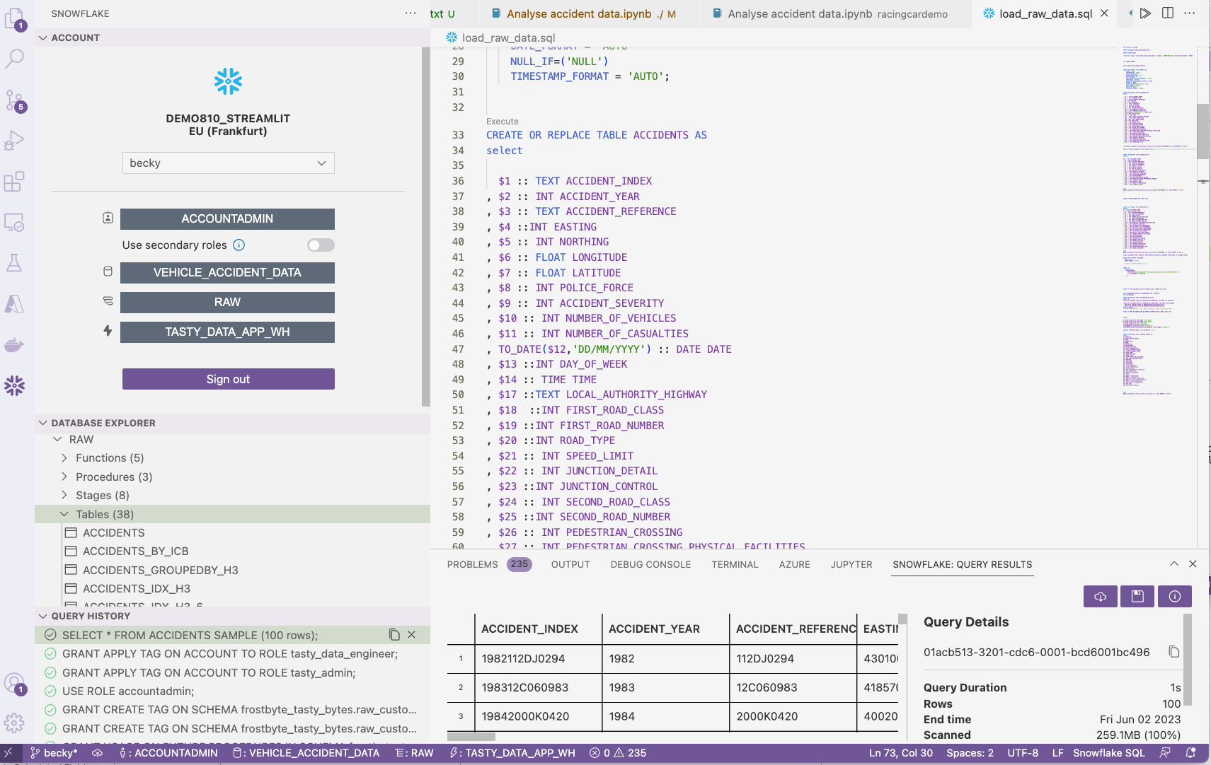
Geospatial data engineering using Snowpark
Use Snowpark for data engineering via your VS Code notebook, opting to use Snowpark DataFrames instead of an SQL file.
To begin, import a GeoJSON file of towns and cities in England, which provides the shape of each major town and city. Use this process to create the file format:
sql = [f'''create or replace file format JSON
    type = JSON
    STRIP_OUTER_ARRAY = TRUE;
''',
f'''PUT file://towns_and_cities.geojson @DATA_STAGE
    auto_compress = false
    overwrite = true;
'''
]

for sql in sql:
    session.sql(sql).collect()
Next, transform the geometry data held within the stage into a Snowpark DataFrame:
geometry_data = session.sql('''select $1::Variant V
FROM @DATA_STAGE/towns_and_cities.geojson (FILE_FORMAT =>'JSON') ''')
Finally, enter the raw data into a table (you can view it in the Snowflake add-in):
geometry_data.write.mode("overwrite").save_as_table("GEOMETRY_DATA")
Working with polygon data
To work with polygon data, use:
- SnowSQL to upload your GeoJSON files to a stage
- The Snowflake function ST_GEOGRAPHY to convert the polygons into a format that Tableau can recognize
Use Snowpark to see what the shape of the imported data looks like:
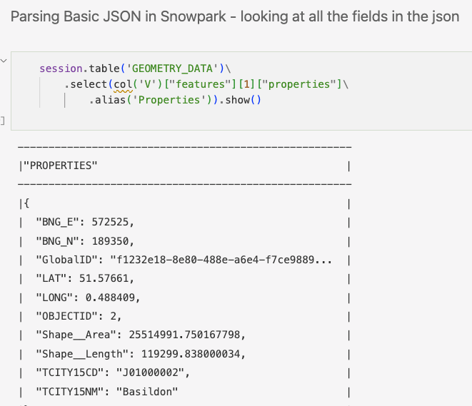
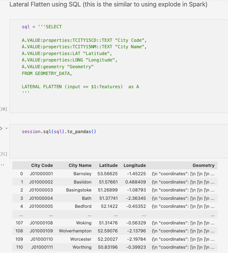
To make the data more readable, use Lateral Flatten to "explode" the GeoJSON into multiple rows. Return to pandas to view the data in a more readable format:
Instead of using SQL syntax, you can use Snowpark's DataFrame syntax:
table1 = session.table('GEOMETRY_DATA')

flatten = table1.join_table_function("flatten",col("V"),lit("features"))

towns_cities = flatten.select(\\
    col('VALUE')["properties"]["TCITY15CD"].cast(StringType()).alias("TOWN_CODE")\\
    ,( col('VALUE')["properties"]["TCITY15NM"]).cast(StringType()).alias("TOWN_NAME")\\
    ,call_udf("TO_GEOGRAPHY",col('VALUE')["geometry"]).alias("GEOMETRY")\\

    )
When importing the geometries, notice that the precision is very high:
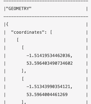
Using polygons with very high precision, which is often unnecessary, can negatively impact performance. To address this, use the Python Shapely library available within the Snowflake service without requiring installation. With this library, create a custom function to reduce the precision of polygons.
Once deployed, this function will be stored and processed in Snowflake like any other function:
sql = '''

CREATE OR REPLACE FUNCTION py_reduceprecision(geo geography, n integer)
returns geography
language python
runtime_version = 3.8
packages = ('shapely')
handler = 'udf'
AS $$
from shapely.geometry import shape, mapping
from shapely import wkt
def udf(geo, n):
    if n < 0:
        raise ValueError('Number of digits must be positive')
    else:
        g1 = shape(geo)
        updated_shape = wkt.loads(wkt.dumps(g1, rounding_precision=n))
        return mapping(updated_shape)
$$

'''
session.sql(sql).collect()
towns_cities_reduced = towns_cities.with_column(
    "GEOMETRY", call_udf("py_reduceprecision", (col("GEOMETRY"), 6))
)
Finally, save the geometry dataframe into a Snowflake table:
towns_cities.write.mode("overwrite").save_as_table("TOWNS_CITIES")
To associate incident data with polygons, you'll need a spatial join because the accident data doesn't include town or city names. Spatial joins can be computationally intensive, particularly when working with large datasets. But in this case, running a spatial join view with 17 million data points and 35,000 polygons took only 41 seconds on an X-Small virtual warehouse:
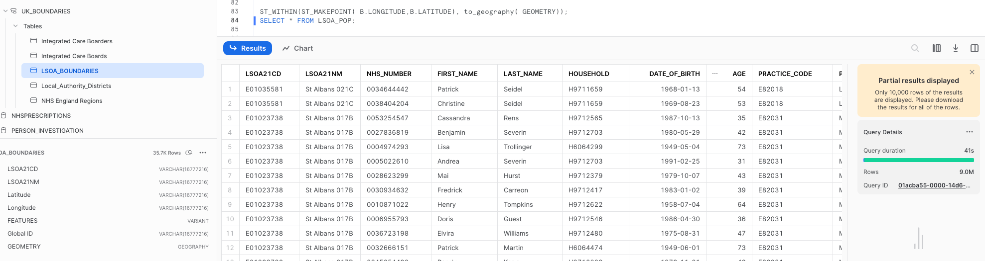
This geospatial function is natively available for instant querying within Snowflake. You don't have to use geospatial functions in Snowpark DataFrames—use them within SQL just like any other function:
CREATE OR REPLACE VIEW LSOA_POP AS

select C.LSOA21CD, c.LSOA21NM, A.* from
(SELECT * FROM
(select * from population_health_table) limit 17000000)a

inner join postcodes b on a.postcode = b.postcode
inner join

GEOGRAPHIC_BOUNDARIES.UK_BOUNDARIES.LSOA_BOUNDARIES c on

ST_WITHIN(ST_MAKEPOINT( B.LONGITUDE,B.LATITUDE), to_geography( GEOMETRY));
If you have billions of data points and various polygons to join several datasets, spatial indexes could be a more efficient choice.
Carto has created an Analytical Toolbox, which includes the H3 spatial indexing system. I'll cover this system in more detail in another post. For now, use the standard spatial join feature to assign a town to every vehicle accident that has corresponding latitude and longitude:
ACCIDENTS_KNOWN_LOCATION.with_column('POINT',call_udf('ST_makepoint',col('LONGITUDE'),col('LATITUDE')))\\
    .write.mode("overwrite").save_as_table("ACCIDENTS_POINTS")#write a table with accident points
ACCIDENTS_IN_TOWNS_CITIES = session.table('ACCIDENTS_POINTS')\\
    .join(TOWNS_CITIES,call_udf('ST_WITHIN',col('POINT'),col('GEOMETRY'))==True)\\
        .select('ACCIDENT_INDEX','TOWN_CODE','TOWN_NAME','GEOMETRY')
After completion, write the table to Snowflake and use Tableau to render the polygons along with the corresponding accident data:
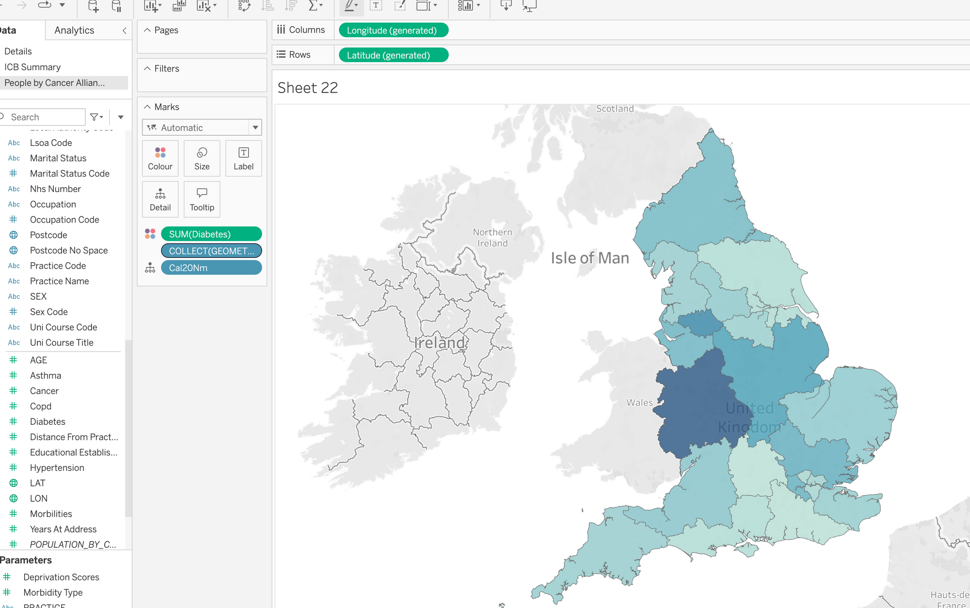
Tableau's native spatial support works seamlessly with Snowflake in "live" query mode.
Embedding Tableau reports in Streamlit
The components.html function is a valuable tool for embedding Tableau reports into Streamlit. It also enables you to link interactions from Streamlit inputs to Tableau.
#an example of the embed code behind one of the tableau
#reports within my streamlit app

components.html(f'''<script type='module'
        src='<https://eu-west-1a.online.tableau.com/javascripts/>
				api/tableau.embedding.3.latest.min.js'>
        </script><tableau-viz id='tableau-viz'
				src='<https://eu-west-1a.online.tableau.com/t/eccyclema/views/>
				carsFIRE_16844174853330/FIRE_SERVICEintoH3'
        width='1300' height='1300' hide-tabs toolbar='hidden' token = {token}>

         ###<viz-filter field="FRA22NM" value="{FIRE_SERVICE}"> </viz-filter>

        <viz-parameter name="MEASURE" value={parameterno}></viz-parameter>

        </tableau-viz>''', height=1300, width=1300)
The dropdown at the top uses the st.selectbox widget to display options. This widget passes the selected parameter to view the results. In the given code, the dropdown is referred to as the variable FIRE_SERVICE:
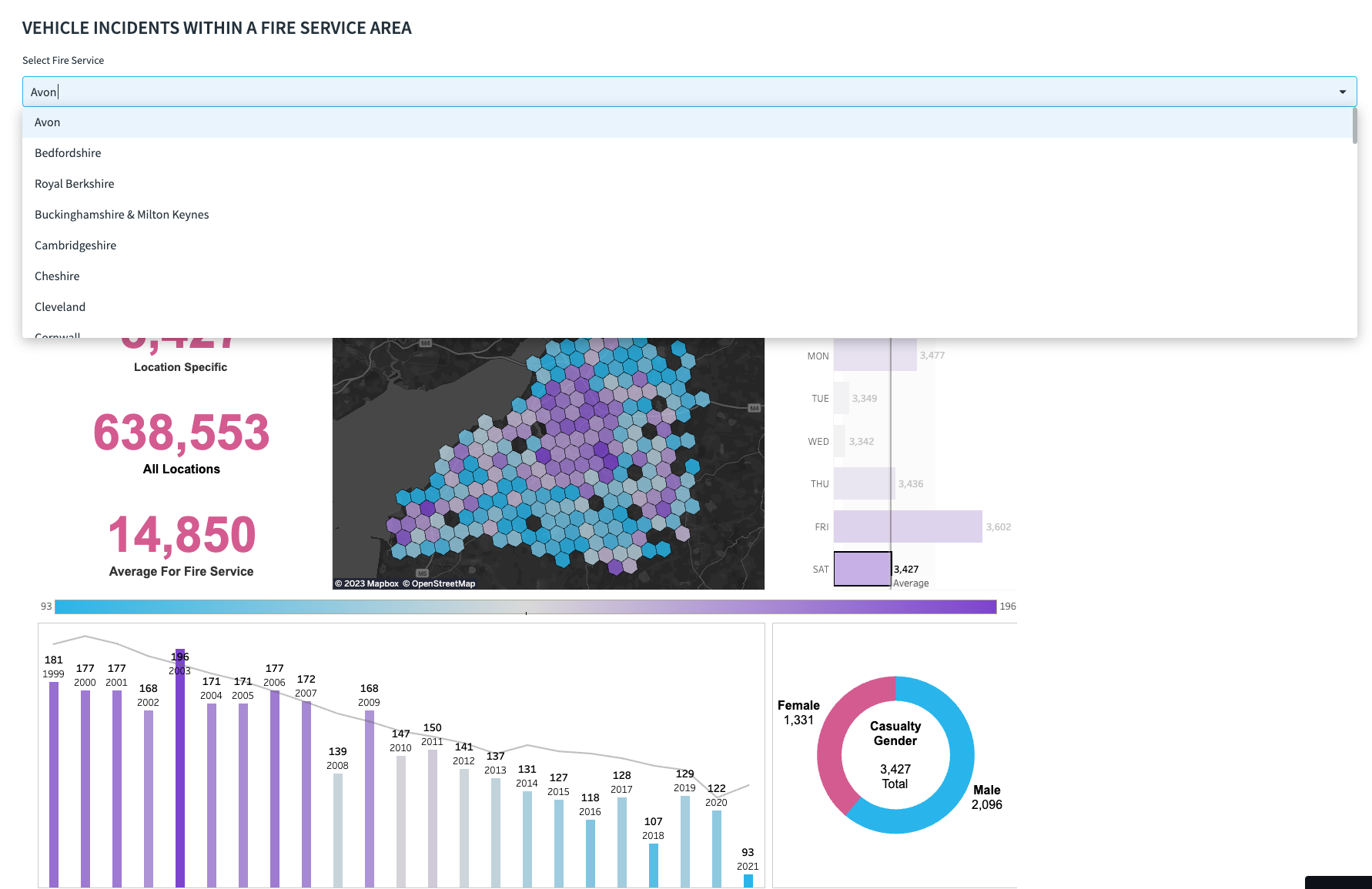
In addition to passing parameters, you can hide Tableau toolbars and tabs to seamlessly integrate the Tableau dashboard into your app. The select box can also control other items not intended for Tableau. For example, my code filters a Folium chart on another tab using the same dropdown.
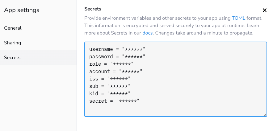
One potential issue is that clicking on an embedded Tableau tab requires signing in to Tableau, which can be visually unappealing. To avoid this, you can use Tableau's connected app capabilities, explained here. This allows the token to be passed from Streamlit to Tableau without requiring the user to log in.
Streamlit stores all secrets/credentials in the secrets.toml file. In the Streamlit Community Cloud, the secrets are managed by the UI within the settings area:
To make this work, encode the token configured in Tableau Online to your Streamlit app (in my code, I applied the variable token to the components.html function):
#token generator for tableau automatic login

token = encode(
	{
		"iss": st.secrets["iss"],
		"exp": datetime.utcnow() + timedelta(minutes=5),
		"jti": str(uuid4()),
		"aud": "tableau",
		"sub": st.secrets["sub"],
		"scp": ["tableau:views:embed", "tableau:metrics:embed"],
		"Region": "East"
	},
		st.secrets["tableau_secret"],
		algorithm = "HS256",
		headers = {
		'kid': st.secrets["kid"],
		'iss': st.secrets["iss"]
        }
  )
Using Carto's Analytic Toolbox to work with geospatial indexes and clustering
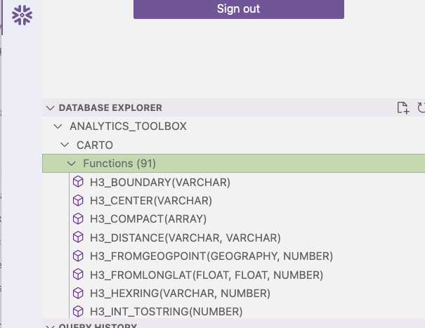
Take advantage of H3 functions within Snowflake by using Carto. Carto extends the capabilities of Snowflake without requiring any installation. Simply obtain the share from the marketplace, and the additional functions will be instantly available. This is one of the advantages of Snowflake's sharing capabilities:

Once deployed (which takes only a second), the functions will appear as a new database in Snowflake. You can also verify this in VS Code:
H3 is a hexagon hierarchy covering the entire planet, with 14 different resolutions (read more here). Each hexagon, regardless of size, has a unique index. A hexagon of the highest resolution could fit inside a child's sandbox:

Converting spatial data into consistently sized hexagons is an effective way to aggregate points into hexagonal samples. Carto provides functions for creating an H3 index from latitude and longitude, which can group hexagons into points. There is also a polyfill function, which can fill a polygon with hexagons. The unique H3 index is always placed consistently, so when joining points to a polygon, you'd join polygons instead of performing a spatial join. This speeds up processing time and is cost-effective.
In the "City Details" tab, you can change the size of the H3 resolution within Streamlit. This calls the Carto function and processes it against the accident data:
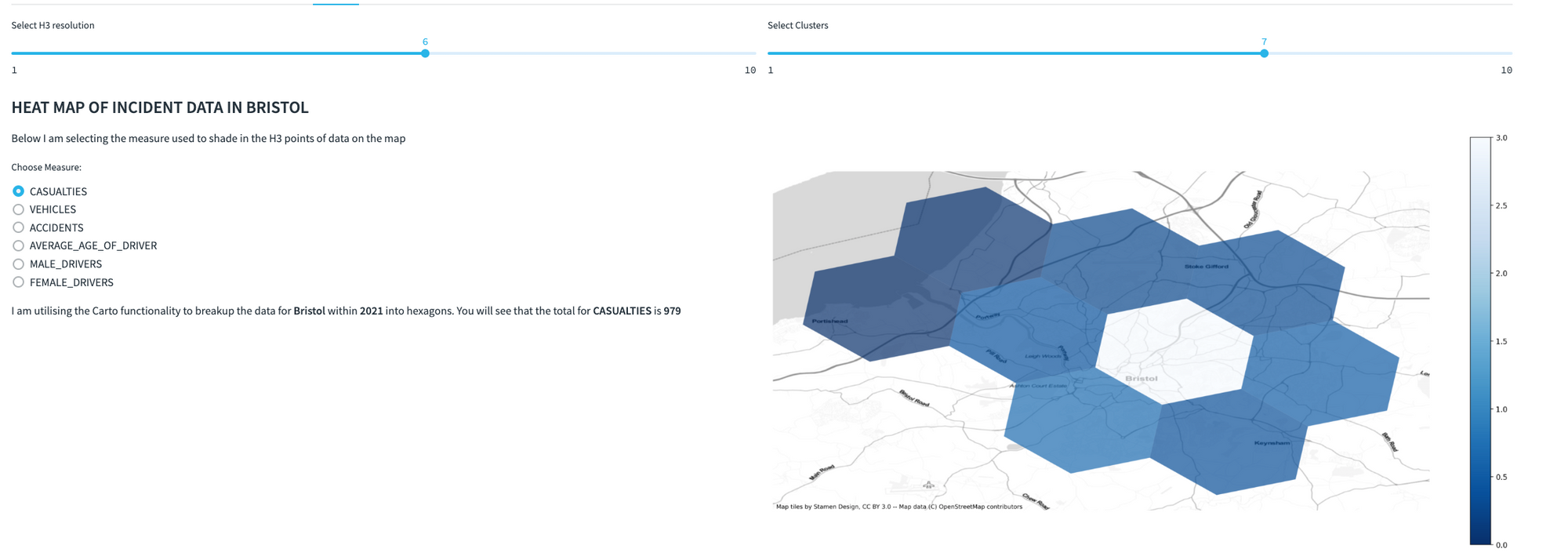
Wrap this code in a function that resizes hexagons for all data within a chosen resolution, year, and town when executed:
import snowflake.snowpark.functions as f
@st.cache_data(max_entries=5)
def CARTO(r,s_year, s_town_code):

    ACCIDENT_TOWN_CITY = session.table('ACCIDENTS_WITH_TOWN_CITY_DETAILS').filter(f.col('TOWN_CODE')==s_town_code)

    ACCIDENT_DETAILS = ACCIDENTS\\
      .filter(f.col('ACCIDENT_YEAR')==s_year)\\
      .join(ACCIDENT_TOWN_CITY,'ACCIDENT_INDEX')

    df = ACCIDENT_DETAILS\\
       .select('LATITUDE','LONGITUDE','ACCIDENT_INDEX','ACCIDENT_YEAR')\\
       .with_column('H3',\\
				f.call_udf('ANALYTICS_TOOLBOX.CARTO.H3_FROMLONGLAT',\\
				f.col('LONGITUDE'),f.col('LATITUDE'),r))\\
       .with_column('H3_BOUNDARY',\\
				f.call_udf('ANALYTICS_TOOLBOX.CARTO.H3_BOUNDARY',f.col('H3')))\\
      .with_column('WKT',f.call_udf('ST_ASWKT',f.col('H3_BOUNDARY')))\\

    accidents = df.group_by('H3').agg(f.any_value('WKT')\\
	.alias('WKT'),f.count('ACCIDENT_INDEX').alias('ACCIDENTS'))

    casualties_tot = df.join(session.table('CASUALTIES')\\
		.select('AGE_OF_CASUALTY','ACCIDENT_INDEX',\\
		'CASUALTY_SEVERITY'),'ACCIDENT_INDEX')

    casualties = df\\
    .join(session.table('CASUALTIES')\\
						.select('AGE_OF_CASUALTY','ACCIDENT_INDEX'\\
						,'CASUALTY_SEVERITY'),'ACCIDENT_INDEX')\\
            .with_column('FATAL',f.when(f.col('CASUALTY_SEVERITY')\\
						==1,f.lit(1)))\\
                            .with_column('SEVERE',\\
						f.when(f.col('CASUALTY_SEVERITY')==2,f.lit(1)))\\
            .with_column('MINOR',f\\
						.when(f.col('CASUALTY_SEVERITY')==3,f.lit(1)))\\
            .group_by('H3').agg(f.any_value('WKT').alias('WKT')\\
            ,f.count('ACCIDENT_INDEX').alias('CASUALTIES')
           ,f.avg('AGE_OF_CASUALTY').alias('AVERAGE_AGE_OF_CASUALTY')\\
           ,f.sum('FATAL').alias('FATAL')\\
           ,f.sum('SEVERE').alias('SEVERE')\\
           ,f.sum('MINOR').alias('MINOR'))
The boundaries function converts the index into a geometry. These hexagons can be visualized in Tableau just like standard polygons.
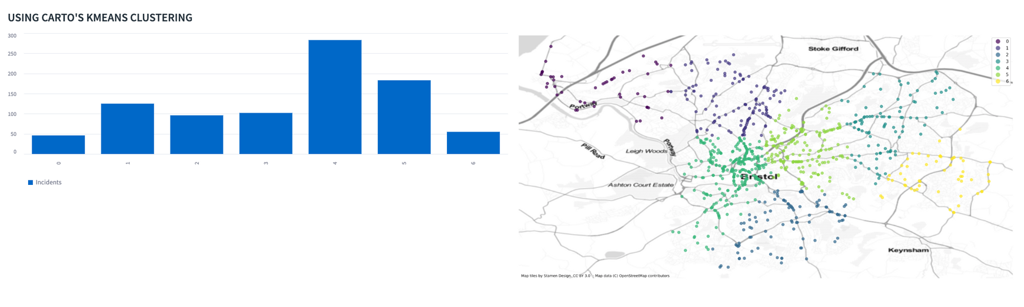
In addition to a comprehensive list of standard Snowflake functions, Carto's toolkit provides many other functions for free, including K-means clustering (read more here):
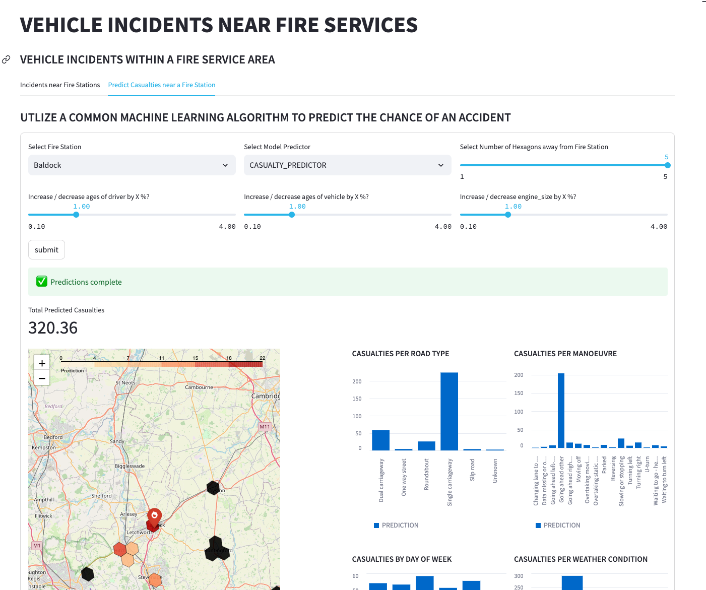
Using Streamlit to run a predictive model
Make a Streamlit page for predicting the number of casualties that may occur within a certain number of hexagons away from a fire station. Use H3_KRING_DISTANCES to determine the distance based on rings of hexagons around the point.
Before creating the app, train a random forest regressor model that relies on a Snowpark-optimized data virtual warehouse within Snowflake. After training, deploy the model and create a function to use in Streamlit. The dataset used for training aggregates using H3 Indexes at resolution 7—about every 5 kilometers (read more here).
Note the following SQL query (I'm parameterizing it using the select boxes and sliders):
sql = f'''SELECT POLICE_FORCE "Police Force",
            H3INDEX,
            any_value(st_aswkt(ANALYTICS_TOOLBOX.CARTO.H3_BOUNDARY(H3INDEX))) WKT,
            VEHICLE_MANOEUVRE "Vehicle Manoeuvre",
            ROAD_TYPE "Road Type",
            VEHICLE_TYPE "Vehicle Type",
            WEATHER_CONDITIONS "Weather Conditions",
            DAY_OF_WEEK "Day of Week",
            AVG(ENGINE_CAPACITY_CC)::INT "Engine Capacity CC",
            AVG(ADJUSTED_ENGINE_SIZE)::INT "Adjusted Engine Capacity CC",
            AVG(AGE_OF_DRIVER)::INT "Age of Driver",
            AVG(ADJUSTED_AGE_OF_DRIVER)::INT "Adjusted age of Driver",
            AVG(AGE_OF_VEHICLE)::INT "Age of Vehicle",
            AVG(ADJUSTED_AGE_OF_VEHICLE)::INT "Adjusted age of Vehicle",
            AVG(PREDICTED_FATALITY)::FLOAT PREDICTION

            FROM

            (
            select VEHICLE_ACCIDENT_DATA.RAW.{choose_model}(
            js_hextoint(A.H3INDEX)

            ,VEHICLE_MANOEUVRE
            ,DAY_OF_WEEK
            ,ROAD_TYPE
            ,SPEED_LIMIT
            ,WEATHER_CONDITIONS
            ,VEHICLE_TYPE
            ,AGE_OF_DRIVER * {age_of_driver}
            ,AGE_OF_VEHICLE * {age_of_vehicle}
            ,ENGINE_CAPACITY_CC * {engine_size}

            )PREDICTED_FATALITY,
            A.H3INDEX,
            B.VALUE AS POLICE_FORCE,
            C.VALUE AS VEHICLE_MANOEUVRE,
            D.VALUE AS ROAD_TYPE,
            E.VALUE AS VEHICLE_TYPE,
            F.VALUE AS WEATHER_CONDITIONS,
            G.VALUE AS DAY_OF_WEEK,
            AGE_OF_DRIVER,
            AGE_OF_VEHICLE,
            ENGINE_CAPACITY_CC,
            AGE_OF_DRIVER * ({age_of_driver}) ADJUSTED_AGE_OF_DRIVER,
            AGE_OF_VEHICLE * ({age_of_vehicle}) ADJUSTED_AGE_OF_VEHICLE,
            ENGINE_CAPACITY_CC * ({engine_size}) ADJUSTED_ENGINE_SIZE

            from

            (SELECT * FROM (SELECT * FROM accidents_with_perc_fatal
						WHERE YEAR = 2021))A

            INNER JOIN (SELECT CODE,VALUE FROM LOOKUPS WHERE FIELD =
						'police_force')B
            ON A.POLICE_FORCE = B.CODE

            INNER JOIN (SELECT CODE,VALUE FROM LOOKUPS WHERE FIELD =
						'vehicle_manoeuvre')C
            ON A.VEHICLE_MANOEUVRE = C.CODE

            INNER JOIN (SELECT CODE,VALUE FROM LOOKUPS WHERE FIELD =
						'road_type')D
            ON A.ROAD_TYPE = D.CODE

            INNER JOIN (SELECT CODE,VALUE FROM LOOKUPS WHERE FIELD =
						'vehicle_type')E
            ON A.VEHICLE_TYPE = E.CODE

            INNER JOIN (SELECT CODE,VALUE FROM LOOKUPS WHERE FIELD
						= 'weather_conditions')F
            ON A.WEATHER_CONDITIONS = F.CODE

            INNER JOIN (SELECT CODE,VALUE FROM LOOKUPS WHERE FIELD
						= 'day_of_week')G
            ON A.DAY_OF_WEEK = G.CODE

            INNER JOIN (
                SELECT VALUE:index H3INDEX, VALUE:distance DISTANCE FROM

                (SELECT FIRE_STATION,
								ANALYTICS_TOOLBOX.CARTO.H3_KRING_DISTANCES
								(ANALYTICS_TOOLBOX.CARTO.H3_FROMGEOGPOINT(POINT, 7),
								{choose_size})HEXAGONS

                FROM  (SELECT * FROM FIRE_STATIONS WHERE FIRE_STATION =
								 '{select_fire_station}')),lateral flatten (input =>HEXAGONS)) H

                ON A.H3INDEX = H.H3INDEX
            )

            GROUP BY POLICE_FORCE, VEHICLE_MANOEUVRE, ROAD_TYPE, VEHICLE_TYPE, WEATHER_CONDITIONS, DAY_OF_WEEK, H3INDEX

            '''
To prevent running the model every time a slider is changed, add a button inside a Streamlit form. This will allow you to execute the SQL code only when you're ready. In the future, you may convert this code section into a stored procedure. This approach creates a table with the results every time the model is run, which isn't ideal from a security standpoint. Converting the code into a stored procedure would be better practice and reduce the amount of Streamlit code required.
Wrapping up
Creating this app was a lot of fun. While it may not be a production-ready application, I wanted to share my vision of how great technologies can work together to create a geospatial solution.
I hope you found this post interesting. If you have any questions, please drop them in the comments below, message me on LinkedIn, or email me. Finally, click here to view the example app.
Happy coding! 🧑💻


Comments
Continue the conversation in our forums →