
Analyzing residential properties for sale in Brazil can be time-consuming. There are public reports that track real estate prices but no data visualizations to compare assets across cities. So I build the Appreciation of residential properties in Brazil app with Streamlit! It combines Pandas, NumPy, Matplotlib, and Seaborn libraries and a few storytelling techniques to make data analysis more accessible.
In this post, you'll learn how to build this app in seven steps:
- Import the required Python modules
- Set up the Matplotlib layout for storytelling
- Gather the data
- Set up the Streamlit app's page, textual elements, widgets, and sidebar
- Create chart 1 (appreciation)
- Create chart 2 (price by squared meter)
- Finalize the app
But first, a bit about the app itself.
The app's working principle
The app uses a single visual type—the stripplot:
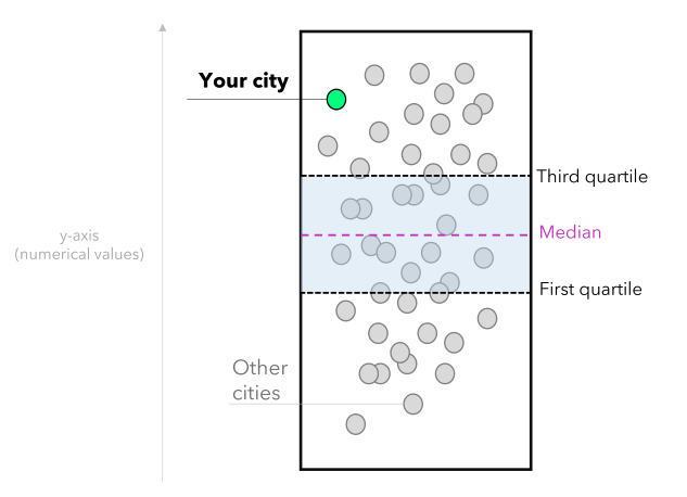
Each dot ⚪ represents a city. The lowest values are at the bottom, and the highest at the top. The user can select a city, highlight it, and compare it with other cities. You can also provide context by using statistical measures such as:
- The first quartile (Q1): represents 25% of the data.
- Median: the middle value that splits the data in half (can also provide an average).
- Third quartile (Q3): represents 75% of the data.
Here is how it works:
- The user selects a Brazilian city marked with a green dot 🟢 on the map.
- Other cities are represented by white dots ⚪, making it easy to compare the selected city with others.
- Statistical measures such as the first quartile, median, and third quartile are displayed, allowing the user to compare the situation of the chosen city against the national average and data distribution.
- The user can extract insights from the data, such as identifying opportunities when an appreciation rate is above the national average, and the price per square meter is below average.
Now, let's get to coding!
1. Import the required Python modules
Import Streamlit, Numpy, and Pandas (for arrays and data manipulation), and Matplotlib and Seaborn (for data visualization).
# Modules:
import numpy as np
import pandas as pd
import matplotlib.pyplot as plt
import seaborn as sns
import streamlit as st
2. Set up the Matplotlib layout for storytelling
This step will let you create a unique design for your Matplotlib figures and define the color palette.
# Setup for Storytelling (matplotlib):
plt.rcParams['font.family'] = 'monospace'
plt.rcParams['font.size'] = 8
plt.rcParams['font.weight'] = 'bold'
plt.rcParams['figure.facecolor'] = '#464545'
plt.rcParams['axes.facecolor'] = '#464545'
plt.rcParams['axes.titleweight'] = 'bold'
plt.rcParams['axes.titlecolor'] = 'black'
plt.rcParams['axes.titlesize'] = 9
plt.rcParams['axes.labelcolor'] = 'darkgray'
plt.rcParams['axes.labelweight'] = 'bold'
plt.rcParams['axes.edgecolor'] = 'darkgray'
plt.rcParams['axes.linewidth'] = 0.2
plt.rcParams['ytick.color'] = 'darkgray'
plt.rcParams['xtick.color'] = 'darkgray'
plt.rcParams['axes.titlecolor'] = '#FFFFFF'
plt.rcParams['axes.titlecolor'] = 'white'
plt.rcParams['axes.edgecolor'] = 'darkgray'
plt.rcParams['axes.linewidth'] = 0.85
plt.rcParams['ytick.major.size'] = 0
3. Collect the data
# --- App (begin):
BR_real_estate_appreciation = pd.read_csv('data/BR_real_estate_appreciation_Q1_2023.csv')
BR_real_estate_appreciation['Annual_appreciation'] = round(BR_real_estate_appreciation['Annual_appreciation'], 2)*100
4. Set up the Streamlit app's page, textual elements, widgets, and sidebar
To configure the style, set up a header and add an app usage tutorial in the sidebar. You can also define widgets for selecting your city of interest.
# Page setup:
st.set_page_config(
page_title="Residential properties (Brazil)",
page_icon="🏢",
layout="centered",
initial_sidebar_state="collapsed",
)
# Header:
st.header('Appreciation of residential properties in Brazil')
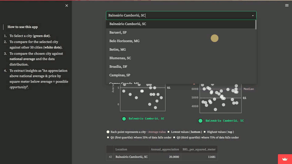
st.sidebar.markdown(''' > **How to use this app**
1. To Select a city (**green dot**).
2. To compare for the selected city against other 50 cities (**white dots**).
3. To compare the chosen city against **national average** and the data distribution.
4. To extract insights as "An appreciation above national average + price by square meter below average = possible *opportunity*".
''')
# Widgets:
cities = sorted(list(BR_real_estate_appreciation['Location'].unique()))
your_city = st.selectbox(
'🌎 Select a city',
cities
)
selected_city = BR_real_estate_appreciation.query('Location == @your_city')
other_cities = BR_real_estate_appreciation.query('Location != @your_city')
5. Create chart 1 (appreciation)
This step refers to the first stripplot, which compares the selected city's annual appreciation to other cities. You can highlight the chosen city in the chart and add reference lines, such as the first quartile, median, and third quartile, to see how it performs.
# CHART 1: Annual appreciation (12 months):
chart_1, ax = plt.subplots(figsize=(3, 4.125))
# Background:
sns.stripplot(
    data= other_cities,
    y = 'Annual_appreciation',
    color = 'white',
    jitter=0.85,
    size=8,
    linewidth=1,
    edgecolor='gainsboro',
    alpha=0.7
)
# Highlight:
sns.stripplot(
    data= selected_city,
    y = 'Annual_appreciation',
    color = '#00FF7F',
    jitter=0.15,
    size=12,
    linewidth=1,
    edgecolor='k',
    label=f'{your_city}'
)

# Showing up position measures:
avg_annual_val = BR_real_estate_appreciation['Annual_appreciation'].median()
q1_annual_val = np.percentile(BR_real_estate_appreciation['Annual_appreciation'], 25)
q3_annual_val = np.percentile(BR_real_estate_appreciation['Annual_appreciation'], 75)

# Plotting lines (reference):
ax.axhline(y=avg_annual_val, color='#DA70D6', linestyle='--', lw=0.75)
ax.axhline(y=q1_annual_val, color='white', linestyle='--', lw=0.75)
ax.axhline(y=q3_annual_val, color='white', linestyle='--', lw=0.75)

# Adding the labels for position measures:
ax.text(1.15, q1_annual_val, 'Q1', ha='center', va='center', color='white', fontsize=8, fontweight='bold')
ax.text(1.3, avg_annual_val, 'Median', ha='center', va='center', color='#DA70D6', fontsize=8, fontweight='bold')
ax.text(1.15, q3_annual_val, 'Q3', ha='center', va='center', color='white', fontsize=8, fontweight='bold')

# to fill the area between the lines:
ax.fill_betweenx([q1_annual_val, q3_annual_val], -2, 1, alpha=0.2, color='gray')
# to set the x-axis limits to show the full range of the data:
ax.set_xlim(-1, 1)

# Axes and titles:
plt.xticks([])
plt.ylabel('Average appreciation (%)')
plt.title('Appreciation (%) in the past 12 months', weight='bold', loc='center', pad=15, color='gainsboro')
plt.legend(loc='center', bbox_to_anchor=(0.5, -0.1), ncol=2, framealpha=0, labelcolor='#00FF7F')
plt.tight_layout()
6. Create chart 2 (price by squared meter)
Here I refer to the second stripplot, which shows the relationship between the city and price per square meter.
# CHART 2: Price (R$) by m²:
chart_2, ax = plt.subplots(figsize=(3, 3.95))
# Background:
sns.stripplot(
    data= other_cities,
    y = 'BRL_per_squared_meter',
    color = 'white',
    jitter=0.95,
    size=8,
    linewidth=1,
    edgecolor='gainsboro',
    alpha=0.7
)
# Highlight:
sns.stripplot(
    data= selected_city,
    y = 'BRL_per_squared_meter',
    color = '#00FF7F',
    jitter=0.15,
    size=12,
    linewidth=1,
    edgecolor='k',
    label=f'{your_city}'
)

# Showing up position measures:
avg_price_m2 = BR_real_estate_appreciation['BRL_per_squared_meter'].median()
q1_price_m2 = np.percentile(BR_real_estate_appreciation['BRL_per_squared_meter'], 25)
q3_price_m2 = np.percentile(BR_real_estate_appreciation['BRL_per_squared_meter'], 75)

# Plotting lines (reference):
ax.axhline(y=avg_price_m2, color='#DA70D6', linestyle='--', lw=0.75)
ax.axhline(y=q1_price_m2, color='white', linestyle='--', lw=0.75)
ax.axhline(y=q3_price_m2, color='white', linestyle='--', lw=0.75)

# Adding the labels for position measures:
ax.text(1.15, q1_price_m2, 'Q1', ha='center', va='center', color='white', fontsize=8, fontweight='bold')
ax.text(1.35, avg_price_m2, 'Median', ha='center', va='center', color='#DA70D6', fontsize=8, fontweight='bold')
ax.text(1.15, q3_price_m2, 'Q3', ha='center', va='center', color='white', fontsize=8, fontweight='bold')

# to fill the area between the lines:
ax.fill_betweenx([q1_price_m2, q3_price_m2], -2, 1, alpha=0.2, color='gray')
# to set the x-axis limits to show the full range of the data:
ax.set_xlim(-1, 1)

# Axes and titles:
plt.xticks([])
plt.ylabel('Price (R\\$)')
plt.legend(loc='center', bbox_to_anchor=(0.5, -0.1), ncol=2, framealpha=0, labelcolor='#00FF7F')
plt.title('Average price (R\\$) by $m^2$', weight='bold', loc='center', pad=15, color='gainsboro')
plt.tight_layout()
7. Finalize the app
Here, you can split the charts into two columns and add a legend. To make it more accessible:
- Display tabular data for the chosen city in addition to the chart
- Provide information about reference indexes (such as inflation) and authorship
# Splitting the charts into two columns:
left, right = st.columns(2)

# Columns (content):
with left:
    st.pyplot(chart_1)
with right:
    st.pyplot(chart_2)

# Informational text:
st.markdown('''
<span style="color:white;font-size:10pt"> ⚪ Each point represents a city </span>
<span style="color:#DA70D6;font-size:10pt"> ▫ <b> Average value </b></span>
<span style="color:white;font-size:10pt"> ◽ Lowest values (<b> bottom </b>)
◽ Highest values (<b> top </b>) <br>
◽ **Q1** (first quartile): where 25% of data falls under
◽ **Q3** (third quartile): where 75% of data falls under
</span>

''',unsafe_allow_html=True)

# Showing up the numerical data (as a dataframe):
st.dataframe(
    BR_real_estate_appreciation.query('Location == @your_city')[[
      'Location', 'Annual_appreciation',
      'BRL_per_squared_meter']]
)

# Adding some reference indexes:
st.markdown(''' > **Reference indexes (inflation):**

* IPCA: **6%** (National Broad Consumer Price Index)
* IGP-M: **4%** (General Market Price Index)

> Data based on public informs that accounts residential properties for 50 Brazilian cities (first quarter of 2023).
''')

# Authorship:
st.markdown('---')
# here you can add the authorship and useful links (e.g., Linkedin, GitHub, and so forth)
st.markdown('---')
# --- (End of the App)
Finally, let's incorporate a dark theme. Note that the layout customizations in Matplotlib will be consistent with the theme's color palette.
[theme]
primaryColor="#00FF7F"
backgroundColor="#464545"
secondaryBackgroundColor="#2b2b29"
textColor="#fbfbfb"
font="serif"
Wrapping up
Now you can use Streamlit to analyze the appreciation of residential properties by employing statistics, data visualization, and storytelling. Although this app is for Brazilian real estate properties, you can apply the same methodology to any country.
If you have any questions, please post them in the comments below or contact me on GitHub, LinkedIn, or Medium.
Happy Streamlit-ing! 🎈


Comments
Continue the conversation in our forums →