You may be familiar with the phrase “A picture is worth a thousand words” and, in the context of data science, a visualized plot provides just as much value. It does this by providing a different look at tabular data, perhaps in the form of simple line charts, histogram distribution and more elaborate pivot charts.
As useful as these can be, a typical chart that we may see in print or on the web are most likely static. Imagine how much more engaging it would be to manipulate these static variables in an interactive dashboard?
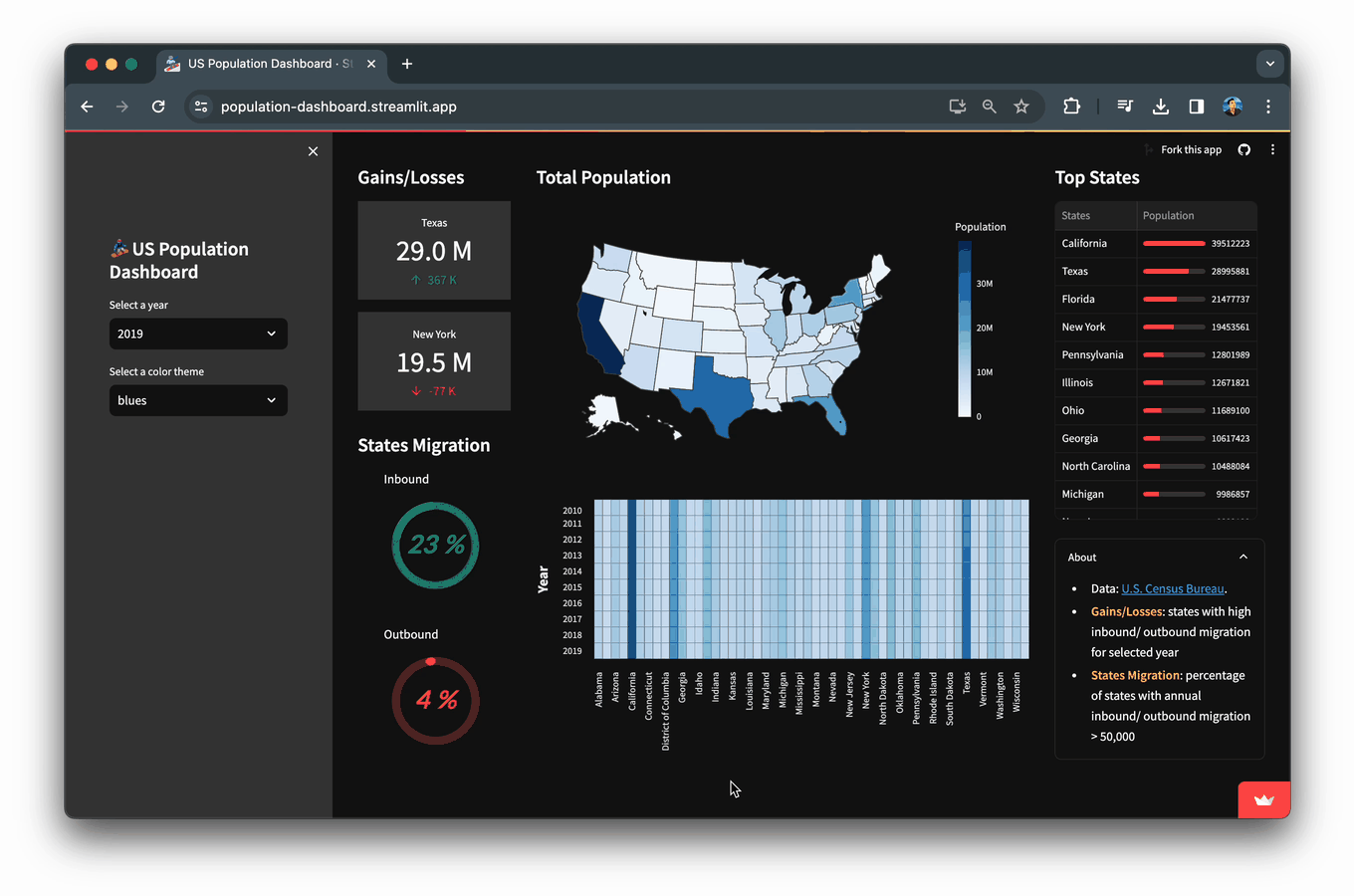
In this blog, you’ll learn how to build a Population Dashboard app that displays data and visualizations of the US population for the years 2010-2019 as obtained from the US Census Bureau.
I'll guide you through the process of building this interactive dashboard app from scratch using Streamlit for the frontend. Our backend muscle comes from PyData heavyweights like NumPy, Pandas, Scikit-Learn, and Altair, ensuring robust data processing and analytics.
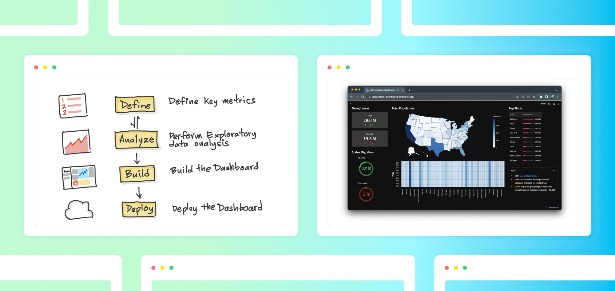
You’ll learn how to:
- Define key metrics
- Perform EDA analysis
- Build the dashboard app with Streamlit
What’s inside the dashboard?
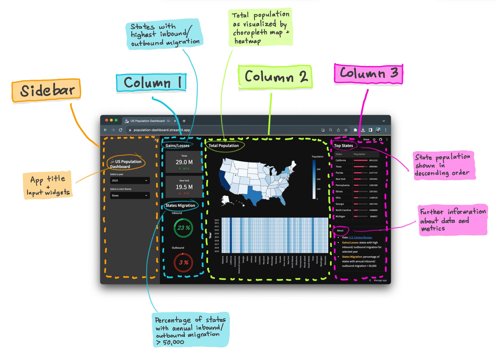
Here’s a visual breakdown of the components that make up this population dashboard:
Let’s get started!
1. Define key metrics
Before we dive into actually building the dashboard, we need to first come up with well-defined metrics to measure what matters.
1.1 Overview of key metrics
The goal of any dashboard is to surface insights that provide the basis for data-driven decision making. What is the primary purpose of the dashboard? This will guide the subsequent questions you want the dashboard to answer in the form of key metrics.
For example:
- In sales, the primary goal may be to understand: “How are sales teams performing?” Metrics may include total revenue by sales rep, units sold by territory, or new leads generated over time.
- In marketing, the primary goal may be to understand “How is my campaign performing?” this may include measuring leading indicators such as response rates or click-through rate, and lagging indicators such as revenue conversion rate or customer acquisition costs.
- In finance, the dashboard may need to answer “How profitable is our business?” this might include gross profit, operating margin, and return on assets.
1.2 Key metrics selected for this app
The primary question this population dashboard aims to answer is: how do US state populations change over time?
What questions do we need to ask that will help us answer this dashboard goal?
- How do total populations compare among different states?
- How do state populations evolve over time and how do they compare to each other?
- In a given year, which states experienced more than 50,000 people moving in, or out? We'll label these inbound and outbound migration metrics.
2. Perform EDA analysis
Once we have our key metrics, we will then need to collect and gain a solid understanding about the data available before we can present it in a visually aesthetic way in our dashboard.
Exploratory data analysis (EDA) can be defined as an iterative process for data understanding that entails asking and answering questions through investigative work of analyzing the data. In essence, your dashboard starts out as a blank canvas and EDA provides a pragmatic approach for coming up with compelling data visuals that tells a story.
John Tukey's seminal work on EDA in 1977 meticulously sets the stage for effective data communication. Here are some notable key takeaways:
- “The greatest value of a graph is when it forces us to see what we never expected.” In fact Tukey, introduced the Box and whisker plot (aka box plots).
- Having a flexible and open mindset when approaching data, hence the “exploratory” nature of EDA.
2.1 What data is available to you?
Here’s a sample of the dataset from the US Census Bureau we’re using for our population dashboard. There are 3 potential variables (states, year and population) that will serve as the basis for our metrics.
states, states_code, id, year, population
Alabama, AL, 1, 2010, 4785437
Alaska, AK, 2, 2010, 713910
Arizona, AZ, 4, 2010, 6407172
Arkansas, AR, 5, 2010, 2921964
California, CA, 6, 2010, 37319502
2.2 Prepare the data
Consolidate the year columns into a single unified column.
The advantage of subsetting the data by year, will provide the necessary format for generating possible visualizations (e.g. a heatmap, choropleth map, etc.) and a sortable dataframe.
2.3 Select charts to best visualize our key metrics
Now that we have a better understanding of the data at our fingertips, and the key metrics to measure, it’s time to decide how to visualize the results on our dashboard. There are countless ways to visualize your datasets, here’s what was selected for our population dashboard app.
- What is the comparison of total populations among different states?
- A choropleth map adds a geospatial dimension to highlight the most and least populated states.
- How do populations of different states evolve over time and how do they compare to each other?
- A heatmap offers a comprehensive overview of states with the highest and lowest population values by presenting this information across different years
- Sorting the dataframe provides a quick and direct comparison of the most and least populated states, thereby eliminating the need to wander through different sections of the charts.
- In a given year, what percent of all states experience inbound/outbound migration >50,000 people?
- A donut chart is a pie chart with an empty inner arc and we’re using this to visualize the percentage of inbound and outbound state migration.
There are countless ways to visualize your datasets!
You can discover even more visualization options from the growing collection of custom components that the community. Here’s a few that you can try out:
streamlit-extrasaffords a wide range of widgets that extends the native functionality of Streamlit.streamlit-shadcn-uiprovides several UI frontend components (modal, hovercard, badges, etc.) that can be incorporated into the dashboard app.streamlit-elementsallows the creation of draggable and resizable dashboard components.
3. Build your dashboard with Streamlit
3.1 Import libraries
First, we’ll start by importing the prerequisite libraries:
- Streamlit - a low-code web framework
- Pandas - a data analysis and wrangling tool
- Altair - a data visualization library
- Plotly Express - a terse and high-level API for creating figures
import streamlit as st
import pandas as pd
import altair as alt
import plotly.express as px
3.2 Page configuration
Next, we’ll define settings for the app by giving it a page title and icon that are displayed on the browser. This also defines the page content to be displayed in a wide layout that fits the page’s width as well as showing the sidebar in the expanded state.
Here, we also set the color theme for the Altair plot to be dark in order to accompany dark color theme of the app.
st.set_page_config(
    page_title="US Population Dashboard",
    page_icon="🏂",
    layout="wide",
    initial_sidebar_state="expanded")

alt.themes.enable("dark")
3.3 Load data
Next, we’ll load data into the app using Pandas’ read_csv() function as follows:
df_reshaped = pd.read_csv('data/us-population-2010-2019-reshaped.csv')
3.4 Add a sidebar
We’re now going to create the app title via st.title() and create drop-down widgets for allowing users to select the specific year and color theme via st.selectbox().
The selected_year (from the available years from 2010-2019) will then be used to subset the data for that year, which is then displayed in-app.
The selected_color_theme will allow the choropleth map and heatmap to be colored according to the selected color specified by the aforementioned widget.
with st.sidebar:
    st.title('🏂 US Population Dashboard')

    year_list = list(df_reshaped.year.unique())[::-1]

    selected_year = st.selectbox('Select a year', year_list, index=len(year_list)-1)
    df_selected_year = df_reshaped[df_reshaped.year == selected_year]
    df_selected_year_sorted = df_selected_year.sort_values(by="population", ascending=False)

    color_theme_list = ['blues', 'cividis', 'greens', 'inferno', 'magma', 'plasma', 'reds', 'rainbow', 'turbo', 'viridis']
    selected_color_theme = st.selectbox('Select a color theme', color_theme_list)
3.5 Plot and chart types
Next, we’re going to define custom functions to create the various plots displayed in the dashboard.
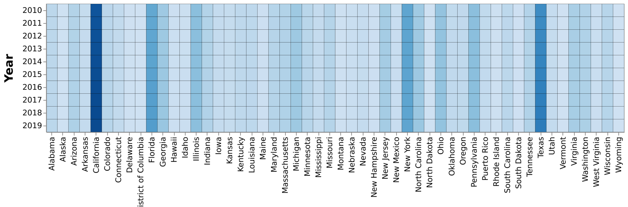
Heatmap
A heatmap will allow us to see the population growth over the years from 2010-2019 for the 52 states.
def make_heatmap(input_df, input_y, input_x, input_color, input_color_theme):
    heatmap = alt.Chart(input_df).mark_rect().encode(
            y=alt.Y(f'{input_y}:O', axis=alt.Axis(title="Year", titleFontSize=18, titlePadding=15, titleFontWeight=900, labelAngle=0)),
            x=alt.X(f'{input_x}:O', axis=alt.Axis(title="", titleFontSize=18, titlePadding=15, titleFontWeight=900)),
            color=alt.Color(f'max({input_color}):Q',
                             legend=None,
                             scale=alt.Scale(scheme=input_color_theme)),
            stroke=alt.value('black'),
            strokeWidth=alt.value(0.25),
        ).properties(width=900
        ).configure_axis(
        labelFontSize=12,
        titleFontSize=12
        )
    # height=300
    return heatmap
Choropleth map
Next, a colored map of the 52 US states for the selected year is depicted by the choropleth map.
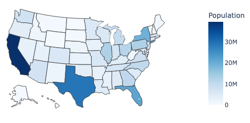
def make_choropleth(input_df, input_id, input_column, input_color_theme):
    choropleth = px.choropleth(input_df, locations=input_id, color=input_column, locationmode="USA-states",
                               color_continuous_scale=input_color_theme,
                               range_color=(0, max(df_selected_year.population)),
                               scope="usa",
                               labels={'population':'Population'}
                              )
    choropleth.update_layout(
        template='plotly_dark',
        plot_bgcolor='rgba(0, 0, 0, 0)',
        paper_bgcolor='rgba(0, 0, 0, 0)',
        margin=dict(l=0, r=0, t=0, b=0),
        height=350
    )
    return choropleth
Donut chart
Next, we’re going to create a donut chart for the states migration in percentage.
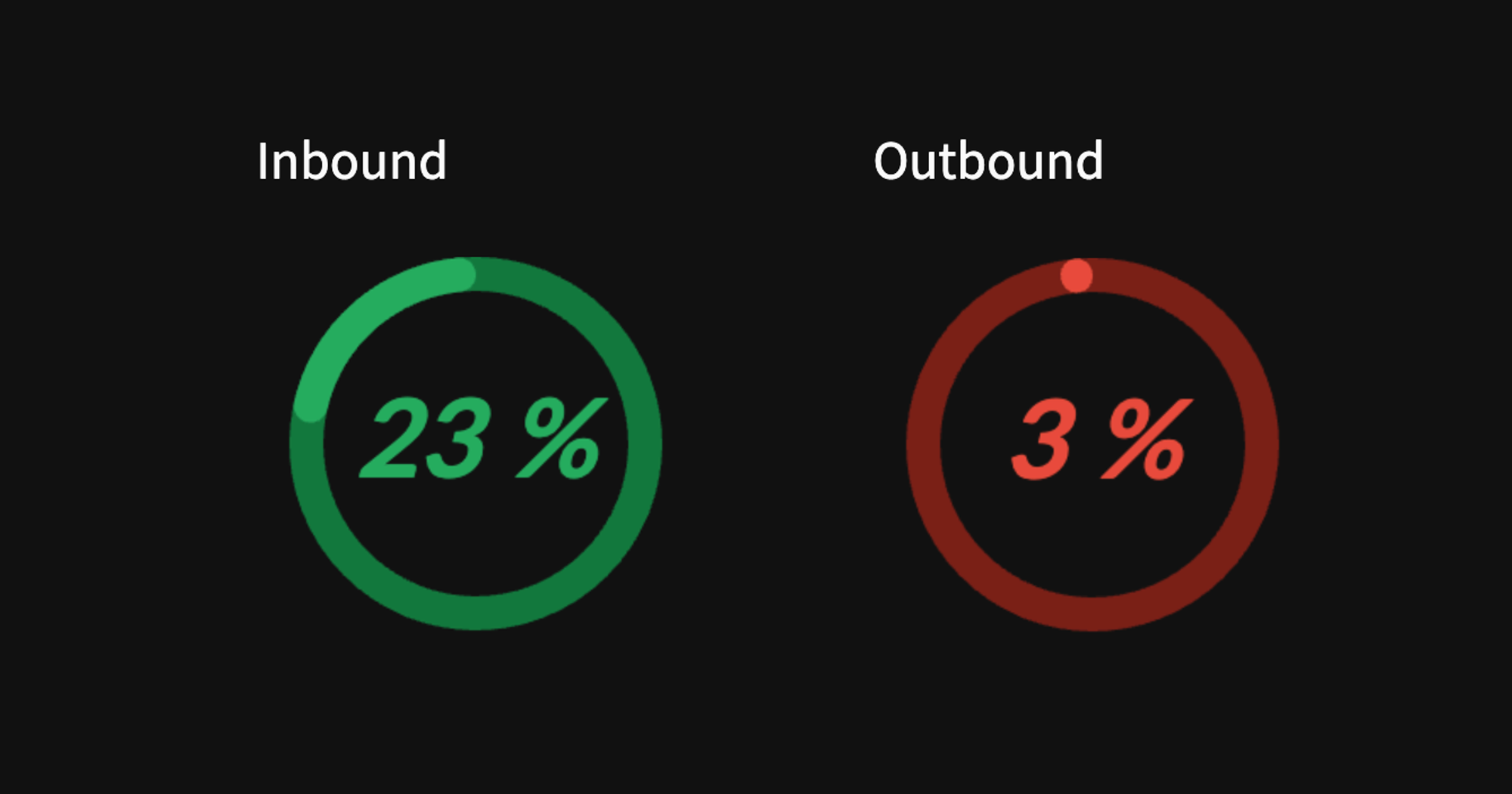
Particularly, this represents the percentage of states with annual inbound or outbound migration > 50,000 people. For instance, in 2019, there were 12 out of 52 states and this corresponds to 23%.
Before creating the donut chart, we’ll need to calculate the year-over-year population migrations.
def calculate_population_difference(input_df, input_year):
  selected_year_data = input_df[input_df['year'] == input_year].reset_index()
  previous_year_data = input_df[input_df['year'] == input_year - 1].reset_index()
  selected_year_data['population_difference'] = selected_year_data.population.sub(previous_year_data.population, fill_value=0)
  return pd.concat([selected_year_data.states, selected_year_data.id, selected_year_data.population, selected_year_data.population_difference], axis=1).sort_values(by="population_difference", ascending=False)
The donut chart is then created from the aforementioned percentage value for states migration.
def make_donut(input_response, input_text, input_color):
  if input_color == 'blue':
      chart_color = ['#29b5e8', '#155F7A']
  if input_color == 'green':
      chart_color = ['#27AE60', '#12783D']
  if input_color == 'orange':
      chart_color = ['#F39C12', '#875A12']
  if input_color == 'red':
      chart_color = ['#E74C3C', '#781F16']

  source = pd.DataFrame({
      "Topic": ['', input_text],
      "% value": [100-input_response, input_response]
  })
  source_bg = pd.DataFrame({
      "Topic": ['', input_text],
      "% value": [100, 0]
  })

  plot = alt.Chart(source).mark_arc(innerRadius=45, cornerRadius=25).encode(
      theta="% value",
      color= alt.Color("Topic:N",
                      scale=alt.Scale(
                          #domain=['A', 'B'],
                          domain=[input_text, ''],
                          # range=['#29b5e8', '#155F7A']),  # 31333F
                          range=chart_color),
                      legend=None),
  ).properties(width=130, height=130)

  text = plot.mark_text(align='center', color="#29b5e8", font="Lato", fontSize=32, fontWeight=700, fontStyle="italic").encode(text=alt.value(f'{input_response} %'))
  plot_bg = alt.Chart(source_bg).mark_arc(innerRadius=45, cornerRadius=20).encode(
      theta="% value",
      color= alt.Color("Topic:N",
                      scale=alt.Scale(
                          # domain=['A', 'B'],
                          domain=[input_text, ''],
                          range=chart_color),  # 31333F
                      legend=None),
  ).properties(width=130, height=130)
  return plot_bg + plot + text
Convert population to text
Next, we’ll going to create a custom function for making population values more concise as well as improving the aesthetics. Particularly, instead of being displayed as numerical values of 28,995,881 in the metrics card to a more concised form as 29.0 M. This was also applied to numerical values in the thousand range.
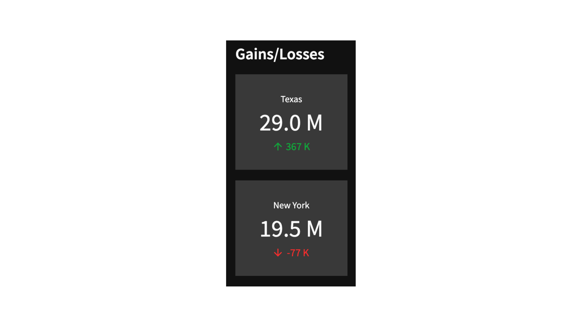
def format_number(num):
    if num > 1000000:
        if not num % 1000000:
            return f'{num // 1000000} M'
        return f'{round(num / 1000000, 1)} M'
    return f'{num // 1000} K'
3.6 App layout
Finally, it’s time to put everything together in the app.
Define the layout
Begin by creating 3 columns:
col = st.columns((1.5, 4.5, 2), gap='medium')
Particularly, the input argument (1.5, 4.5, 2) indicated that the second column has a width of about three times that of the first column and that the third column has a width about twice less than that of the second column.
Column 1
The Gain/Loss section is shown where metrics card are displaying states with the highest inbound and outbound migration for the selected year (specified via the Select a year drop-down widget created via st.selectbox).
The States migration section shows a donut chart where the percentage of states with annual inbound or outbound migration > 50,000 are displayed.
with col[0]:
    st.markdown('#### Gains/Losses')

    df_population_difference_sorted = calculate_population_difference(df_reshaped, selected_year)

    if selected_year > 2010:
        first_state_name = df_population_difference_sorted.states.iloc[0]
        first_state_population = format_number(df_population_difference_sorted.population.iloc[0])
        first_state_delta = format_number(df_population_difference_sorted.population_difference.iloc[0])
    else:
        first_state_name = '-'
        first_state_population = '-'
        first_state_delta = ''
    st.metric(label=first_state_name, value=first_state_population, delta=first_state_delta)

    if selected_year > 2010:
        last_state_name = df_population_difference_sorted.states.iloc[-1]
        last_state_population = format_number(df_population_difference_sorted.population.iloc[-1])
        last_state_delta = format_number(df_population_difference_sorted.population_difference.iloc[-1])
    else:
        last_state_name = '-'
        last_state_population = '-'
        last_state_delta = ''
    st.metric(label=last_state_name, value=last_state_population, delta=last_state_delta)


    st.markdown('#### States Migration')

    if selected_year > 2010:
        # Filter states with population difference > 50000
        # df_greater_50000 = df_population_difference_sorted[df_population_difference_sorted.population_difference_absolute > 50000]
        df_greater_50000 = df_population_difference_sorted[df_population_difference_sorted.population_difference > 50000]
        df_less_50000 = df_population_difference_sorted[df_population_difference_sorted.population_difference < -50000]

        # % of States with population difference > 50000
        states_migration_greater = round((len(df_greater_50000)/df_population_difference_sorted.states.nunique())*100)
        states_migration_less = round((len(df_less_50000)/df_population_difference_sorted.states.nunique())*100)
        donut_chart_greater = make_donut(states_migration_greater, 'Inbound Migration', 'green')
        donut_chart_less = make_donut(states_migration_less, 'Outbound Migration', 'red')
    else:
        states_migration_greater = 0
        states_migration_less = 0
        donut_chart_greater = make_donut(states_migration_greater, 'Inbound Migration', 'green')
        donut_chart_less = make_donut(states_migration_less, 'Outbound Migration', 'red')

    migrations_col = st.columns((0.2, 1, 0.2))
    with migrations_col[1]:
        st.write('Inbound')
        st.altair_chart(donut_chart_greater)
        st.write('Outbound')
        st.altair_chart(donut_chart_less)
Column 2
Next, the second column displays the choropleth map and heatmap using custom functions created earlier.
with col[1]:
    st.markdown('#### Total Population')

    choropleth = make_choropleth(df_selected_year, 'states_code', 'population', selected_color_theme)
    st.plotly_chart(choropleth, use_container_width=True)

    heatmap = make_heatmap(df_reshaped, 'year', 'states', 'population', selected_color_theme)
    st.altair_chart(heatmap, use_container_width=True)
Column 3
Finally, the third column shows the top states via a dataframe whereby the population are shown as a colored progress bar via the column_config parameter of st.dataframe.
An About section is displayed via the st.expander() container to provide information on the data source and definitions for terminologies used in the dashboard.
with col[2]:
    st.markdown('#### Top States')

    st.dataframe(df_selected_year_sorted,
                 column_order=("states", "population"),
                 hide_index=True,
                 width=None,
                 column_config={
                    "states": st.column_config.TextColumn(
                        "States",
                    ),
                    "population": st.column_config.ProgressColumn(
                        "Population",
                        format="%f",
                        min_value=0,
                        max_value=max(df_selected_year_sorted.population),
                     )}
                 )

    with st.expander('About', expanded=True):
        st.write('''
            - Data: [U.S. Census Bureau](<https://www.census.gov/data/datasets/time-series/demo/popest/2010s-state-total.html>).
            - :orange[**Gains/Losses**]: states with high inbound/ outbound migration for selected year
            - :orange[**States Migration**]: percentage of states with annual inbound/ outbound migration > 50,000
            ''')
3.7 Deploying the Dashboard app to the cloud
For a video walkthrough on deploying a Streamlit app, check out this tutorial on YouTube.
BONUS: 5 reminders when building dashboards
- Perform EDA to gain data understanding
- Identify key metrics for tracking what matters
- Decide on charts to best visualize key metrics
- Group related metrics together
- Use clear and concise labels to describe metrics
Wrapping up
In summary, Streamlit offers a quick, efficient, and code-friendly way to build interactive dashboard apps in Python, making it a go-to tool for data scientists and developers working with data visualization.
One of the key features of Streamlit is its ability to automatically update and re-render the app based on incremental changes in the data or input parameters, which makes it highly suitable for real-time data visualization tasks.
Check out this tutorial video to follow along:
What dashboards are you building? In the comments below, share your dashboard below to inspire the community, or ask for feedback!
Follow me on X at @thedataprof, on LinkedIn at Chanin Nantasenamat, or subscribe to my Data Professor channel on Youtube!
Happy Streamlit-ing! 📊


Comments
Continue the conversation in our forums →