
Hey, Streamlit community! 👋
I'm Peter Vidos, the CEO and Founder of Vizzu. Our cutting-edge open-source JavaScript library makes it easy to create animated charts and data stories. To help data scientists share their insights, we created a Python API called ipyvizzu and its storytelling extension, ipyvizzu-story. I'm excited to introduce these tools and guide you in building amazing animated data stories in Streamlit!
This tutorial covers:
- How to use ipyvizzu
- How to build a data story with ipyvizzu-story
- How to embed the story in a Streamlit app
- How to use Streamlit's input widgets for interactive storytelling
If you can't wait to try it out, here's the app and the repo.
But first, let's answer a few questions you might have...
How to use ipyvizzu
ipyvizzu is an IPython extension of the open-source Vizzu JavaScript charting library. It uses a single logic to create any chart, allowing it to interpolate between the charts expressed on its interface. In essence, it's a generic chart morpher.
The animate method lies at the heart of ipyvizzu. It has three arguments: one for setting the data being visualized, one for configuring the chart, and one for styling. Optional arguments can also describe how ipyvizzu should animate to a certain state.
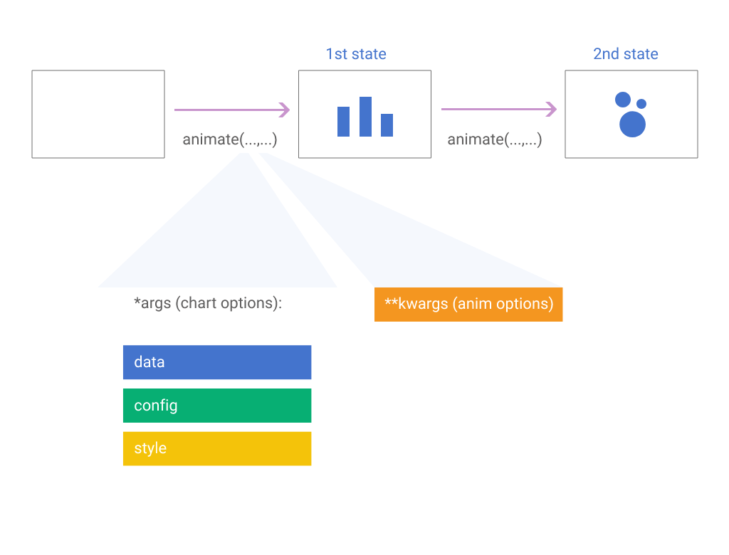
When describing a chart on ipyvizzu's interface, it'll draw a static chart. Then, if you describe another chart, the original chart will morph into the new one. This morphing can involve small changes, such as zooming in on certain parts, or more profound alterations, like changing geometrical elements, coordinate systems, and adding or removing categories or values.
Regardless of the changes, ipyvizzu will automatically create an animation to connect your charts, making it easy to follow. (We're trying hard to make it that way 😉.) Ipyvizzu can be installed from PyPI or Conda, which works within various notebooks and other environments. (Read more in our docs.)
Now, let's get some data and start building!
Gathering the data
The data used in this analysis comes from the United Nation's World Population Projections, a comprehensive database containing population data for every country from 1950 to 2100.
The UN categorizes countries into six regions that largely correspond to continents: Africa, Asia, Europe, Latin America and the Caribbean (LAC), Northern America, and Oceania. In this analysis, we'll focus on the population of these regions.
The initial dataframe sample below shows three forecasted series in the last three columns: Medium (in the Population column), High, and Low. While the past values are identical across the three series, the future values differ:
| Year | Region | Period | Population | High | Low |
|---|---|---|---|---|---|
| 2010 | Africa | Past | 1 041 484 014 | 1 041 484 014 | 1 041 484 014 |
| 2015 | Africa | Past | 1 185 462 534 | 1 185 462 534 | 1 185 462 534 |
| 2020 | Africa | Past | 1 344 069 830 | 1 344 069 830 | 1 344 069 830 |
| 2025 | Africa | Future | 1 512 428 655 | 1 520 384 567 | 1 504 473 149 |
| 2030 | Africa | Future | 1 692 186 171 | 1 720 044 019 | 1 664 337 234 |
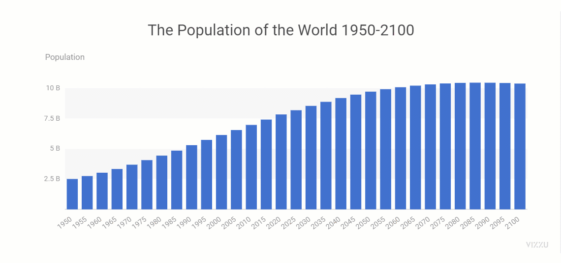
Building your first chart
chart.animate(data,
   Config({
            'x': 'Year',
            'y': 'Population',
            'title': 'The Population of the World 1950-2100'
        })
)
I've made some changes to the styling (not shown above) to keep the focus on the chart configuration for now:
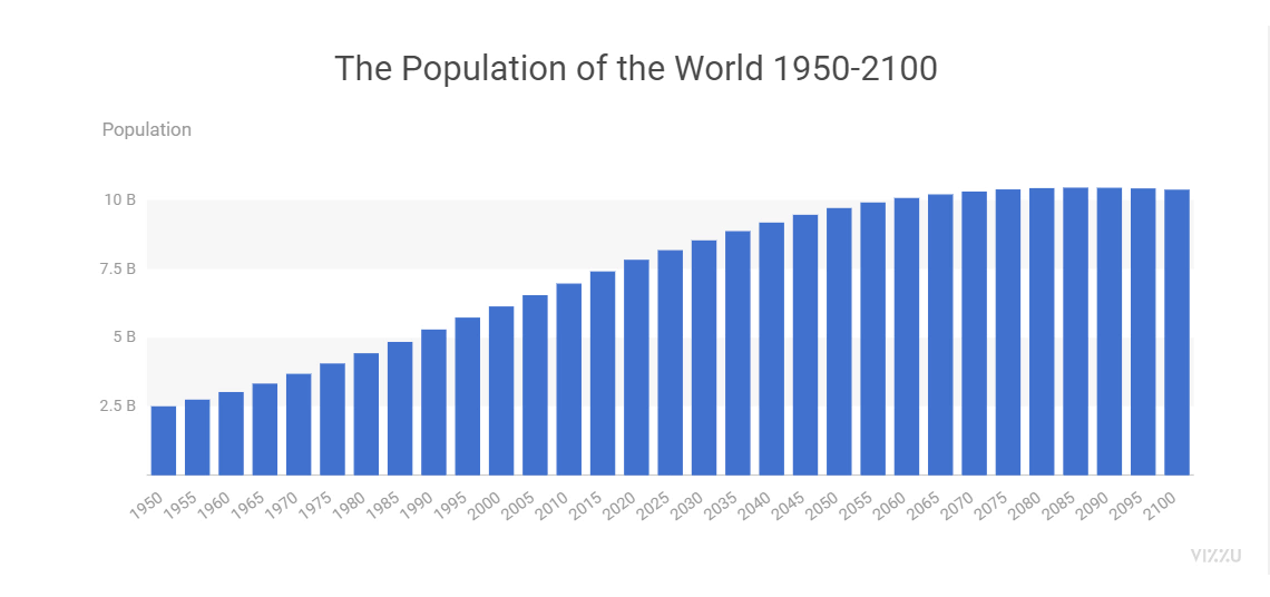
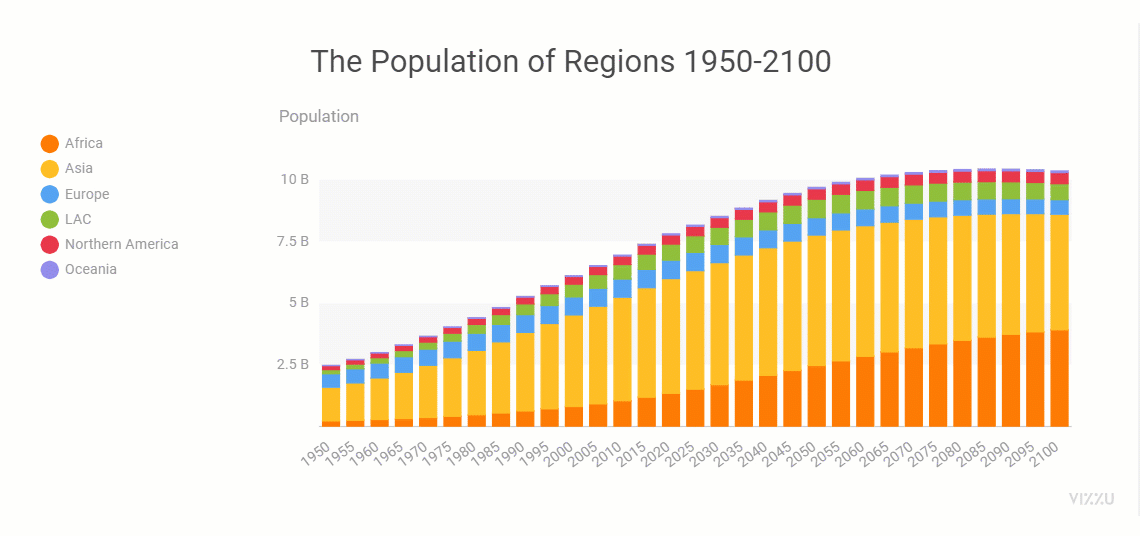
Notice that ipyvizzu automatically aggregates the population values per year. If you call the animate method again with a different configuration—by adding Region to the y-axis and the color scale—magic happens:
chart.animate(
   Config({
            'y': ['Population','Region'],
            'color': 'Region',
            'title': 'The Population of Regions 1950-2100',
        })
)
To zoom in, use a filter on the chart data. The filter is a JavaScript expression that only shows items on the chart that match the expression. Let's zoom in on past data:
chart.animate(
    Data.filter("record.Period == 'Past'"),
    Config({'title': 'The Population of Regions 1950-2020'}),
)
How to build a data story with ipyvizzu-story
ipyvizzu-story is an extension of ipyvizzu that enables embedding charts into an interactive data story. This story can be presented on the fly or shared as an interactive HTML.
ipyvizzu-story adds buttons underneath the charts, enabling viewers to switch between them intuitively. Navigation can also be done using PgUp, PgDn buttons, arrow keys, or a clicker. With the full-screen option in the bottom right corner, you have a presentation tool within your Streamlit app.
The syntax of ipyvizzu-story is very similar to ipyvizzu's. With ipyvizzu-story, you have a Story object containing all of the data shown in the story and the charts created based on that data. These are arranged into Slides and Steps.

Slides can contain one or more Steps.
A Step (and a single-Step Slide) is essentially the same as the Chart object in ipyvizzu, with some minor but important differences (for now):
- All of the data must be added to the story at initialization and can be filtered at each Step throughout the Story.
- Animation options are not available.
In the case of a Slide with multiple Steps, all but the last Steps are interim charts that connect a Slide with a previous Slide. The animation will only stop when the Story is played at the last Step.
Here are the three charts created so far, with a small update. The story starts with a filter already applied on the first slide to show only the data for the past, as it makes more sense from a storytelling aspect. Click on the buttons below the chart to explore this mini-story.
Adding more slides
Let's explore some basic features of ipyvizzu-story by adding more slides to the data story. Below is the code for four additional slides, followed by another interactive story at the end of the section that begins with the last slide of the previous story, making navigation easier.
Let's add some slides to help viewers better understand the population dynamics for these regions. First, let's change the geometry to the area so that trends are easier to spot:
slide2 = Slide(
    Step(
        Config({'geometry': 'area'})
))

story2.add_slide(slide2)
Then, use a nifty feature of ipyvizzu called splitting to show the components of a stacked chart (in this case, the regions) side-by-side:
slide3 = Slide(
    Step(
        Config({'split': True}),
))
Another intriguingly simple option in ipyvizzu and ipyvizzu-story is the ability to set the alignment of the chart to "stretch". This will result in the chart showing percentages instead of values. Additionally, you should switch off the splitting from the previous slide in the same step:
slide4 = Slide(
    Step(
        Config({
            'split': False,
            'align':'stretch',
            'title': 'The Population of Regions 1950-2100 (%)'
})))
Finally, let's zoom in on one of the regions, Africa, using the Data.filter method. To make it easier to understand, we'll use a slide with two steps. First, we switch back to values with ‘align’:’min’, and then we apply the filter:
slide5 = Slide()

slide5.add_step(
    Step(
        Config({
            'align':'min'
})))

slide5.add_step(
    Step(
        Data.filter("record.Region == 'Africa'"),
        Config({
            'title': 'The Population of Africa 1950-2100'
})))
And here you go!
Comparing scenarios
One of the greatest benefits of using animated charts is the intuitive connection between different data set views. This feature works exceptionally well for all of the transitions you've seen so far. Another significant use case for this feature is when you want to compare scenarios. Fortunately, the U.N. provides different forecasts for how the population will change in the future.
Up to this point, we have only worked with the Medium scenario. Now, it's time to experiment with the High and Low scenarios. To do so, change the value on the y-axis:
slide2 = Slide(
    Step(
        Config({
            'y': ['High','Region'],
})))

slide3 = Slide(
    Step(
        Config({
            'y': ['Low','Region'],
})))
Let's check the story!
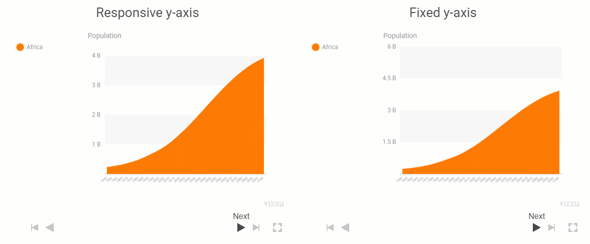
The first slide repeats the last slide from the previous section, with a minor change. Can you spot it?
The only change I made was fixing the range of the y-axis to 6 billion. It's easier to compare the values in different scenarios this way, but I had to switch off ipyvizzu's default responsive range—which works great in many other cases. Here are the code snippet and a short GIF to compare the same slides with the two settings:
Config({y': { "range": {"max": 6000000000} }})
Showing growth and loss components
With ipyvizzu's animated transitions, you can dig a little deeper while keeping the context and helping the audience follow along. But you naturally have to have the desired depth within the data.stitutes the growth and decline in the forecasted population statistics, enriching the data by adding the number of births, deaths, and the positive/negative net migration.
As you can see in the example below, I have added an additional dimension called "Category" and renamed "Population" to "Medium" for easier comprehension. Note that deaths and negative net migration are represented as negative numbers:
| Year | Region | Period | Category | Medium | High | Low |
|---|---|---|---|---|---|---|
| 2010 | Africa | Past | Deaths | - 52 967 312 | - 52 967 312 | - 52 967 312 |
| 2015 | Africa | Past | Deaths | - 53 597 303 | - 53 597 303 | - 53 597 303 |
| 2020 | Africa | Past | Deaths | - 58 545 143 | - 58 545 143 | - 58 545 143 |
| 2025 | Africa | Future | Deaths | - 60 338 052 | - 59 286 873 | - 61 389 558 |
| 2030 | Africa | Future | Deaths | - 65 556 853 | - 63 865 647 | - 67 249 451 |
To help viewers understand how these factors contribute to the population, I want the sources of growth to appear above the chart and deaths and negative net migration to appear below the x-axis (represented by negative numbers).
To properly show these extra categories on the chart, use the color scale—just like you did when you showed the regional composition of the world population before. But you'll also need to update the color palette for two reasons:
- Not to confuse the viewers by using the same colors as the regions
- To keep the components beneath the x-axis visible by giving the region (in this case, Africa) a semi-transparent color
Set the palette using the Style argument. The third color in this list corresponds to Africa. To adjust transparency, change the last two bits of the color code to 20 instead of the default FF value:
Style({ 'plot.marker.colorPalette': '#FF8080FF #808080FF #FE7B0020 #60A0FFFF #80A080FF' })
Add a slide that includes two steps. In the first step, show the data with the applied filter set to include only first births and positive net migration. In the second step, show the remaining two categories with the filter changed accordingly:
slide2.add_step(Step(
        Data.filter('record.Region === "Africa" && (record.Category === "Population" || record.Category === "Migration+" || record.Category === "Births")'),
        Config(
        {
            'y':['Medium','Category'],
            'color': ['Category']
})))

slide2.add_step(Step(
        Data.filter('record.Region === "Africa"'),
        Config({'title': 'Adding sources of gain and loss to the mix '})
))
Here's the new story snippet, starting where you last left off:
The positive and negative net migration is so small compared to all other factors that they can't be seen on the chart. But they're there—you'll see it in the next step. 😉
Aggregating and comparing scenarios
After displaying the contributing factors on a chart, you can aggregate the projected births, deaths, and net migration for the period between 2020 and 2100. Comparing each scenario will help you understand their differences better.
Just filter out the Population data and all information about the past. Remove the Year category, and ipyvizzu will automatically aggregate the values. Place the value on the x-axis instead of the y-axis to create four bar charts. To compare the High and Low predictions, change this value and visually compare the scenarios (I fixed the x-axis range to make the comparison easier).
Click through the slides to see the fundamental differences between the Medium, High, and Low population predictions:
Yep, the scenarios differ mostly by the number of projected Births.
How to embed the story in a Streamlit app
To embed the ipyvizzu-story in Streamlit, use the same code that you would use in a notebook within the .py file that serves as the source of your app (import a few more packages in the beginning). No need to call the story.play() method—Streamlit will handle that for you:
from streamlit.components.v1 import html
import ssl
import streamlit as st
import pandas as pd
from ipyvizzu import Data, Config, Style
from ipyvizzustory import Story, Slide, Step

ssl._create_default_https_context = ssl._create_unverified_context
The only minor difference compared to notebooks is that, in Streamlit, the size of the story must be set in pixels (in notebooks, you can also use percentages and other metrics):
story.set_size(750, 450)
Generate the HTML containing your story by adding the following snippet:
html(story._repr_html_(), width=750, height=450)
And voilá!
It's worth noting that if you move between the first and last slides of this story, then ipyvizzu will fade as there aren't any data points that are the same in these two views.
How to use Streamlit's input widgets for interactive storytelling
It's time to use Streamlit's awesome possibilities! Let's add a couple of input widgets to make the story interactive. Users should be able to select the region they want to zoom in on to check the detailed forecasts. You can provide this option by creating a dropdown using st.selectbox:
regions = df['Region'].unique()
sel_region = st.selectbox('Select region', list(regions))
Next, implement this choice throughout the story. The biggest challenge here is parameterizing the filters to zoom into the selected region and applying the corresponding color palettes and axis ranges.
After the user selects a region with the select box, the story will regenerate and reset to the first slide. This is the default behavior of ipyvizzu-story after loading. But, since the first five slides are the same regardless of the selected region, it makes sense to enable the user to skip these standard slides. Just add st.checkbox and set its default value to "False":
skip_intro = st.checkbox(
    'Skip intro slides', value=False
)
It's easy to implement this into the story. Simply add the code that creates the first slides into an if statement in such a way that these slides are only generated if the skip_intro value is false:
if not skip_intro :
    slide1 = Slide(
        Step(...
If you check the code of the final app, you'll notice that we used the condition the other way around, so it first checks if the skip_intro is True. This is because if it's True, you must change the color palette to use the colors you selected for the regions before the first slide was played.
Lastly, ipyvizzu-story has another great feature.
You can export the story as an interactive HTML file that includes the slides and data. This file can be sent via email, embedded in a web page (like this blog post 😊), or served from any web server. To make it easy for viewers to use this feature, add a button with just one line of code. Use st.download_button to export the story into an HTML file that includes the name of the selected region.
st.download_button('Download HTML export', story.to_html(), file_name=f'world-population-story-{sel_region}.html', mime='text/html')
And here you go! 🙂
Wrapping up
We've covered everything you need to know to create amazing animated data stories with ipyvizzu and ipyvizzu-story in Streamlit. We hope this tutorial has empowered you to take your data storytelling to the next level. Remember, you can always reach out to the Vizzu community and team for help on your data journey. Join our Slack workspace to start collaborating and sharing your data stories! If you have any questions, please post them in the comments below or contact me on GitHub, Twitter, or LinkedIn.
Happy Streamlit-ing! 🎈


Comments
Continue the conversation in our forums →