Part 1: Building an app for the user
When you're building an app it's easy to focus on just getting it to work for your data and models, but it's equally important to think about your viewer. We've all had times when an app we created was shared with teammates and we were told it was hard to use, or it was slow, or that it could look nicer.
Never fear - Streamlit is here to help! Not only is it super easy to stand up web apps as a Data Scientist, but with a few easy tricks it’s also possible to have them look great and be performant! We're doing a 3 part series of blog posts on usability, aesthetics and performance.
In Part 1, we’ll go over tips on how to design for the user. In Part 2, we'll cover how Streamlit features like Layout, Theming can help make your app look great and finally in Part 3, we'll focus on how to make the apps even more performant.
Kicking off Part 1: Designing for the user, the main things to keep in mind are:
- Put yourself in the user's shoes
- Show users how your app works and have instructions
- Have examples
- Hide excess information
Let's jump in!
Start with the user
A good place to begin before starting to write Streamlit code is to think how your users will actually use the app. Imagine what they might do when opening the app or better yet, talk to some of your users and discuss:
- What is the problem that the user is facing?
- What objectives are users trying to achieve?
- How will users use this app?
Writing down your users goals and matching that to specific widgets, text, and visuals to add (or even doing some quick wireframing!) can help structure your app into something both easy-to-use and effective for your user's needs.
Show users how it works
Using an app can sometimes be confusing, especially for first time users. To help them navigate the app, add some explainer text in the app or a separate document that tells them how to use it. And because showing is always better than telling, it can be helpful to consider creating a video that navigates through the various inputs. You can do this with a feature Streamlit natively ships with called Record a screencast.
At Streamlit, we use this feature to record demos of our new features as seen in some of our previous blog posts (See Theming and Forms blog posts)
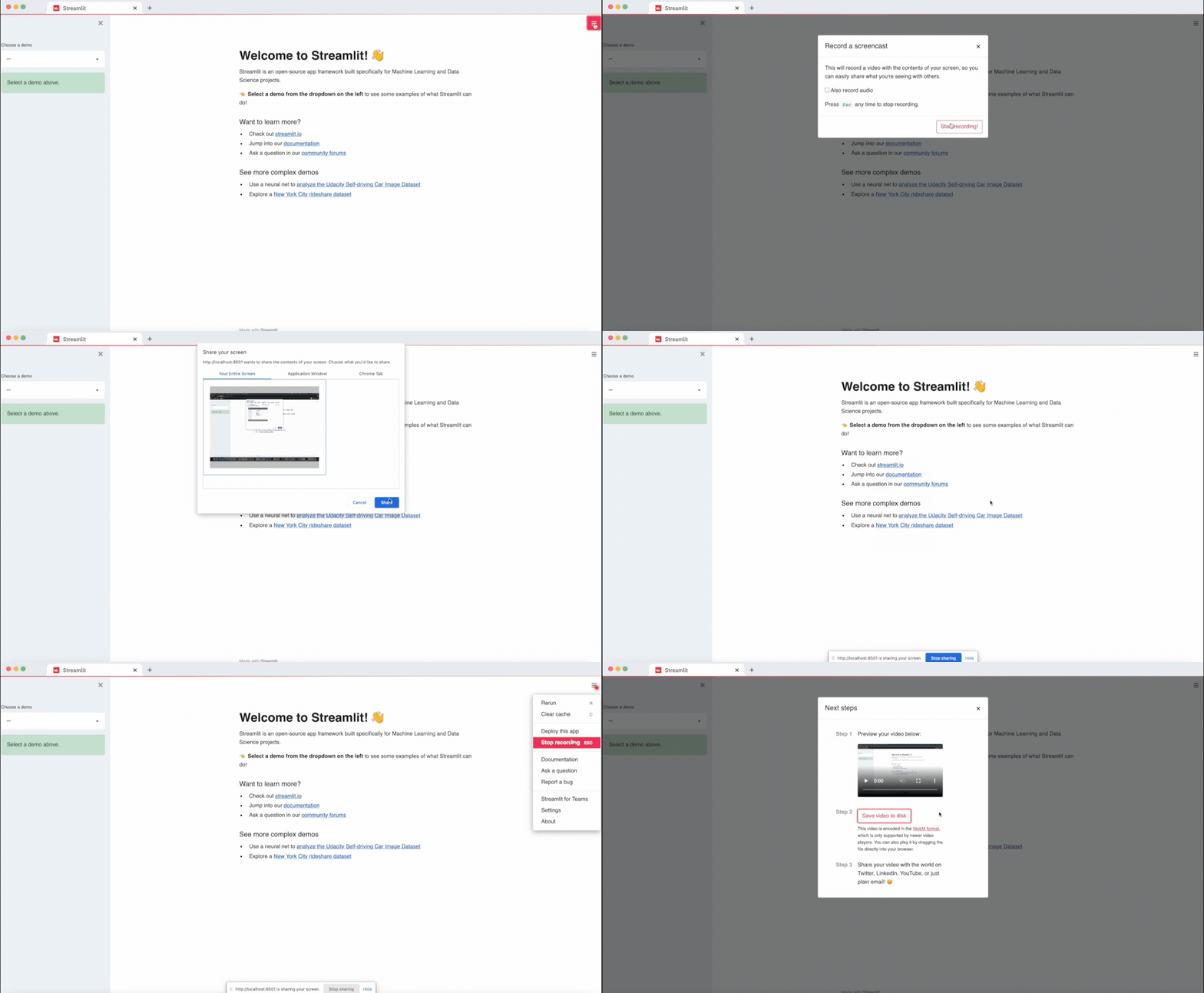
It is also super easy to embed videos in Streamlit apps. All it takes is two lines of code!
import streamlit as st

st.video('recorded_screencast.mp4')
Have examples of input data
With multiple input fields or file formats, first time users can be confused by what goes into each box and how the app will respond. Having default input data helps users get started on using the app right away.
In your streamlit app, default input data can be pre-filled into widgets by using the value argument, for eg.
txt = st.text_area('Text to analyze', value='It was the best of times')
For other apps, where the input type can be something more complex, app developers can provide a default input. For eg. the Goodreads Reading Habits app developed by Tyler Richards is a great example of how having default inputs allows the user to visualize the app's expected output.
Show information only when it is needed
To reduce visual clutter, sometimes it's best to hide information and let the user access it when needed. This frees up valuable screen real estate for the developer to help focus the user's attention. In this section, we describe 2 ways of achieving this: 1) Tooltips and 2) Expanders.
Using Tooltips
Starting with version 0.79.0, Streamlit introduced Tooltips which can be associated with input widgets like st.text_input, st.selectbox etc. Tooltips can help reduce visual clutter as well as act as a source of helpful information for app users.
Tooltips can be conveniently added to supported widgets using the help keyword.
import streamlit as st

st.title('Tooltips in Streamlit')
st.radio("Pick a number", [1, 2, 3], help='Select a number out of 3 choices')

# Tooltips also support markdown
radio_markdown = '''
Select a number, you have **3** choices!
'''.strip()

st.header('Tooltips with Markdown')
st.radio("Pick a number", [1, 2, 3], help=radio_markdown)
This results in a (?) being added to the widget. Upon hovering on the tooltip, the help message appears as shown below:
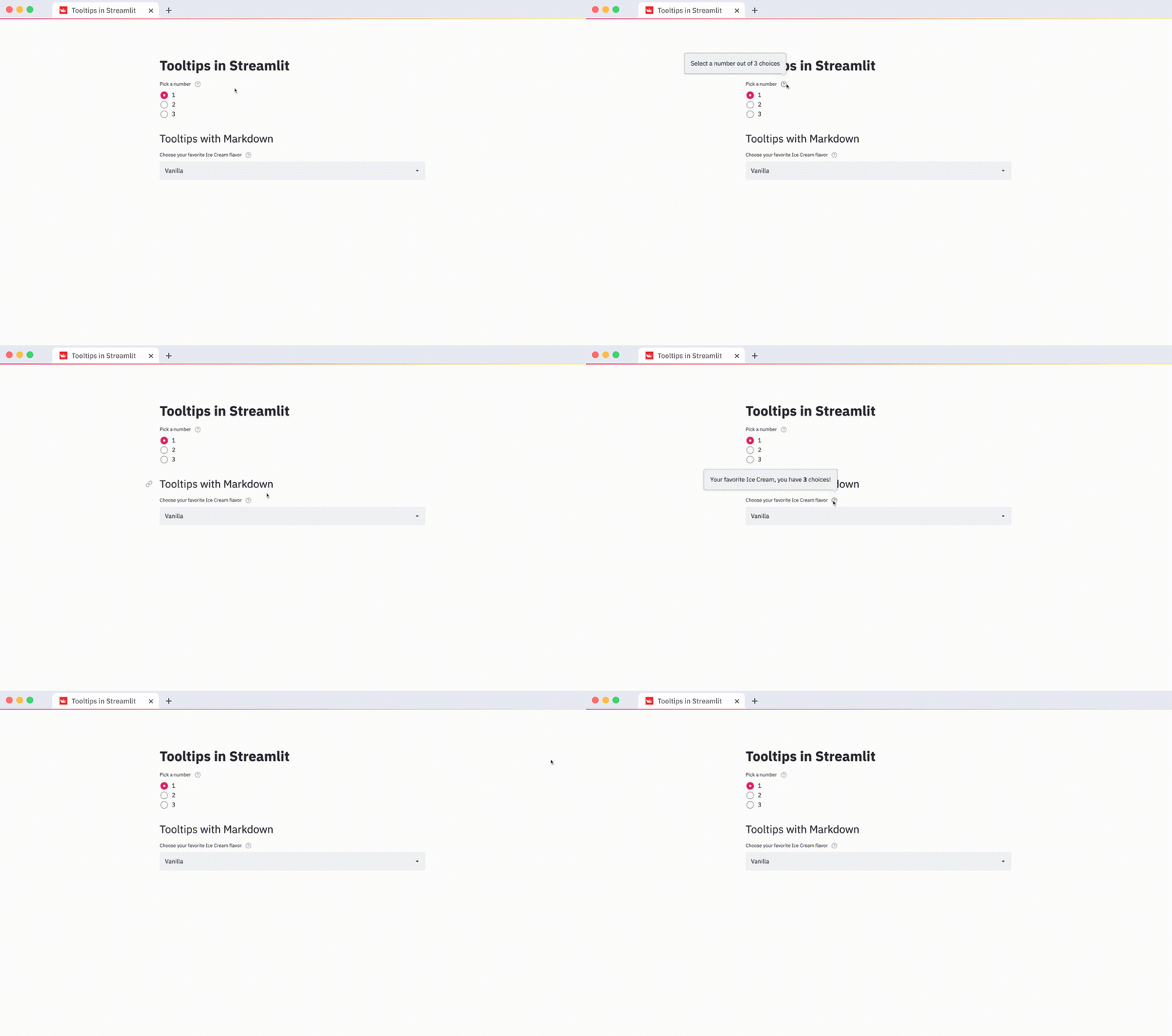
All input widgets like st.number_input, st.slider, st.radio, st.text_area etc support tooltips via the help keyword.
Using Expanders
Expanders can also be used to reduce visual clutter and hide text that may only be relevant to users looking for additional details.

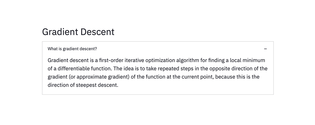
See our previous blog post on Layouts for more details on how to use expanders.
Wrapping up
We hope that by using these features, your Streamlit apps will be cleaner and more usable for your users. To use the features discussed above in your apps, go ahead and upgrade to the latest version of Streamlit
pip install --upgrade streamlit
In Part 2, of this blog series, we'll cover more on how Streamlit features like Layout, Theming, and Anchors can help make your app look even better 🎈
If you have any questions let us know on the forum!


Comments
Continue the conversation in our forums →