At Streamlit, we strive to enable developers to easily make beautiful apps that create great experiences for their users. In Part I of this blog series, we covered how to Design for the User. In Part II, we jump into how you can use layout and design options to make visually appealing apps for your app viewers.
Kicking off this post, the main things to keep in mind are:
- Lay it out in columns
- Choose your theme colors and contrast ratios wisely
- Use text sizing for emphasis
- Make it fun with badges, logos and emojis 🥳
Let's jump in!
Lay it out in columns
Organizing your app with column layouts with st.beta_columns helps place content in a uniform way across the app. A great example is Streamlit Cheat Sheet (source code) by Daniel Lewis. Having information represented in columns create a proportional distribution of information and gives consistency to the interface.
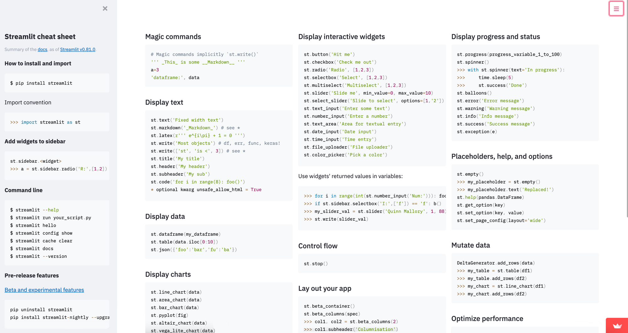
Additionally, this page uses wide mode to show even more content. Page contents can be laid out in 'centered' or 'wide' mode(as shown below) using st.set_page_config :
# NOTE: This must be the first command in your app, and must be set only once
st.set_page_config(layout="wide")
Use layout to focus attention in a direction
Horizontal Flow
In this type of layout, we want the viewer to scan information from left to right, for eg. the NYC Uber Ridesharing App (source code) by Streamlit. In the first row, we see 3 charts containing similar conceptual information, i.e., airport pickups shown left to right. In the 2nd row, we see pickups per minute represented across the minutes of the hour.
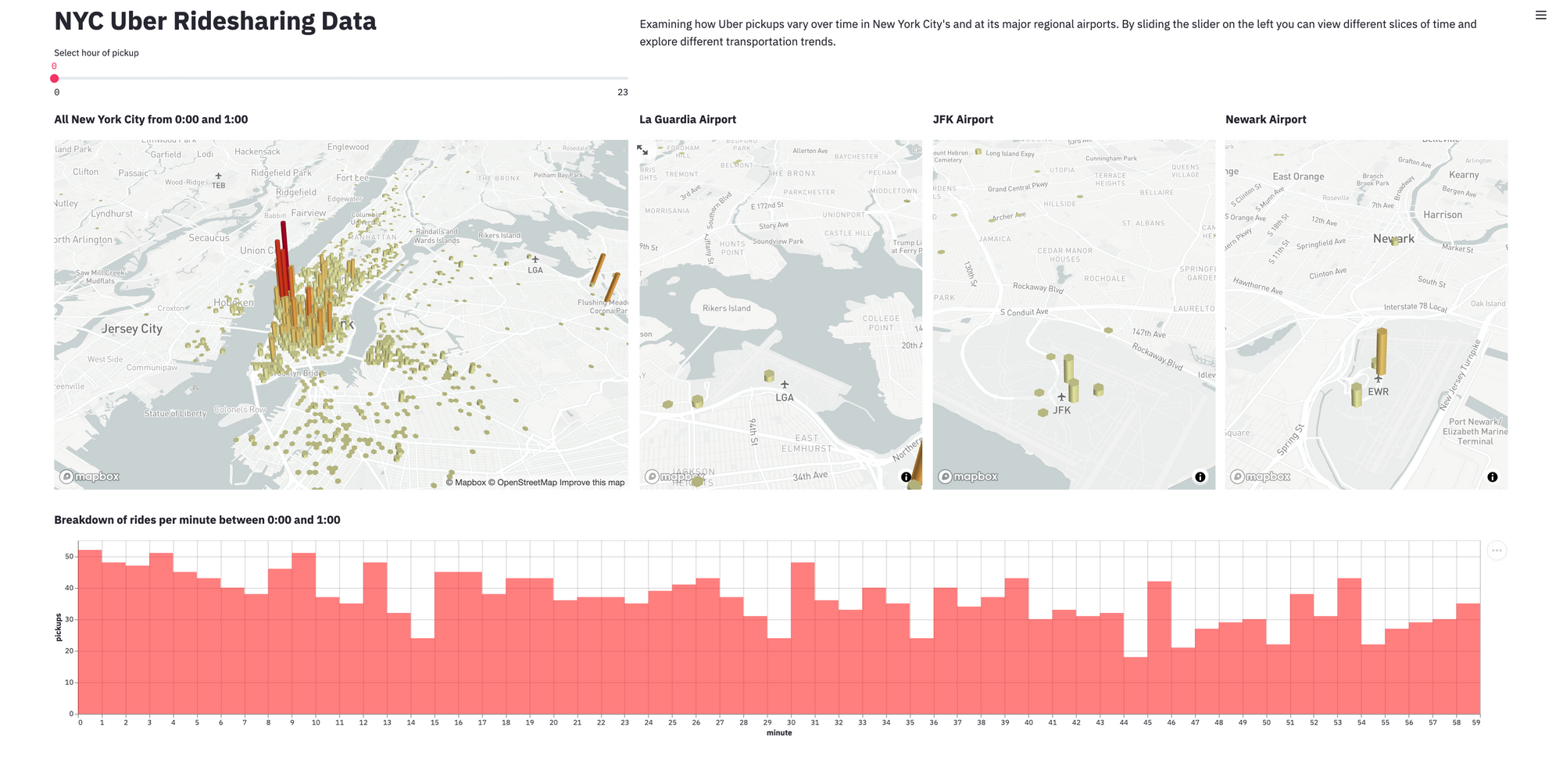
The above layout (with one columns with double and the rest with single width) can be achieved with this code:
col1, col2, col3, col4 = st.beta_columns((2,1,1,1))

with col1:
    # Add chart #1

...

with col4:
    # Add chart #4

# Add bottom chart
Vertical Flow with a Sidebar
In this type of layout, information is presented vertically and the viewer is encouraged to consume the data starting at the top and then scrolling to the bottom. This often carries with it the implicit understanding that an item presented is logically dependent on the item above it. For e.g. the PGA Modeler app (source code) by Andy Uttley.
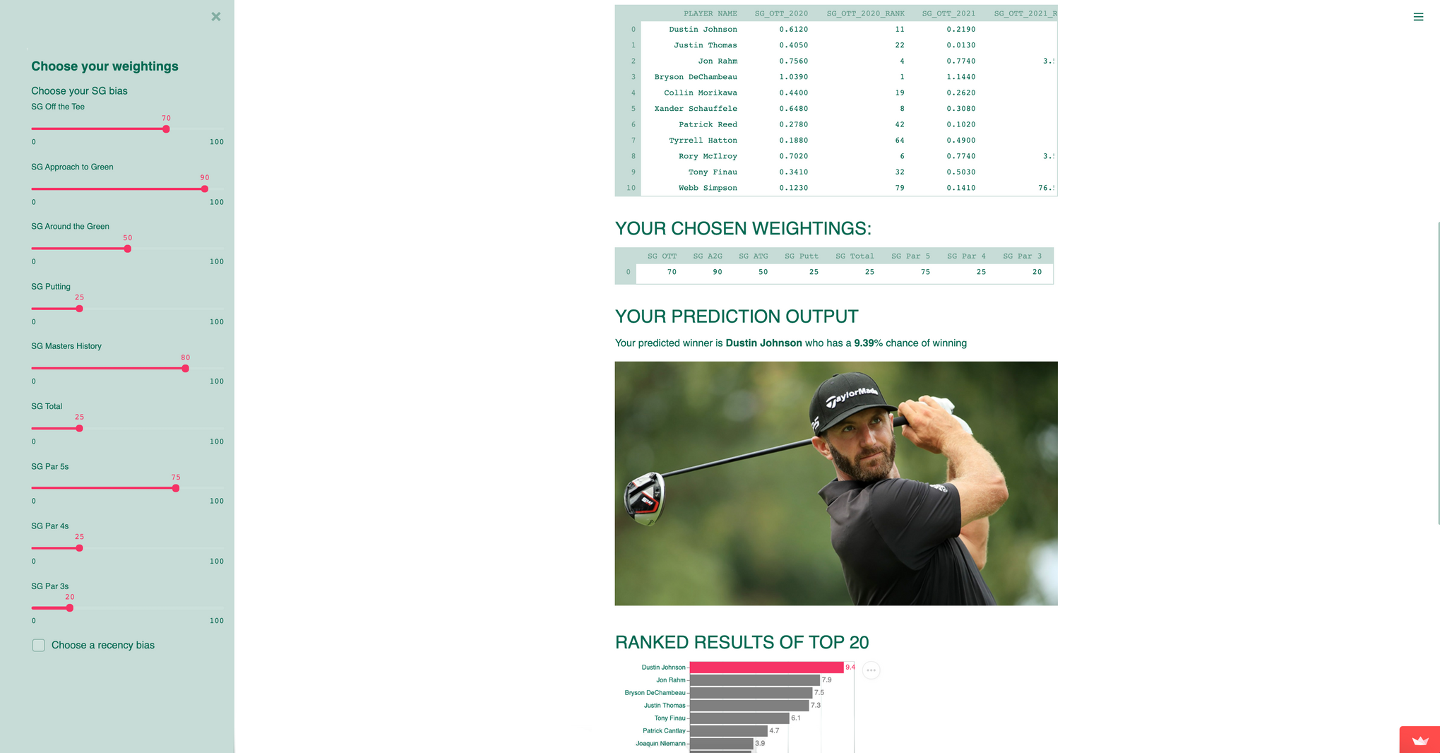
The above layout has a sidebar which contains all the input widgets like sliders, buttons, checkboxes on the left and all of the output widgets like charts, images, data tables etc. in the main body of the app. This layout can be achieved with the following code:
# Input widgets in the sidebar
with st.sidebar:
	# input widget 1
	# input widget 2
	...

# Load data based on the inputs from the sidebar widgets

# Main body contents: Output Widgets
st.dataframe(data)
...
st.line_chart()
Theming, Colors and Contrast Ratios
Streamlit supports Theming and Dark mode, which allows you to choose between multiple default (light, dark) themes or create your own. Get your company colors in there or just pick something you love. For an example, see the theming launch sample app (source code) by Streamlit.

Colors and contrast
When picking your colors take some time to think about how they work together and the contrast between your light and dark colors. If two adjacent elements have the same color or very similar colors, it makes the content very difficult, if not impossible, to read. When contrast is low between text and background, the message blends together, reducing legibility of the display. Here is a great article on the Role of Color in UX that can help you pick great colors for your app theme
Text Sizing and Emphasis
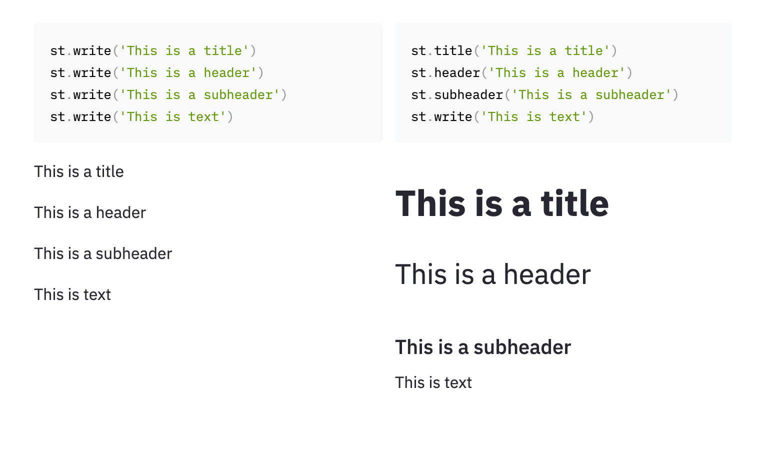
Having text with different sizing can reduce the cognitive load on the reader since it creates a hierarchy of importance. Bigger text generally draws more user attention!
There are several st commands which allow the user to do semantic titling. Each of these commands: st.title, st.header, st.subheader allows the user to create emphasis and use vertical space to give the page more structure. Below, we compare the same text written using different text sizing.
You can also use st.caption to display non-important information for captions below plots, tables or paragraphs.
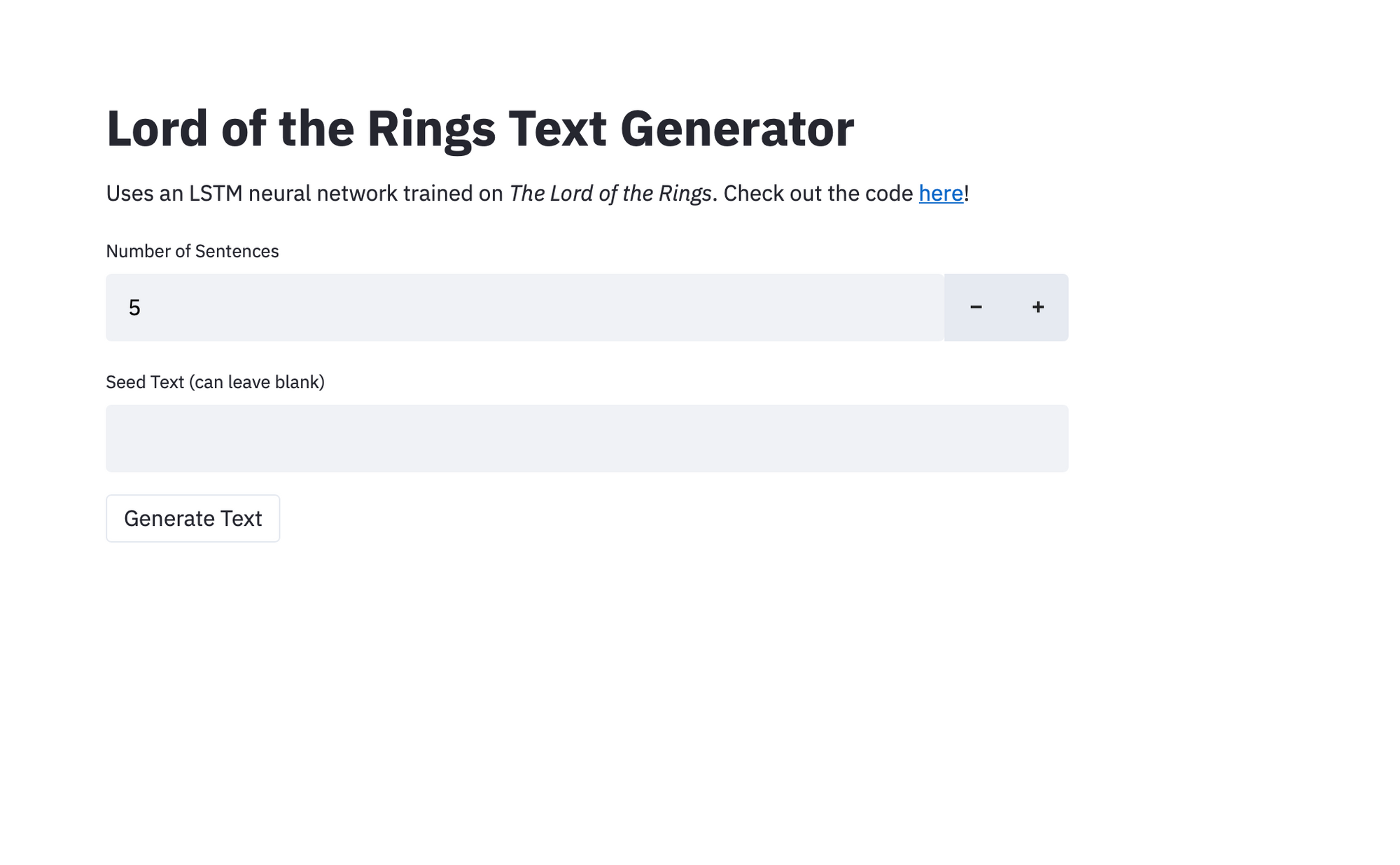
A good rule of thumb is to start with a title via st.title and have a short 2-sentence description via st.write of the app below it to explain more about how the app works. See a great example of this in the Lord of the Rings Text Generator by Christian Doucette.
Make it fun with logos, emojis and badges
Add logos
With just a couple of lines of code, you can add your company's logo to an app to reflect your company's branding:
st.image(logo_url, width=100)
st.title("Streamlit Dashboard Demo")
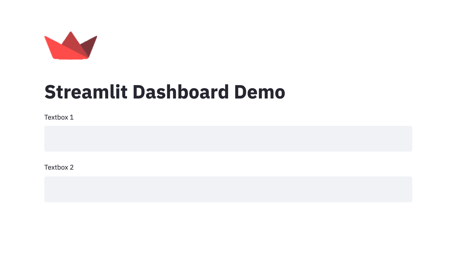
And if you want the logo next to your text, just use st.beta_columns.
Add Favicons, Page Titles etc.
st.set_page_config allows you to set some default settings for the page like the Page Title, icon, sidebar state etc:
st.set_page_config(
    page_title="Ex-stream-ly Cool App",
    page_icon="🧊",
    layout="wide",
    initial_sidebar_state="expanded"
)
Add emojis and badges
At Streamlit, we love emojis and like it when apps use them in interesting ways. They can be added to titles as shown in the Year on Github app by Johannes Reike (source code) shown below.

Additionally, try adding in badges for your users to connect with your project on social media.
To add a badge to star your Github project (replace <username> and <repo>):
st.write("[](<https://gitHub.com/><username>/<repo>)")
Or follow you on Twitter:
st.write("[](<https://www.twitter.com/><username>)")
Or create other badges via https://shields.io/ (especially the Social category) and add them to your app with markdown similar to above.
💡 Pro tip: You can also consider adding a Streamlit badge to your GitHub repo.
Wrapping up
We hope that by following these pointers, your Streamlit apps will look great and be more fun for your users. To use the features discussed above in your apps, make sure to upgrade to the latest version of Streamlit:
pip install --upgrade streamlit
In Part 3, of the blog series, we'll cover how to make your apps more performant so that using them is a fast and zippy experience for everyone.
If you have any questions let us know below or on the forum!


Comments
Continue the conversation in our forums →