Need a baseline for your latest time-series forecasting project? Want to explain the decision-making process of a predictive model to a business audience? Struggling to understand if car prices are seasonal before buying a new one? I might have something for you...
A forecasting app Streamlit Prophet! 🔮
In this post, I'll teach you how to build it in 5 simple steps:
- Step 1. Data exploration
- Step 2. Performance evaluation
- Step 3. Error diagnosis
- Step 4. Model optimization
- Step 5. Forecast interpretability
Want to jump right in? Test the app online or install the python package and run it locally.
But before we get to the fun stuff, let's talk about...
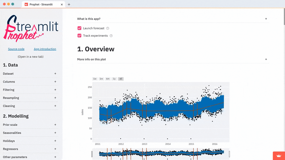
What is Streamlit Prophet?
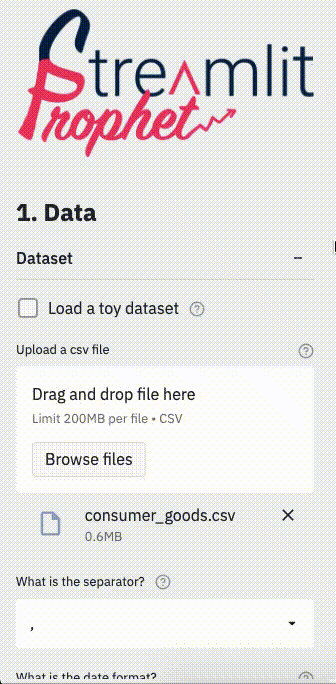
Streamlit Prophet is a Streamlit app that helps data scientists create forecasting models without coding. Simply upload a dataset with historical values of the signal. The app will train a predictive model in a few clicks. And you get several visualizations to evaluate its performance and for further insights.
The underlying model is built with Prophet. Prophet is an open-source library developed by Facebook to forecast time-series data. The signal is broken down into several components such as trend, seasonalities, and holidays effects. The estimator learns how to model each of these blocks, then adds their contributions to produce an interpretable forecast. It performs better when the series has strong seasonal patterns and several cycles of historical data.

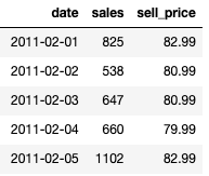
Let’s say, you want to predict the future sales for consumer goods in a store. Your historical data ranges from 2011 to 2015. A baseline model with default parameters fits on the data as you upload it. Your dataset will look like this:
Now, let's dive into building it!
Step 1. Data exploration
The first step in any forecasting project is to make sure that you know the dataset perfectly. Prophet provides a nice decomposition of the signal. The app has several charts to show you these insights at a glance.
The following graph gives you a global representation of the uploaded time series:
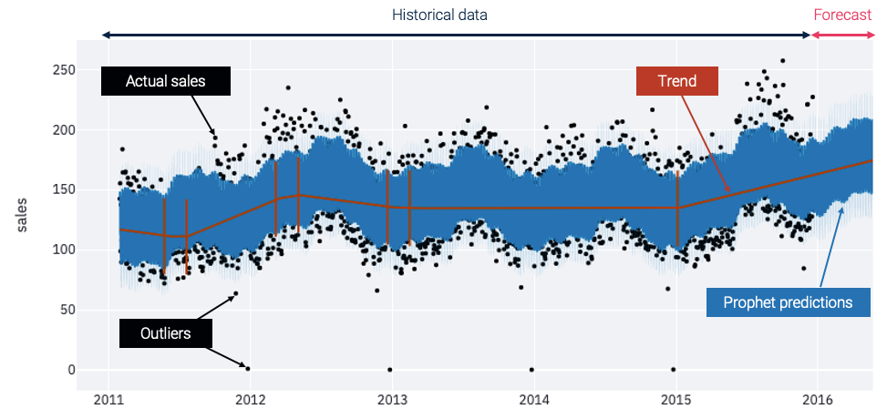
- Actual sales. The black points are actual historical sales. Often they're between 75 and 225 units per day.
- Outliers. At Christmas time, when the stores are closed, you can spot some outliers with low or no sales.
- Trend. The red line shows the trend. It gives you a synthetic vision of the signal and helps visualize the global evolutions.
- Prophet predictions. The blue line represents the forecasts made by a Prophet model that's automatically trained on your dataset. The model expects the sales to increase in 2016, following the growing trend that started in 2015.
These forecasts seem to be seasonal, but it's hard to distinguish between the different periodic components on this first plot. Let’s check another visualization to understand how these seasonal patterns affect the model output:
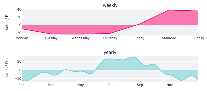
Two periodicities have been detected. They give you interesting insights into consumers’ habits:
- Weekly cycle. The weekly cycle shows that most people shop on weekends, during which forecasts are increased by nearly 40 units per day.
- Yearly seasonality. The graph also suggests that the sold products have a yearly seasonality, with more sales during the summer as compared to the rest of the year. The estimator will combine these periodic components and the global trend to produce the forecasts for future days.
Step 2. Performance evaluation
These plots synthesize the way data is modeled by Prophet. But is this representation reliable?
To answer this question, a section of the app is dedicated to the evaluation of the model quality. It shows a baseline forecasting performance. The time series is split into several parts. First, the model is fitted on a training set. Then it gets tested on a validation set. You also have advanced options like cross-validation.
There are different metrics to assess the model quality. Absolute metrics such as the root mean squared error (RMSE) calculate the magnitude of errors in the number of sales. At the same time, the relative metrics like the mean absolute percentage error (MAPE) are more interpretable. It's up to you to select the metric that's most relevant for your use case.
Because performance is unlikely to be uniform over all data points, getting a global indicator is not enough. Compute the metrics at a more detailed granularity to get a clear understanding of the model quality.
Let’s start with an in-depth analysis at the daily level, which is the lowest possible granularity in our case, as the model makes one prediction per day:
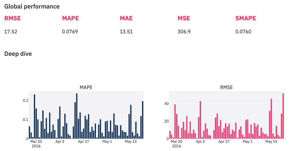
Observe an important variability. There are days when the error is bigger than 20% while some other forecasts are almost perfectly accurate. With this information in mind, you're probably wondering if there are patterns in the way the model makes mistakes. Are there days when it performs poorly? Fortunately, the app provides handy charts to satisfy our curiosity.
Step 3. Error diagnosis
The error diagnosis section is the most useful one. Here you can highlight the areas where forecasts could be improved and identify the challenges while building a reliable forecasting model. Use interactive visualizations to focus on specific areas.
For example, the scatter plot below represents each forecast made on the validation set by a single point (hover over the ones away from the red line to see which data points forecasts are far from the truth):
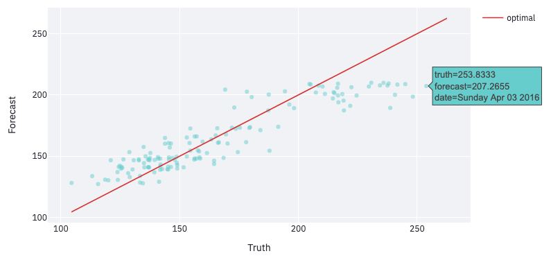
In this example, hovering over the top right area shows that the points furthest from the red line are Saturdays and Sundays. This suggests that the model performs better during the week.
Let’s aggregate daily performance metrics to validate this intuition:
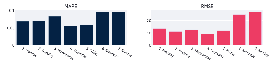
On average, errors are bigger on the weekends. Keep this in mind when optimizing the model. Performance might also evolve over time. Select other levels of aggregation in the app to check it out. For example, compute metrics at a weekly or monthly granularity, or over the period of time when you suspect it to perform differently.
Step 4. Model optimization
Now you know the model’s main weaknesses. How do you improve it? In the app’s sidebar edit the default configuration and enter your specifications. All performance metrics and visualizations are updated each time you change settings, so you can get quick feedback.
First, apply some customized pre-processing to your dataset. You have several alternatives to get around the challenges identified earlier. For example, a cleaning section lets you get rid of the outliers observed at Christmas. The outliers might confuse the model. You can also filter out particular days and train distinct models for the week and the weekends, as they seemed to be associated with different purchasing behaviors. Some other filtering and resampling options are available as well, in case they're relevant to your problem.
To help the model better fit the data, you can tune Prophet hyper-parameters. They influence how the estimator learns to represent the trend and the seasonalities from historical sales, and the relative weight of these components in the global forecast. Don’t worry if you’re not familiar with Prophet models. Tooltips explain the intuition behind each parameter and guide you through the tuning process.
In the modeling section, you can also feed the model with external information such as holidays or variables related to the signal to be forecasted (like the products’ selling price). These regressors are likely to improve performance as they provide the model with additional knowledge about a phenomenon that impacts sales.
Step 5. Forecast interpretability
Having an accurate forecasting model is nice, but being able to explain the main factors that contribute to its predictions is even better.
The last section of the app aims at helping you understand how your model makes decisions. You can look at a single component and see how its contribution to the overall forecasts evolves over time. Or you can take a single forecast and decompose it into the sum of contributions from several components.
Let’s start with the first option. The different components that influence forecasts are the trend, the seasonalities, and the external regressors. You already observed the impact of the weekly and the yearly seasonalities, so let’s take a look at the external regressors like the holidays and the products’ selling price:
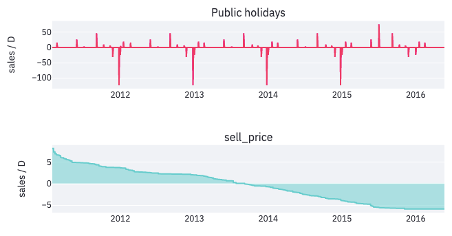
The impact of the public holidays is important. For example, every year at the beginning of September Labor Day increases forecasts by 50 sales. On Christmas, the dips show that the model has taken into account the fact that stores are closed on that day. And the price has increased year after year. So its impact on sales has shifted from positive to negative.
Let's take a look at how the model produces one specific forecast, especially when a particular event influences the prediction. This waterfall chart shows this decomposition for the forecast made on October 31st, 2012:
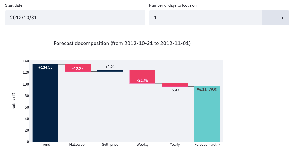
In this example, the model ended up forecasting 96 sales. This is the sum of the contributions from five different components:
- Global trend (+134): the most influential factor.
- Halloween effect (-12): fewer sales on Halloween than on regular days.
- Sell price (+2): the price must've been lower than on average that day.
- Weekly seasonality (-23): this was a Wednesday, so not the weekend.
- Yearly seasonality (-5): October is a low season for this product.
That kind of decomposition is not only useful for sharing insights with collaborators, it can also help analysts understand why their model doesn’t perform as expected. The app’s sidebar has parameters to increase or decrease the different components’ relative weights.
Wrapping up
I hope you add Streamlit Prophet to your forecasting toolbox. Look at the source code to learn more about how this app was built. And visit the Artefact tech blog for more information about our data science projects.
Have questions or improvement ideas? Please post them in the comments below or reach out to me through Medium or LinkedIn.
Thanks a lot for reading! ❤️


Comments
Continue the conversation in our forums →