
Ever thought you could build a real-time dashboard in Python without writing a single line of HTML, CSS, or Javascript?
Yes, you can! In this post, you’ll learn:
- How to import the required libraries and read input data
- How to do a basic dashboard setup
- How to design a user interface
- How to refresh the dashboard for real-time or live data feed
- How to auto-update components
Can’t wait and want to jump right in? Here's the code repo and the video tutorial.
What’s a real-time live dashboard?
A real-time live dashboard is a web app used to display Key Performance Indicators (KPIs).
If you want to build a dashboard to monitor the stock market, IoT Sensor Data, AI Model Training, or anything else with streaming data, then this tutorial is for you.
1. How to import the required libraries and read input data
Here are the libraries that you’ll need for this dashboard:
- Streamlit (st). As you might’ve guessed, you’ll be using Streamlit for building the web app/dashboard.
- Time, NumPy (np). Because you don’t have a data source, you’ll need to simulate a live data feed. Use NumPy to generate data and make it live (looped) with the Time library (unless you already have a live data feed).
- Pandas (pd). You’ll use pandas to read the input data source. In this case, you’ll use a Comma Separated Values (CSV) file.
Go ahead and import all the required libraries:
import time  # to simulate a real time data, time loop

import numpy as np  # np mean, np random
import pandas as pd  # read csv, df manipulation
import plotly.express as px  # interactive charts
import streamlit as st  # 🎈 data web app development
You can read your input data in a CSV by using pd.read_csv(). But remember, this data source could be streaming from an API, a JSON or an XML object, or even a CSV that gets updated at regular intervals.
Next, add the pd.read_csv() call within a new function get_data() so that it gets properly cached.
What's caching? It's simple. Adding the decorator @st.experimental_memo will make the function get_data() run once. Then every time you rerun your app, the data will stay memoized! This way you can avoid downloading the dataset again and again. Read more about caching in Streamlit docs.
dataset_url = "https://raw.githubusercontent.com/Lexie88rus/bank-marketing-analysis/master/bank.csv"

# read csv from a URL
@st.experimental_memo
def get_data() -> pd.DataFrame:
    return pd.read_csv(dataset_url)

df = get_data()

2. How to do a basic dashboard setup
Now let’s set up a basic dashboard. Use st.set_page_config() with parameters serving the following purpose:
- The web app title
page_titlein the HTML tag <title> and in the browser tab - The favicon that uses the argument
page_icon(also in the browser tab) - The
layout = "wide"that renders the web app/dashboard with a wide-screen layout
st.set_page_config(
    page_title="Real-Time Data Science Dashboard",
    page_icon="✅",
    layout="wide",
)
3. How to design a user interface
A typical dashboard contains the following basic UI design components:
- A page title
- A top-level filter
- KPIs/summary cards
- Interactive charts
- A data table
Let’s drill into them in detail.
Page title
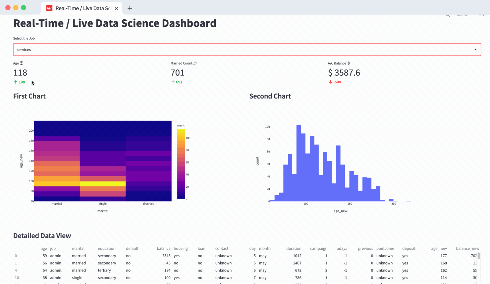
The title is rendered as the <h1> tag. To display the title, use st.title(). It’ll take the string “Real-Time / Live Data Science Dashboard” and display it in the Page Title.
# dashboard title
st.title("Real-Time / Live Data Science Dashboard")
Top-level filter
First, create the filter by using st.selectbox(). It’ll display a dropdown with a list of options. To generate it, take the unique elements of the job column from the dataframe df. The selected item is saved in an object named job_filter:
# top-level filters
job_filter = st.selectbox("Select the Job", pd.unique(df["job"]))
Now that your filter UI is ready, use job_filter to filter your dataframe df.
# dataframe filter
df = df[df["job"] == job_filter]
KPIs/summary cards
Before you can design your KPIs, divide your layout into a 3 column layout by using st.columns(3). The three columns are kpi1, kpi2, and kpi3. st.metric() helps you create a KPI card. Use it to fill one KPI in each of those columns.
st.metric()’s label helps you display the KPI title. The value **is the argument that helps you show the actual metric (value) and add-ons like delta to compare the KPI value with the KPI goal.
# create three columns
kpi1, kpi2, kpi3 = st.columns(3)

# fill in those three columns with respective metrics or KPIs
kpi1.metric(
    label="Age ⏳",
    value=round(avg_age),
    delta=round(avg_age) - 10,
)

kpi2.metric(
    label="Married Count 💍",
    value=int(count_married),
    delta=-10 + count_married,
)

kpi3.metric(
    label="A/C Balance $",
    value=f"$ {round(balance,2)} ",
    delta=-round(balance / count_married) * 100,
)
Interactive charts
Split your layout into 2 columns and fill them with charts. Unlike the metric above, use the with clause to fill the interactive charts in the respective columns:
- Density_heatmap in fig_col1
- Histogram in fig_col2
# create two columns for charts
fig_col1, fig_col2 = st.columns(2)

with fig_col1:
    st.markdown("### First Chart")
    fig = px.density_heatmap(
        data_frame=df, y="age_new", x="marital"
    )
    st.write(fig)

with fig_col2:
    st.markdown("### Second Chart")
    fig2 = px.histogram(data_frame=df, x="age_new")
    st.write(fig2)
Data table
Use st.dataframe() to display the data frame. Remember, your data frame gets filtered based on the filter option selected at the top:
st.markdown("### Detailed Data View")
st.dataframe(df)
4. How to refresh the dashboard for real-time or live data feed
Since you don’t have a real-time or live data feed yet, you’re going to simulate your existing data frame (unless you already have a live data feed or real-time data flowing in).
To simulate it, use a for loop from 0 to 200 seconds (as an option, on every iteration you’ll have a second sleep/pause):
for seconds in range(200):

    df["age_new"] = df["age"] * np.random.choice(range(1, 5))
    df["balance_new"] = df["balance"] * np.random.choice(range(1, 5))
    time.sleep(1)
Inside the loop, use NumPy's random.choice to generate a random number between 1 to 5. Use it as a multiplier to randomize the values of age and balance columns that you’ve used for your metrics and charts.
5. How to auto-update components
Now you know how to do a Streamlit web app!
To display the live data feed with auto-updating KPIs/Metrics/Charts, put all these components inside a single-element container using st.empty(). Call it placeholder:
# creating a single-element container.
placeholder = st.empty()
Put your components inside the placeholder by using a with clause. This way you’ll replace them in every iteration of the data update. The code below contains the placeholder.container() along with the UI components you created above:
with placeholder.container():

    # create three columns
    kpi1, kpi2, kpi3 = st.columns(3)

    # fill in those three columns with respective metrics or KPIs
    kpi1.metric(
        label="Age ⏳",
        value=round(avg_age),
        delta=round(avg_age) - 10,
    )

    kpi2.metric(
        label="Married Count 💍",
        value=int(count_married),
        delta=-10 + count_married,
    )

    kpi3.metric(
        label="A/C Balance $",
        value=f"$ {round(balance,2)} ",
        delta=-round(balance / count_married) * 100,
    )

    # create two columns for charts
    fig_col1, fig_col2 = st.columns(2)

    with fig_col1:
        st.markdown("### First Chart")
        fig = px.density_heatmap(
            data_frame=df, y="age_new", x="marital"
        )
        st.write(fig)

    with fig_col2:
        st.markdown("### Second Chart")
        fig2 = px.histogram(data_frame=df, x="age_new")
        st.write(fig2)

    st.markdown("### Detailed Data View")
    st.dataframe(df)
    time.sleep(1)
And...here is the full code!
import time  # to simulate a real time data, time loop

import numpy as np  # np mean, np random
import pandas as pd  # read csv, df manipulation
import plotly.express as px  # interactive charts
import streamlit as st  # 🎈 data web app development

st.set_page_config(
    page_title="Real-Time Data Science Dashboard",
    page_icon="✅",
    layout="wide",
)

# read csv from a github repo
dataset_url = "https://raw.githubusercontent.com/Lexie88rus/bank-marketing-analysis/master/bank.csv"

# read csv from a URL
@st.experimental_memo
def get_data() -> pd.DataFrame:
    return pd.read_csv(dataset_url)

df = get_data()

# dashboard title
st.title("Real-Time / Live Data Science Dashboard")

# top-level filters
job_filter = st.selectbox("Select the Job", pd.unique(df["job"]))

# creating a single-element container
placeholder = st.empty()

# dataframe filter
df = df[df["job"] == job_filter]

# near real-time / live feed simulation
for seconds in range(200):

    df["age_new"] = df["age"] * np.random.choice(range(1, 5))
    df["balance_new"] = df["balance"] * np.random.choice(range(1, 5))

    # creating KPIs
    avg_age = np.mean(df["age_new"])

    count_married = int(
        df[(df["marital"] == "married")]["marital"].count()
        + np.random.choice(range(1, 30))
    )

    balance = np.mean(df["balance_new"])

    with placeholder.container():

        # create three columns
        kpi1, kpi2, kpi3 = st.columns(3)

        # fill in those three columns with respective metrics or KPIs
        kpi1.metric(
            label="Age ⏳",
            value=round(avg_age),
            delta=round(avg_age) - 10,
        )

        kpi2.metric(
            label="Married Count 💍",
            value=int(count_married),
            delta=-10 + count_married,
        )

        kpi3.metric(
            label="A/C Balance $",
            value=f"$ {round(balance,2)} ",
            delta=-round(balance / count_married) * 100,
        )

        # create two columns for charts
        fig_col1, fig_col2 = st.columns(2)
        with fig_col1:
            st.markdown("### First Chart")
            fig = px.density_heatmap(
                data_frame=df, y="age_new", x="marital"
            )
            st.write(fig)

        with fig_col2:
            st.markdown("### Second Chart")
            fig2 = px.histogram(data_frame=df, x="age_new")
            st.write(fig2)

        st.markdown("### Detailed Data View")
        st.dataframe(df)
        time.sleep(1)
To run this dashboard on your local computer:
- Save the code as a single monolithic
app.py. - Open your Terminal or Command Prompt in the same path where the
app.pyis stored. - Execute
streamlit run app.pyfor the dashboard to start running on your localhost and the link would be displayed in your Terminal and also opened as a new Tab in your default browser.
Wrapping up
Congratulations! You have learned how to build your own real-time live dashboard with Streamlit. I hope you had fun along the way.
If you have any questions, please leave them below in the comments or reach out to me at 1littlecoder@gmail.com or on Linkedin.
Thank you for reading, and Happy Streamlit-ing! 🎈


Comments
Continue the conversation in our forums →