Ever wondered how to use a bit of tissue (a biopsy, a surgery specimen, or a tube of blood) to diagnose lymphoma? Cue the CloneRetriever app!
In this post, you’ll learn:
- How to familiarize yourself with the data
- How the “lymphoma” tissue differs from the “normal” tissue
- How to combine samples in a SwarmPlot
- How to make a classification algorithm
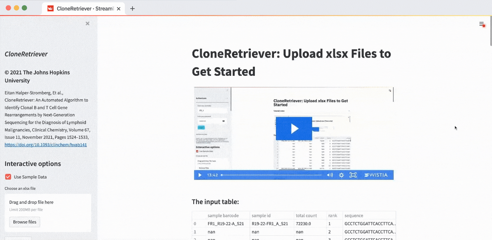
Want to jump right in? Here's the CloneRetriever app.
What is the CloneRetriever app?
I’m a molecular pathologist. I look at a lot of tissue samples. Annotating them by hand as “lymphoma” or “normal” is very painful. I built the CloneRetriever app to diagnose blood cancer by using a semi-processed Excel file as data input.
How do you diagnose blood cancers like lymphoma? You examine the tissue under a microscope or sequence its DNA to look for abnormal cells. Alternatively, you can make algorithms look for dominant clonal expansions in DNA sequences consistent with lymphoma.
To interpret this DNA data, you’ll need heavy-duty lab equipment like a PCR machine, a DNA sequencer, or reagents. If you work in a place where it'd available (for example, a hospital by a university), you’ll get a file containing DNA information.
Let’s take a look at how to read it.
1. How to familiarize yourself with the data
Inside the app, take a look at the video tutorial. Below it, you’ll see the input table. That’s your DNA data:
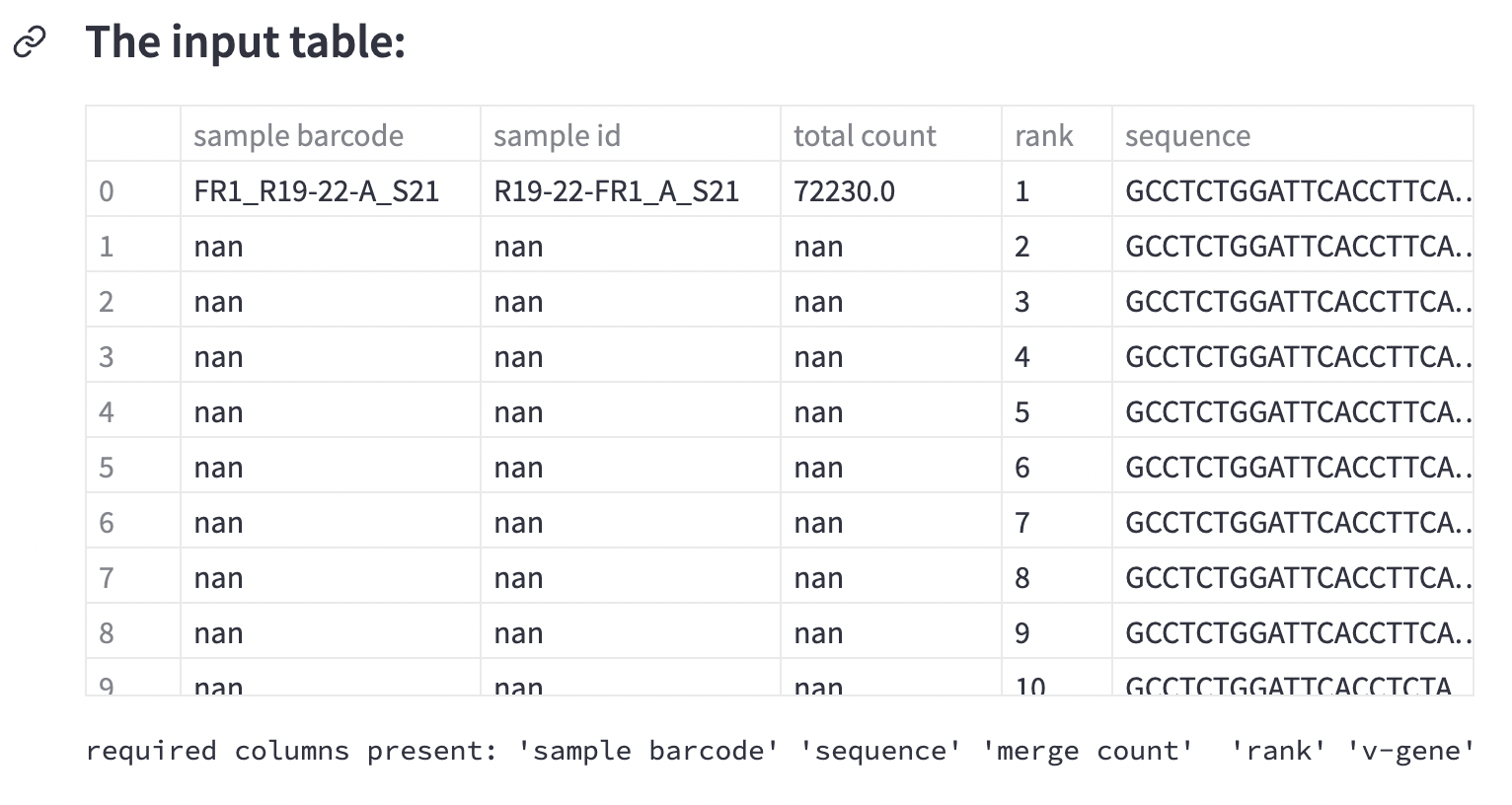
This is four samples worth of data—sixty rows per sample. Each row represents the quantity of a particular piece of DNA.
In lymphoma, immune cells proliferate out of control. To diagnose it, you’d measure a piece of DNA that codes for a certain type of molecule known as immunoglobulin. This bit of DNA is specific to different populations of immune cells. Hence, lymphoma immunoglobulin will be different from the immune cells immunoglobulin.
Each row contains a measurement of a unique piece of immunoglobulin DNA. But how do you know if it’s lymphoma?
Look for the bits of DNA that are much more abundant. That’s lymphoma. See the column name descriptions? You’re solving a classification problem. This sample data is already annotated as lymphoma or not:
2. How the “lymphoma” tissue differs from the “normal” tissue
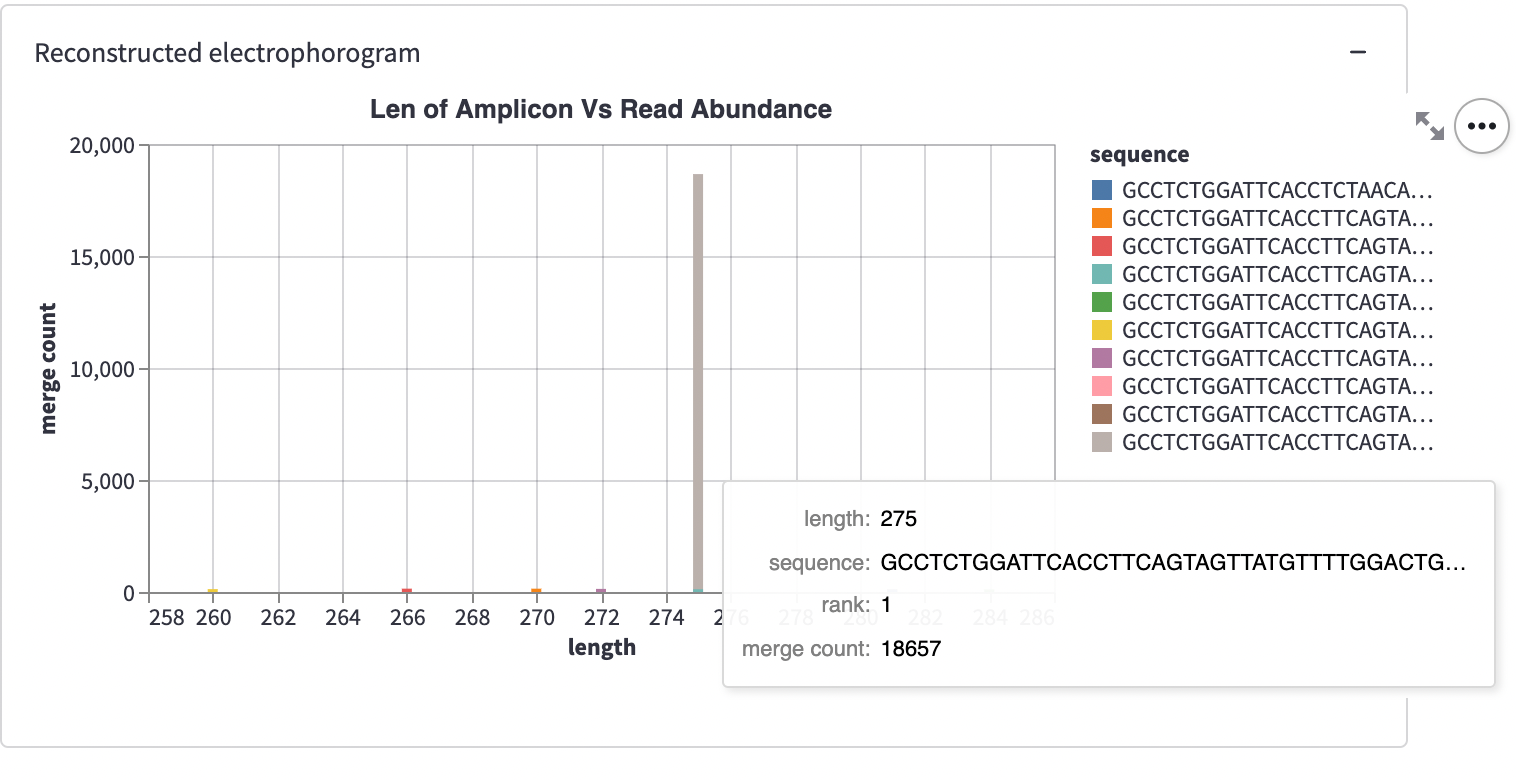
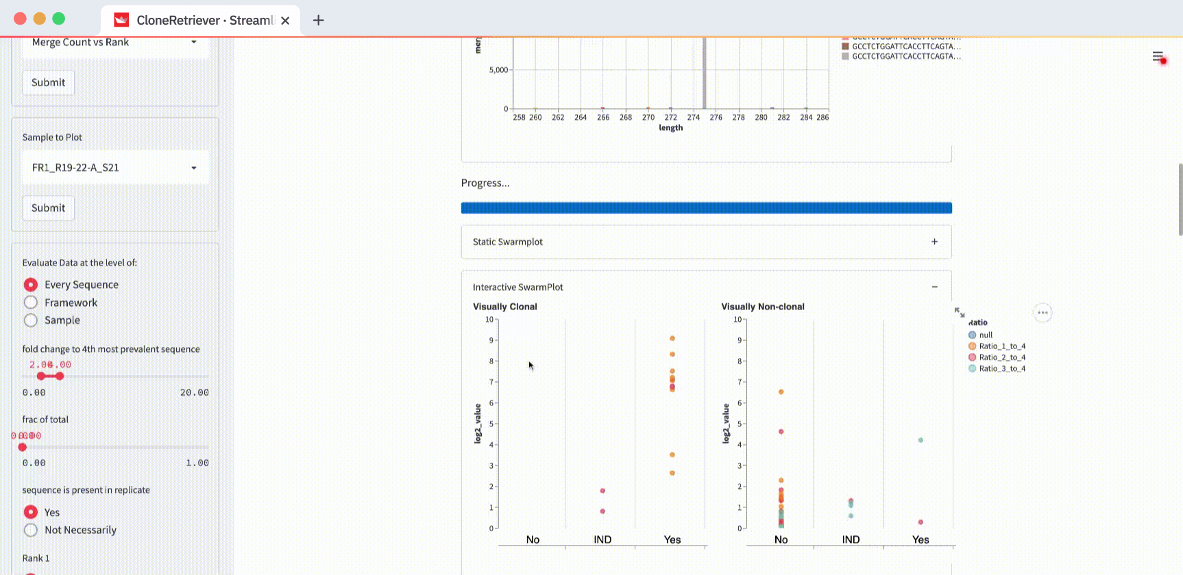
Below the input table, you’ll see a container titled “Reconstructed electropherogram.” It represents one single sample:
This plot is a histogram.
The X-axis shows the sequence length. The Y-axis shows the number of particular length DNA sequences. Each histogram has ten bars—one per sample “unit” sequence. The multicolored stacked bars represent the sequences of the same length.
Cancer looks like a tall bar—a spike. It’s because cancer sequences come from the cells that proliferate much faster than normal cells. Note: the sample FR1_R19-22-A_S21 is plotted by default. It shows cancer (indicated in the box 'sample to plot'). If you switch the view to the third one down the list, FR1_R19-23-A_S23, you’ll see normal cells. No massive spike!
3. How to combine samples in a SwarmPlot
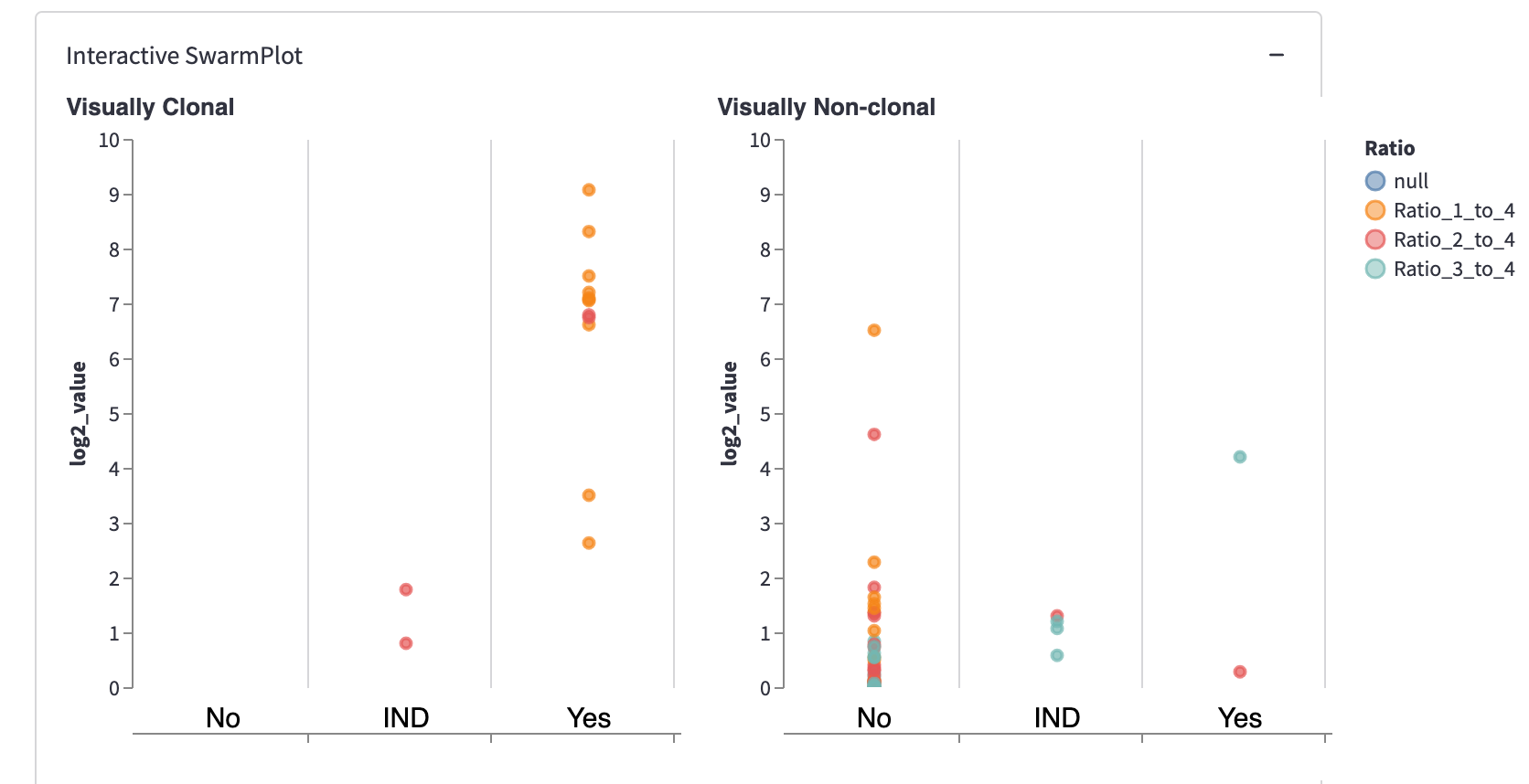
What is a SwarmPlot? It’s the aggregated view of many DNA samples in one plot.
In the app, you’ll see a static SwarmPlot and an interactive SwarmPlot with two side-by-side panels. It has your data plotted together. Each point represents 1-3 sequences within a discrete unit of ten sequences.
For example, change the “Evaluate data at the level of” from “Every Sequence” to “Sample” and hit submit:
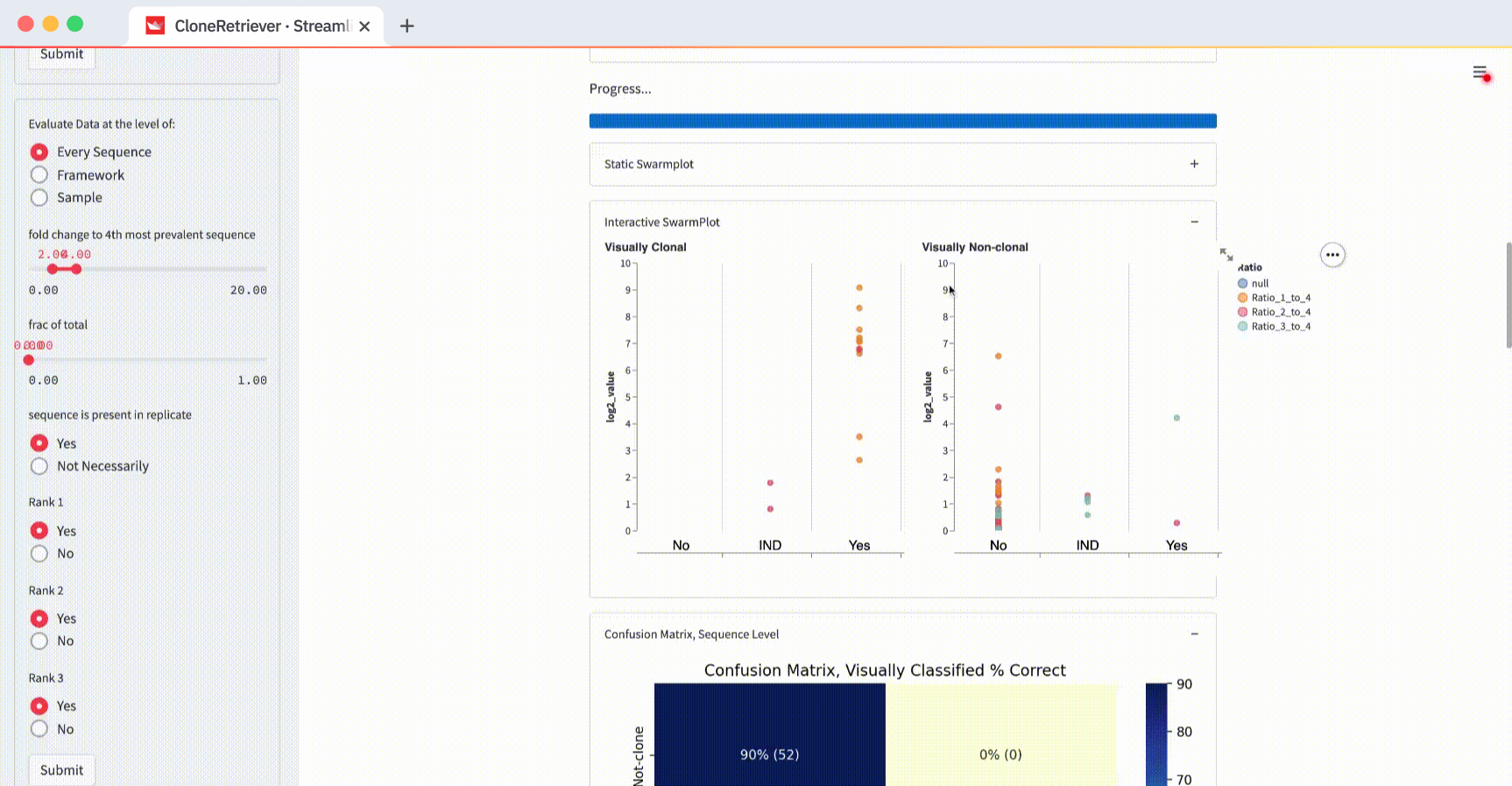
You’ll see one point for each of the four samples. It represents the piece of DNA that’s most likely derived from lymphoma.
And look! The two lymphoma samples in the left panel are within the "Yes" column! The app correctly classified them according to these three values: “fold change to 4th most prevalent sequence,” “frac of total,” and “sequence is present in replicate.”
So why use “Framework” or “Every Sequence” when you can view the four sample points?
Because sometimes there are many different DNA pieces that can indicate lymphoma. From a pathologist’s perspective, they should be reported in a test result. For a longer explanation of the SwarmPlot, read my manuscript.
4. How to make a classification algorithm
Use the three classifier buttons to predict lymphoma:
- “Fold change to 4th most prevalent sequence.” The ratio of the DNA sequence to the fourth sequence, by rank.
- “Frac of total.” The fraction of the DNA sequence relative to the combined total of every sequence in its measurement set.
- “Sequence is present in replicate.” A boolean of “the sequence in question that’s also present in its replicate.”
You can also use these buttons to classify the data in the SwarmPlots. All points in the left SwarmPlot (the positives) appear in the “Yes” column. All points in the right SwarmPlot (the negatives) appear in the “No” column.
The classifier function result is our diagnosis: “lymphoma,” “no-lymphoma”, or “unclear even after looking at the result manually.” To view it, scroll down to the “New Classifier True” output. Right below it, you’ll see the classifier output showing the values of the three most appropriate predictors.
Changing the evaluation level from “Every Sequence” to “Framework” or “Sample” will change the classifier result. At the sample level, the classifier sees only four data points (two positive and two negative), with each contributing one point to the most worrisome lymphoma sequence.
The default values “fold change to 4th most prevalent sequence” ≥4, “frac of total” ≥0, and “in replicate” separate the two positives from one negative but not from the other. In the plot on the right (with negatives), you’ll see one point in the first column (correctly classified as negative) and one point in the third column (incorrectly classified as positive).
How do you get the perfect separation of the positives and the negatives? The SwarmPlot on the left will show all data points in the third “Yes” column. The SwarmPlot on the right will show all data points in the first “No” column.
Wrapping up
Congratulations! Now you know how pathologists look at a file containing pieces of DNA and use it to diagnose lymphoma. You learned how to look at the data from the perspective of a single sample and in a combined view. You played around with the predictor threshold values to see how that changed the outcome of a classification.
Thank you for reading this article. I hope it helped you see how molecular pathologists think about blood cancer in the context of looking at someone’s DNA. If you have any questions or feedback, please leave them in the comments below or reach out to me at cloneRetriever@jhmi.edu.
References
Halper-Stromberg, Eitan (2021). CloneRetriever: An Automated Algorithm to Identify Clonal B and T Cell Gene Rearrangements by Next-Generation Sequencing for the Diagnosis of Lymphoid Malignancies


Comments
Continue the conversation in our forums →