
Hi, community! 👋
My name is Michał Nowotka, and I’m a new Engineering Manager at Streamlit / Snowflake. Before diving into my first PR, I wanted to create my first Streamlit app that was fun, used freely available data, and had as many Steamlit components as possible.
While reading the Culture Map book by Erin Meyer, I came across the six cultural dimensions theory by Geert Hofstede: Power Distance, Individualism, Uncertainty avoidance, Masculinity, Long Term Orientation, and Indulgence vs. restraint. The data was freely available, so I decided to give it a try.
In this post, I’ll show you:
- How to dynamically create buttons and assign them a columnar layout
- How to create a scatterplot with flags as markers
- How to find the best matching country
Want to jump right in? Here's a demo app and a repo code.
How to dynamically create buttons and assign them a columnar layout
After downloading the data, add a multi-select component to choose as many countries as as possible. By default, the multi-select shows a random selection of ten countries but they can be added or removed. You can also choose countries from a predefined group:
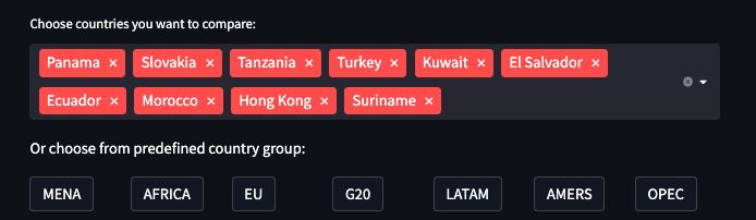
Notice that all buttons selecting a group are rendered in a separate column. I wanted to allow for easy adding/removing country groups in the code, so that the rendering parts looked like this:
st.write("Or choose from predefined country group:")
columns = st.columns(len(country_data.COUNTRY_GROUPS))
for idx, column in enumerate(columns):
    with column:
        group = country_data.COUNTRY_GROUPS[idx]
        st.button(group, key=group, on_click=country_group_callback)
All buttons share the same on_click callback. To figure out which button called it and update the multi-select, use session state:
def country_group_callback():
    chosen_group = [
        group_name for group_name, selected in st.session_state.items() if
        selected and group_name in country_data.COUNTRY_GROUPS][0]
    countries = country_data.GROUPS_TO_COUNTRIES[chosen_group]
    st.session_state["default_countries"] = countries
How to create a scatter plot with flags as markers
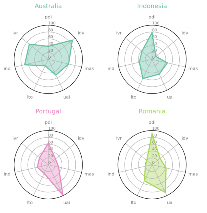
After selecting a few countries, you can visualize their cultural dimensions with:
- Choropleth
- Radar plots
- Heatmap
- Scatter plot
Choropleth is a kind of map that uses color to visualize a given property. Generate six choropleths for each dimension in separate tabs with plotly:

The tabs act as Python context managers and can be used with the with keyword:
st.write("Or choose from predefined country group:")
columns = st.columns(len(country_data.COUNTRY_GROUPS))
for idx, column in enumerate(columns):
    with column:
        group = country_data.COUNTRY_GROUPS[idx]
        st.button(group, key=group, on_click=country_group_callback)
To make switching from one tab to another less tedious, visualize multiple dimensions on a single graph with radar plots. Here are some good examples of how to do this with Matplotlib:
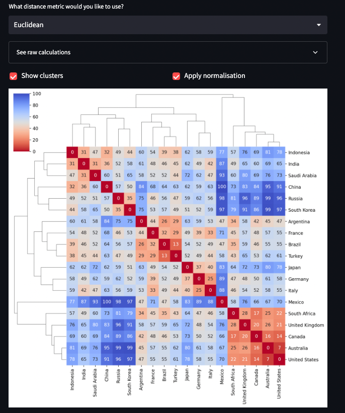
Considering all six dimensions is cumbersome, so how about compressing them into one number? You can measure the “cultural distance” between all selected countries with Scipy. It lets you choose from different distance measures (Euclidean, Cosine, Manhattan, etc.). You can put them into a dictionary for convenience:
from scipy.spatial import distance

AVAILABLE_DISTANCES = {
    "Euclidean": distance.euclidean,
    "Cosine": distance.cosine,
    "Manhattan": distance.cityblock,
    "Correlation": distance.correlation,
}
Now computing a distance between two countries is easy:
HOFSTEDE_DIMENSIONS = ['pdi', 'idv', 'mas', 'uai', 'lto', 'ind', 'ivr']

def compute_distance(
        country_from: types.CountryInfo,
        country_to: types.CountryInfo,
        distance_metric: str
) -> float:
    from_array = [max(getattr(country_from, dimension) or 0, 0) for dimension in HOFSTEDE_DIMENSIONS]
    to_array = [max(getattr(country_to, dimension) or 0, 0) for dimension in HOFSTEDE_DIMENSIONS]
    return AVAILABLE_DISTANCES[distance_metric](from_array, to_array)
Next, let’s create a distance matrix to compute the distances between all selected countries. Since the number of distances is proportional to the square of the number of selected countries, you can cache the result using st.cache decorator:
@st.cache
def compute_distances(
        countries: types.Countries,
        distance_metric: str
) -> tuple[PandasDataFrame, float]:
    index = [country.title for country in countries]
    distances = {}
    max_distance = 0
    for country_from in countries:
        row = []
        for country_to in countries:
            distance = compute_distance(country_from, country_to, distance_metric)
            max_distance = max(max_distance, distance)
            row.append(distance)
        distances[country_from.title] = row
    return pd.DataFrame(distances, index=index), max_distance
Now let’s plot the heatmap, cluster together similar countries, and show which country belong to which cluster. You can combine them with clustermap from Seaborn by applying the hierarchical clustering to the sides of the heatmap. Change the distance metric to change the colors and the row-and-columns clustering:
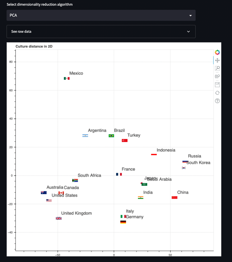
The distance between the countries is cultural as opposed to geographical, so it’d be great to see it in 2D space with their cultural traits (and not coordinates). For this, you’ll need two dimensions. But which two should you use? Instead of choosing them arbitrarily, reduce the dimensionality using Principal Component Analysis. Just like scipy helped you with the distance metrics, scikit-learn can help with dimensionality reduction:
from sklearn import decomposition

AVAILABLE_DECOMPOSITION = {
    'PCA': decomposition.PCA,
    'FastICA': decomposition.FastICA,
    'NMF': decomposition.NMF,
    "MiniBatchSparsePCA": decomposition.MiniBatchSparsePCA,
    "SparsePCA": decomposition.SparsePCA,
    "TruncatedSVD": decomposition.TruncatedSVD
}
Next, compute the 2D data, use scatterplot to visualize locations, and mark each point with a country flag (fetch the data from Wikipedia 🙂). Use the Bokeh library to replace markers with image URLs:
How to find the best matching country
Since each dimension can score 1-100, use a set of six sliders to ask the users about their preferences:

It takes a lot of space, so let’s do it on a separate page. And just for fun, let’s add a button that sets each slider to a random value. Now you can compute a distance between user preferences and each country and select the top N hits. To make N a variable, use number input. You’re ready to present the ranking:

This looks pretty boring, so let’s add some data visualization. How about a radar plot? Let’s stack two radar spiders together. The red one will show your selected preferences, and the colored one will show the top country—to see how close it is to your preferences:

Read the code to learn more about:
- Loading markdown content into st.markdown from an external .md file
- Hiding raw content using st.expander
- Showing pandas data frames using st.write
- Setting app title headers and subheaders with st.title, st.header, st.subheader, and more!
Wrapping up
It’s amazingly easy to create complex visualizations and perform data analysis with Streamlit. And deployment is a breeze! Apparently, the top two countries matching my personal cultural preferences are Switzerland and UK. Coincidentally, that’s where I’ve spent 7+ years of the last 14 years of my life. 🙂 If you have questions about the app, feel free to reach out to me via LinkedIn or email.
Happy Streamlit-ing! 🎈


Comments
Continue the conversation in our forums →