
Hey community, 👋
We're three Italian guys born and raised in the charming Brianza and the bustling Milan: Matteo (a data analyst), Luca (a medical doctor), and Federico (a student). We live 10 kilometers apart, but LinkedIn has connected us. When we met in person for coffee ☕ (yes, we're Italians!), we discovered a shared goal: to innovate the Italian healthcare system.
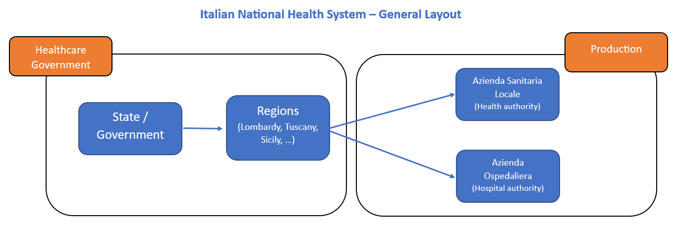
In Italy, the public healthcare system is funded through taxes. But due to high demand and long wait times, the existing coverage is inadequate, and the data for analysis is missing. So we created Mehedi (stands for "Medical Health Data Insights")—an integrated analytics platform for small clinics to improve decision-making and patient care:
In this post, we'll show you:
- How to create a dynamic form as data entry
- How to create an interactive dashboard for patient satisfaction
- How to connect Google Sheets to Streamlit
- How to create a multi-page app
- How to create data manipulation techniques
- How to use ML algorithms to improve the prediction of goal metrics
Why create Mehedi?
Over the last ten years, healthcare data has grown exponentially. This created an opportunity for:
- Direct impact analytics (clinical and research) to create a benefit for the patient.
- Indirect analytics (analytical tools or systems) to create a benefit for all stakeholders.
We wanted to display the data in a simple dashboard:
The shift towards "Value-Based Care" required new metrics to evaluate performance—to benefit patients, healthcare professionals, and providers. Patient satisfaction is important, but few tools collect patient experience metrics (not connected to traditional metrics for actionable insights).
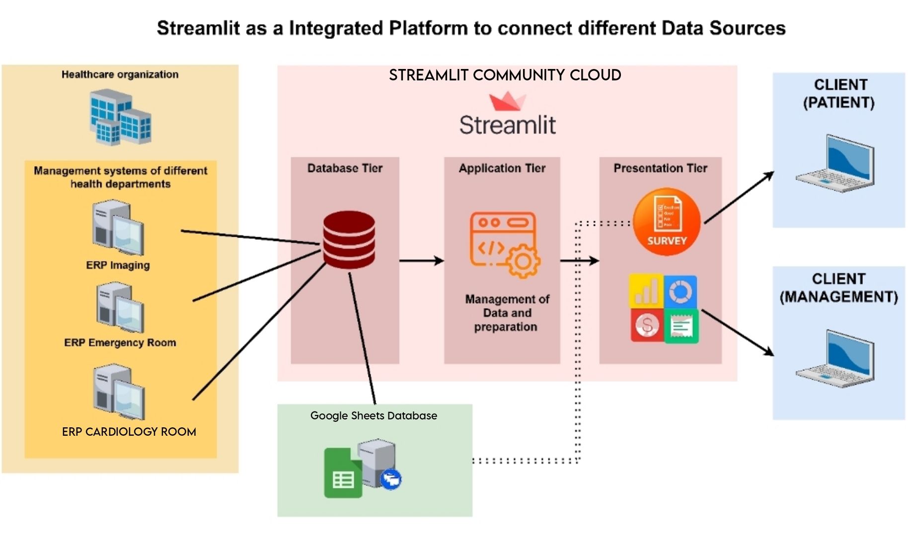
Streamlit was the perfect tool for Mehedi:
- It connected multiple sources in a database tier
- It elaborated on the data and logic in an app tier
- It collected patient data and feedback through a survey and presents it beautifully (it can even be customized by medical service type!)
Here is the app itself:
And now, let's get to building it!
1. How to create a dynamic form as data entry
The entry point to Mehedi is the patient experience survey. It has targeted questions and free text boxes for general suggestions, opinions, and feedback.
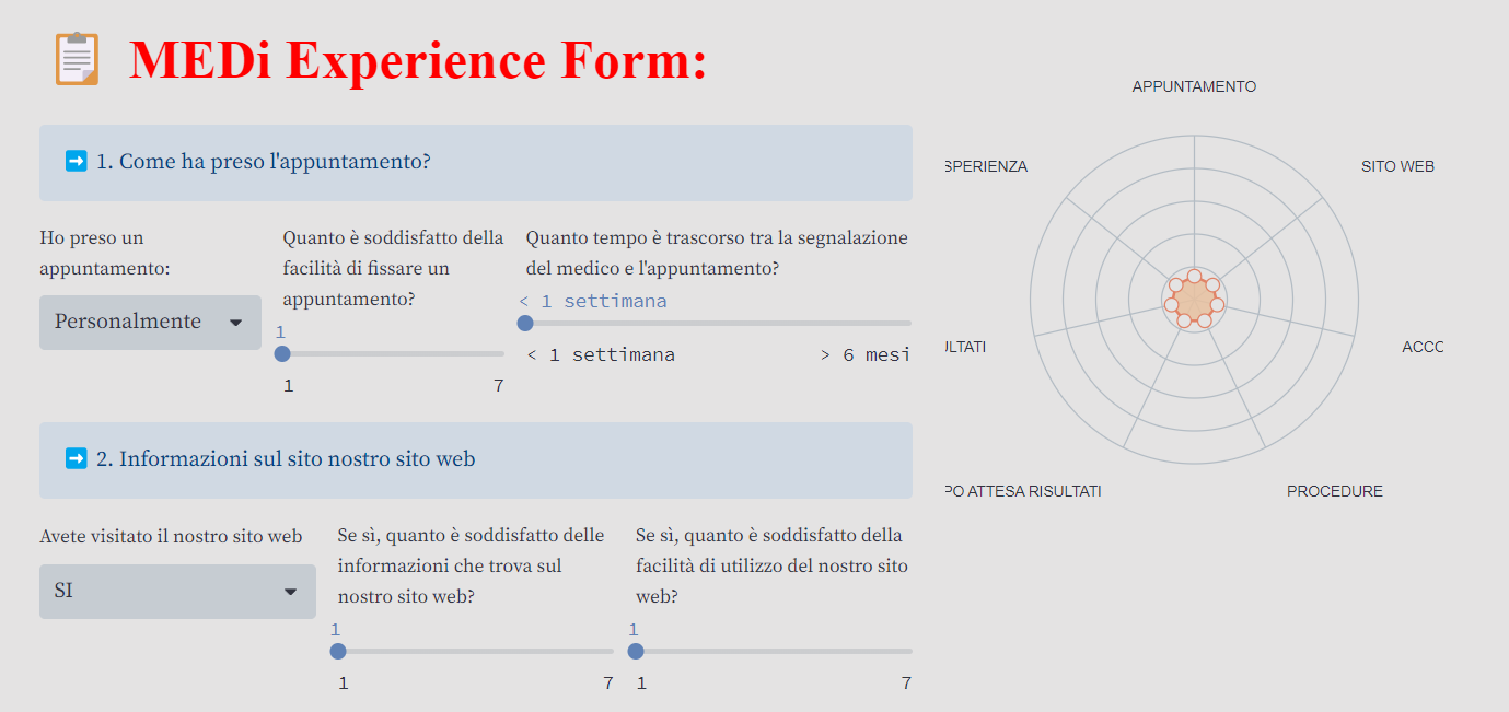
Let's consider a scenario with three different dynamic forms that depend on a slider representing a patient's appointment time duration.
To get started, follow these steps:
- Import the necessary Streamlit library using
import streamlit as st - Create a slider to capture the appointment time using
appointment_time = st.slider("Select appointment duration", min_value, max_value) - Based on the value of the slider, use conditional statements to display the appropriate dynamic form:
# Using a slider, you can choose the time available.
slider = st.slider(label='Trascina lo slider', min_value=1,max_value=10, value=1, key='Form5')

# ###FORM 1
if slider<4:
		col1,  col2 = st.columns([1, 0.60])
		with col1:
		    new_title = '<b style="font-family:serif; color:#FF0000; font-size: 40px;">📋 MEDi Experience Form:</b>'
		    st.markdown(new_title, unsafe_allow_html=True)
		    st.info("➡️ 1. Come ha preso l'appuntamento?")
		    cols = st.columns((1, 1))
		    #APPUNTAMENTO
		    var_a1 = cols[0].selectbox("Ho preso un appuntamento:",  ["Personalmente",  "Telefono",  "Sito Web", "E-mail",  "Tramite medico",  "Altro"])
		    var_a2= cols[1].slider("Quanto è soddisfatto della facilità di fissare un appuntamento?", 1, 7, 1)
		with col2:
				DATA = [{"taste": "APPUNTAMENTO", "Peso Area": var_a2},
		            {"taste": "ACCOGLIENZA", "Peso Area": med_accoglienza},
		            {"taste": "PROCEDURE", "Peso Area": var_d2},
		            {"taste": "RISULTATI", "Peso Area": var_f3},
		            {"taste": "ESPERIENZA", "Peso Area": med_experience}]
		    graph_pes(DATA)
# ###FORM 2
elif slider>3 and slider<8:
		## add the questions for form 2
# ###FORM 3
elif slider>7:
		## add the questions for form 3
Why not use st.form()? Because you want to create a form that provides feedback on progress after each user interaction. With st.form(), the user can evaluate only what they entered in the form after the submit section.
Just use "Nivo" and pass the necessary data as input:
from streamlit_elements import elements, mui
from streamlit_elements import nivo

DATA = [{"taste": "RISULTATI", "peso_area": variable1},
        {"taste": "CONSAPEVOLEZZA E FIDUCIA", "peso_area": variable2},
        {"taste": "COINVOLGIMENTO", "peso_area": variable3},
        {"taste": "DISTINTIVITA'", "peso_area": variable4},
        {"taste": "COMPORTAMENTI", "peso_area": variable5}]

# radar chart example
def graph_pes(DATA):
        with elements("nivo_charts"):
            with mui.Box(sx={"height": 400}):
                nivo.Radar(
                    data=DATA,
                    keys=["peso_area"],
                    indexBy="taste",
                    maxValue=7,
                    valueFormat=">-.2f",
                    margin={"top": 80, "right": 60, "bottom": 80, "left": 60},
                    gridLabelOffset=36,
                    dotSize=10,
                    dotColor={"theme": "background"},
                    dotBorderWidth=1,
                    fillOpacity=0.85,
                    borderWidth=2,
                    borderColor="#e08367",
                    dotBorderColor="#e08367",
                    motionConfig="wobbly",
                    legends=[
                        {
                            "anchor": "top-left",
                            "direction": "column",
                            "translateX": -70,
                            "translateY": -100,
                            "itemWidth": 40,
                            "itemHeight": 20,
                            "itemTextColor": "#999",
                            "symbolSize": 12,
                            "symbolShape": "circle",
                            "effects": [
                                {
                                    "on": "hover",
                                    "style": {
                                        "itemTextColor": "#000"
                                    }
                                }
                            ]
                        }
                    ],
                    theme={
                        "background": "#E4E3E3",
                        "textColor": "#31333F",
                        "grid": {"line": {
                                            "stroke": "#b3bcc4",
                                            "strokeWidth": 1
                                        }
                                    },
                        "tooltip": {
                            "container": {
                                "background": "#E4E3E3",
                                "color": "#31333F",
                            }
                        }
                    }
                )
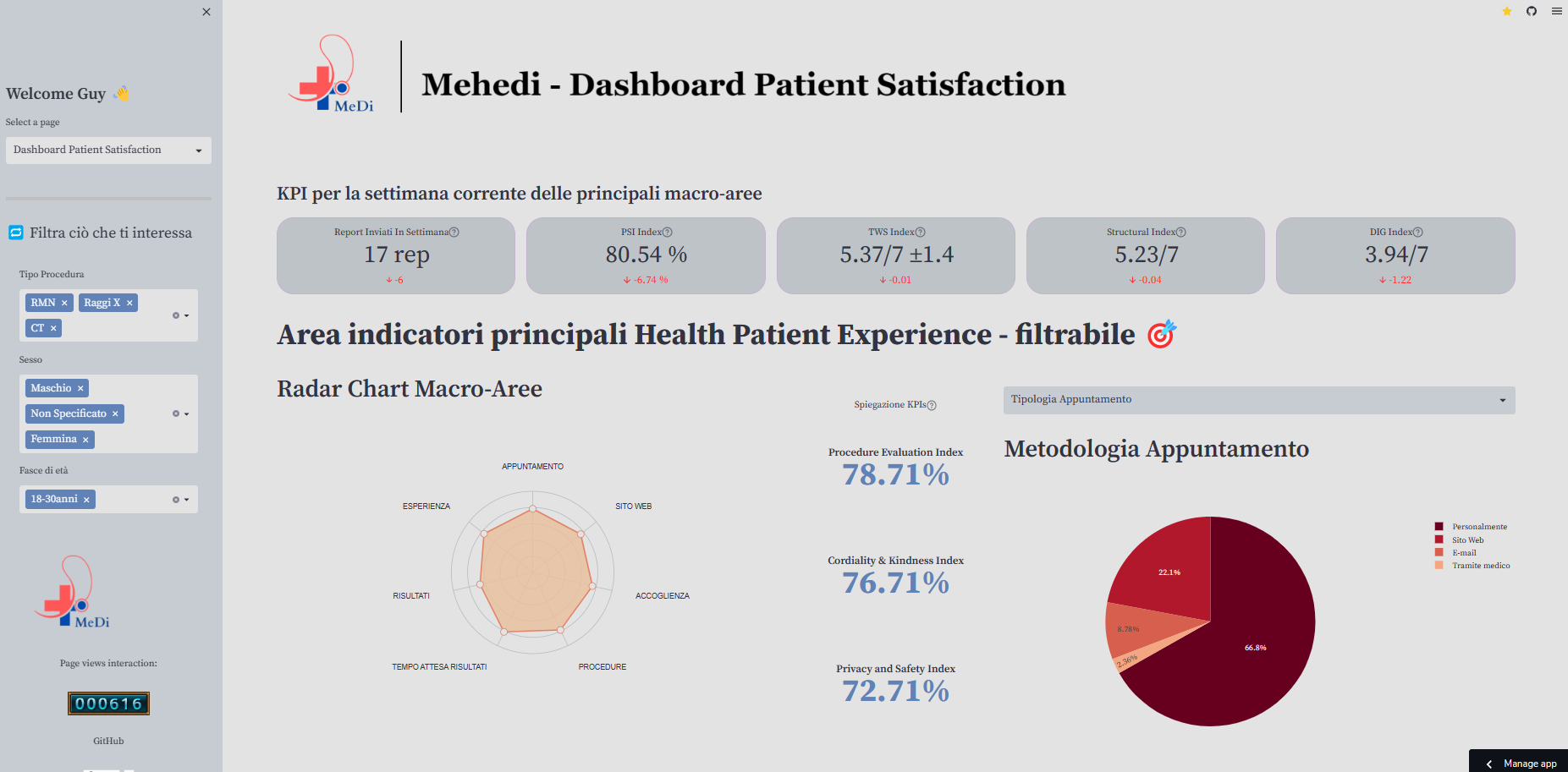
2. How to create an interactive dashboard for patient satisfaction
Streamlit is excellent for integrating multiple data sources, enabling vital data harmonization and pipeline. It can integrate diverse data sources, including ERP systems from healthcare organizations.
The dashboard helps managers make adjustments, measure their effects, and improve patient centrality:
To create a patient satisfaction dashboard, follow these steps:
Install the necessary libraries:
pip install streamlit plotly altair pandas
Import the required modules in your Streamlit app:
import streamlit as st
import pandas as pd
import plotly.express as px
Load and preprocess your patient satisfaction data:
# Load the data from a data source (reading gsheet to dataframe)
sheet_url = "url"
url_1 = sheet_url.replace("/edit#gid=", "/export?format=csv&gid=")
df=pd.read_csv(url_1)

# Define Filter on sidebar
a, b, c = st.sidebar.columns([0.05,1,0.05])
with a:
    st.write("")
with b:
    Proced_Fil=st.multiselect("Tipo Procedura", df["Tipo_procedura"].unique(),  default=["RMN", "Raggi X", "CT"])
    Sesso_Fil=st.multiselect("Sesso", df["Sesso"].unique(),  default=["Maschio", "Femmina", "Non Specificato"])
    Eta_Fil=st.multiselect("Fasce di età", df["Range_Età"].unique(),  default=["18-30anni"])
    st.image(image3, width=170)
with c:
    st.write("")

# Inizialize a filtered dataframe with pandas query

df_selection = df.query("Tipo_procedura == @Proced_Fil & Sesso == @Sesso_Fil & Range_Età == @Eta_Fil")
Create interactive visualizations using Plotly, Altair, or other libraries:
# Use Plotly to create a bar chart
df42= df.groupby(pd.Grouper(key='Timestamp', axis=0,freq='1W')).count().reset_index()
df42.rename(columns={'Sesso':'Form_Inviati'}, inplace=True)
df42["target"]=10
df42["MA_REPORT"]=df42["Form_Inviati"].rolling(2).mean()
st.header("Bar Chart Numero report inviati per settimana")
fig=px.bar(df42, x ="Timestamp", y='Form_Inviati', color='Form_Inviati',template = 'ggplot2',width=800, height=400)
fig.add_trace(go.Scatter(x=df42['Timestamp'], y=df42["target"],mode='lines', line=dict(color="blue"), name='Safety Target'))
fig.add_trace(go.Scatter(x=df42['Timestamp'], y=df42["MA_REPORT"],mode='lines', line=dict(color="orange"), name='Media mobile'))
fig.update_layout(legend=dict(
    yanchor="top",
    y=0.99,
    xanchor="left",
    x=0.01))
st.plotly_chart(fig, use_container_width=True)
Add additional components, such as sliders or dropdowns, for interactive filtering and customization:
# Define Section of KPI using st.metric of Streaml
st.subheader("KPI per la settimana corrente delle principali macro-aree")
col1, col2, col3, col4, col5 = st.columns(5)
with col1:
    len_report_sett_now=df1['Sesso'].iloc[-1]
    len_report_sett_last_week=df1['Sesso'].iloc[-2]
    delta_report=int(len_report_sett_now) - int(len_report_sett_last_week)
    st.metric("Report Inviati In Settimana",  value= str(int(len_report_sett_now))+" rep", delta=str(delta_report),  help="Numero totale di report inviati questa settimana rispetto a settimana scorsa")
with col2:
    #Settimana attuale psi
    df2_att_scorsa_settimana=df.loc[(df['Timestamp'] >= str(date_last_week))]
    df2_medie_valori_week=df2_att_scorsa_settimana.mean().reset_index()
    df2_medie_valori_week.columns = ['variables', 'count']
    psi_this_week=round(df2_medie_valori_week["count"].mean(), 4)
    psi_perc=round((psi_this_week/7)*100,2)
    #Settimana precedente alla sett scorsa psi
    df2_prima_scorsa_settimana=df.loc[(df['Timestamp'] < str(date_last_week))]
    df2_medie_valori_prec_week=df2_prima_scorsa_settimana.mean().reset_index()
    df2_medie_valori_prec_week.columns = ['variables', 'count']
    psi_prima_last_week=round(df2_medie_valori_prec_week['count'].mean(), 4)
    #differenza tra i PSI
    delta_psi=round(((float(psi_this_week)-float(psi_prima_last_week))/7)*100, 2)
    if psi_perc>100:
        psi_perc==100
    st.metric("PSI Index",  value=str(psi_perc)+" %", delta=str(delta_psi)+" %", help="Patient Satisfaction Index (misura complessiva di grado di soddisfazione dei pazienti)")
3. How to connect Google Sheets to Streamlit
Streamlit seamlessly integrates with Google Sheets through the pandas library, treating the source as a simple CSV file.
Just follow these steps.
Install the necessary libraries:
pip install gspread
pip install oauth2client
Create a service account key in the Google Cloud Console:
- Go to the Google Cloud Console (https://console.cloud.google.com/)
- Create a new project or select an existing one
- Enable the Google Sheets API for your project
- Go to "Credentials" and create a new service account key
- Download the JSON key file for the service account
Paste the private key into the secrets.toml file, making any necessary modifications to fit the required standard.
Set up your script using the provided script as a guide.
Store your data in a script storage, as shown in the example below, where we saved data from a long form.
Here is how to do this:
import google_auth_httplib2
import httplib2
from google.oauth2 import service_account
from googleapiclient.discovery import build
from googleapiclient.http import HttpRequest

@st.cache_resource()
def connect_to_gsheet():
    # Create a connection object.
    credentials = service_account.Credentials.from_service_account_info(
        st.secrets["gcp_service_account"],
        scopes=[SCOPE],
    )

    # Create a new Http() object for every request
    def build_request(http, *args, **kwargs):
        new_http = google_auth_httplib2.AuthorizedHttp(
            credentials, http=httplib2.Http()
        )
        return HttpRequest(new_http, *args, **kwargs)

    authorized_http = google_auth_httplib2.AuthorizedHttp(
        credentials, http=httplib2.Http()
    )
    service = build(
        "sheets",
        "v4",
        requestBuilder=build_request,
        http=authorized_http,
    )
    gsheet_connector = service.spreadsheets()
    return gsheet_connector

@st.cache_data()
def get_data(gsheet_connector) -> pd.DataFrame:
    values = (
        gsheet_connector.values()
        .get(
            spreadsheetId=SPREADSHEET_ID,
            range=f"{SHEET_NAME}!A:E",
        )
        .execute()
    )

    df = pd.DataFrame(values["values"])
    df.columns = df.iloc[0]
    df = df[1:]
    return df

def add_row_to_gsheet(gsheet_connector, row) -> None:
    gsheet_connector.values().append(
        spreadsheetId=SPREADSHEET_ID,
        range=f"{SHEET_NAME}!A:E",
        body=dict(values=row),
        valueInputOption="USER_ENTERED",
    ).execute()

# submit form and store data
submitted = st.button(label="Submit")
if submitted==True:
   st.success("Successfully")
   st.ballons()
   add_row_to_gsheet(df,
                  [[var_a1, var_a2, var_a3,
                    var_b1, var_b2, var_b3,
                    var_c1, var_c2, var_c3,
                    var_d1, var_d2, var_d3,
                    var_d4, var_d5, var_d6, var_d7,
                    var_e1,  var_e2,
                    var_f1, var_f2, var_f3,
                    var_g1, var_g2, var_g3, var_g4,var_g5,
                    var_h1, var_h2, var_h3,var_h4, var_h5, var_h6, var_h7,var_h8, var_h9,
                    var_i1, var_i2,
                    feedback_gen, str(datetime_object),  "Form_lungo",
                    add_comm,  emozione,  sentiment]])
4. How to create a multi-page app
To implement multi-page functionality, incorporate the Patient_Form.py and other relevant scripts from our repo.
The code shows how different functions can simulate separate pages within the app:
- The functions
form_pazienti(),dashboard_patient_satisf(), andlanding_page()represent distinct pages, each displaying relevant content. - The
page_names_to_funcsdictionary maps page names to their respective functions. - The
selected_pagevariable, determined by the user's selection from the sidebar, executes the corresponding function to display the chosen page's content.
Here is an example:
#Example: Through functions we can simulate different pages of the web-app

def form_pazienti():
	st.title("Page1 application")

def dashboard_patient_satisf():
	st.title("Page2 application")

def landing_page():
	st.title("Page3 application")

page_names_to_funcs = {
            "Form Patient Satisfaction": form_pazienti,
            "Dashboard Patient Satisfaction": dashboard_patient_satisf,
            "Info Framework":landing_page}
selected_page = st.sidebar.selectbox("Select a page", page_names_to_funcs.keys(), key ="value")
page_names_to_funcs[selected_page](
5. How to create data manipulation techniques
To make simple and beautiful dashboards, use the patient satisfaction results to develop key performance indicators (KPIs) and extract actionable insights.
The surveys capture two aspects of the interview:
- The numerical portion involves quantitative data analysis. Users adjust the bar based on a Likert scale of 0 to 7.
- The free-text portion involves qualitative data analysis. Users input comments, and the application provides elaboration on the numerical data.
Patient forms contain qualitative data that is analyzed manually. We aimed to translate the comments into quantitative information not typically captured in tabular form (view the dataset here).
Just import the necessary libraries:
#basic libraries
import streamlit as st
import pandas as pd
import numpy as np
import time
from datetime import date
from datetime import timedelta
from htbuilder import div, big, h2, styles
from htbuilder.units import rem

#cv libraries
from PIL import Image

#visualization libraries
import plotly.express as px
import plotly.graph_objects as go
from wordcloud import WordCloud,  STOPWORDS
import matplotlib.pyplot as plt

#machine learning libraries
from sklearn.metrics import mean_squared_error
from sklearn.model_selection import train_test_split
from sklearn import datasets, ensemble
from sklearn.inspection import permutation_importance
import statsmodels.api as sm
from streamlit_elements import elements, mui
from streamlit_elements import nivo
from sklearn.linear_model import LinearRegression
from sklearn.preprocessing import PolynomialFeatures
6. How to use ML algorithms to improve the prediction of goal metrics
You can also implement a predictive KPI using a machine learning (ML) algorithm called Gradient-Boosting. It considers all relevant variables to predict the Patient Satisfaction Index for upcoming weeks.
The index represents the overall satisfaction of patients:
#algorithms Gradient Boosting to predict PSI
def training_ml(x,  y):
    X_train, X_test, y_train, y_test = train_test_split(
    X, y, test_size=0.05, random_state=13)

    params = {
    "n_estimators": 500,
    "max_depth": 4,
    "min_samples_split": 5,
    "learning_rate": 0.01,
    "loss": "squared_error"}

    reg = ensemble.GradientBoostingRegressor(**params)
    reg.fit(X_train, y_train)

    pred=reg.predict(X_test)

    mse = mean_squared_error(y_test, pred)
    print("The mean squared error (MSE) on test set: {:.4f}".format(mse))
    #take the first prediction
    return pred[-1]

#check preds (1 e 7)
pred = training_ml(X,  y)
Use polynomial regression algorithms to calculate the relationship between patients' satisfaction and wait time. Each line in the algorithm represents a different-order polynomial, with parameters identified using form data.
You can analyze patient comments using sentiment analysis, an approach to natural language processing (NLP) that identifies the emotional tone behind the written text.
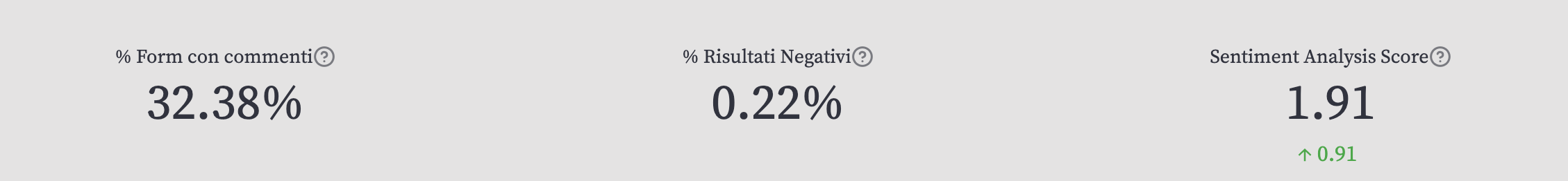
- % Form with Comment (Value (%) represents the number of people who completed the form and left a comment)
- % Negative Results (Value (%) represents the number of negative keyword results out of the total results of keywords added by users, excluding articles, conjunctions, and non-significant words)
- % Sentiment Analysis Score (Value as Positive-Negative Ratio. Calculate the ratio of positive to negative keywords. If the result is greater than 0, there are more positive keywords.)
This is a method that organizations can use to evaluate and classify opinions regarding a product, service, or idea.
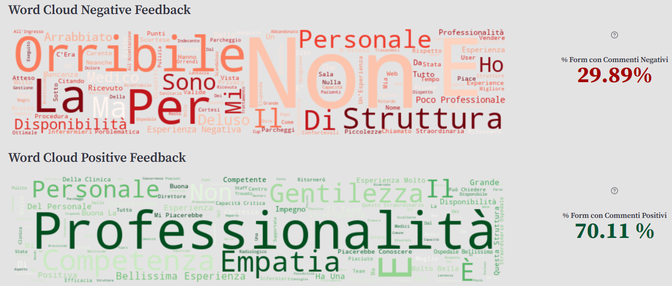
Here is how to build a similar word cloud:
# How to build a WordCloud on Streamlit using Matplotlib
st.header("Word Cloud Patient Form")
commenttext_merged= df['Comment_Text'].str.cat(sep=' , ')

# all words in title case
text_propercase=commenttext_merged.title()

# remove all non necessary words as articles and con
stop_words =STOPWORDS.update(["La ", "Non ", "Mi ", "E ", "Il ", "Dei ", "Di ", "Degli ", "Lo ",  "Della ", "C'Era ", ", ",  "Del ",  "Per ", "Sotto ", "Alcuni", "Alcune ", "Ok "
                        , "Rispetto!","Degli ",  "Ho ", "E' ",  "Da ",  "Un ",  "In ",  "Una ", "Dalla ", "Stata ", "Mia ", "Che ",  "Ma ",  "Tutto ",  "Sono "])

#Create and generate a word cloud image:
wordcloud = WordCloud(stopwords = stop_words,background_color="#E4E3E3", width=800, height=500, colormap="Blues").generate(text_propercase)
fig, ax = plt.subplots(facecolor="#E4E3E3")
plt.imshow(wordcloud, interpolation='bilinear')
plt.axis("off")
plt.subplots_adjust(left=-5, right=-2, top=-2, bottom=-5)
plt.show()
st.pyplot(fig)
Here is how it looks:

Finally, integrate an AI tool into the Patient Satisfaction Form to classify comments based on Italian BERT's sentiments and emotions classification. This language model can detect and classify comments into two different labels: positive and negative (binary classification). And it can extract emotions from a phrase and classify them into four labels: joy, anger, fear, and sadness (see the repo here).
Use the results of this classification to calculate two metrics—to see how many comments are considered positive and negative by BERT:
Wrapping up
Mehedi is a result of long talks, design studies, and research. Using our IT, medical, and management knowledge, we made a customizable platform for healthcare facilities to gather useful information directly from patients. Streamlit helped us create our app super fast!
We welcome your feedback and opportunities for collaboration. Please leave us a message in the comments below, on GitHub, or on LinkedIn: Matteo, Luca, and Federico.
Thank you, and happy Streamlit-ing! 🎈


Comments
Continue the conversation in our forums →