Matplotlib is one of the most popular charting libraries in Python. It’s also a popular way to add charts to your Streamlit apps. Just use st.pyplot!
But Matplotlib charts are static images. No zooming or moving the chart around.
In this post, I'll show you how to make them interactive:
1. Simple example:
- Step 1. Create a basic Matplotlib chart
- Step 2. Make the chart interactive
2. Advanced example:
- Step 1. Render the graph statically
- Step 2. Make the graph interactive with mpld3
- Step 3. Add tooltips for even more interactivity
TLDR? Use mpld3 and render pyplots with Streamlit’s built-in st.pyplot command. With a few lines of code, you can add panning, zooming, resetting, and rendering!
1. Simple example
Step 1. Create a basic Matplotlib chart
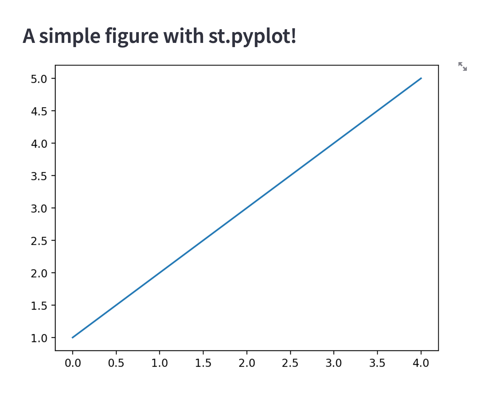
First, create a basic Matplotlib chart and add it to your Streamlit app (you’ll add interactivity later).
Here is what the code will look like:
import streamlit as st
import matplotlib.pyplot as plt

#create your figure and get the figure object returned
fig = plt.figure()
plt.plot([1, 2, 3, 4, 5])

st.pyplot(fig)
And here’s what your app should look like now:
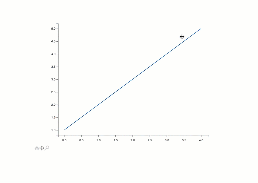
Step 2. Make the chart interactive
Making this chart interactive is super simple.
Use the fantastic mpld3 library. It’ll convert the Matplotlib figure (fig) into an interactive Javascript representation and return it as HTML. Embed this HTML snippet in your app via Streamlit’s custom component API:
import matplotlib.pyplot as plt
import mpld3
import streamlit.components.v1 as components

#create your figure and get the figure object returned
fig = plt.figure()
plt.plot([1, 2, 3, 4, 5])

fig_html = mpld3.fig_to_html(fig)
components.html(fig_html, height=600)
Now your users can pan, zoom, reset, and explore the details of your chart! 📊
Want to explore it yourself? See the app deployed live here.
For more mpld3’s plugins, check out mpld3’s website and documentation.
2. Advanced example
Step 1. Render the graph statically
Start out by statically rendering the graph:
# Imports for all of the code
import matplotlib.pyplot as plt
import numpy as np
import pandas as pd
import mpld3
import streamlit as st
from mpld3 import plugins

def f(t):
    return np.exp(-t) * np.cos(2*np.pi*t)

t1 = np.arange(0.0, 5.0, 0.1)
t2 = np.arange(0.0, 5.0, 0.02)

# How to set the graph size
two_subplot_fig = plt.figure(figsize=(6,6))
plt.subplot(211)
plt.plot(t1, f(t1), color='tab:blue', marker=',')
plt.plot(t2, f(t2), color='black', marker='.')

plt.subplot(212)
plt.plot(t2, np.cos(2*np.pi*t2), color='tab:orange', linestyle='--', marker='.')

st.pyplot(two_subplot_fig)
This code will make something like this:
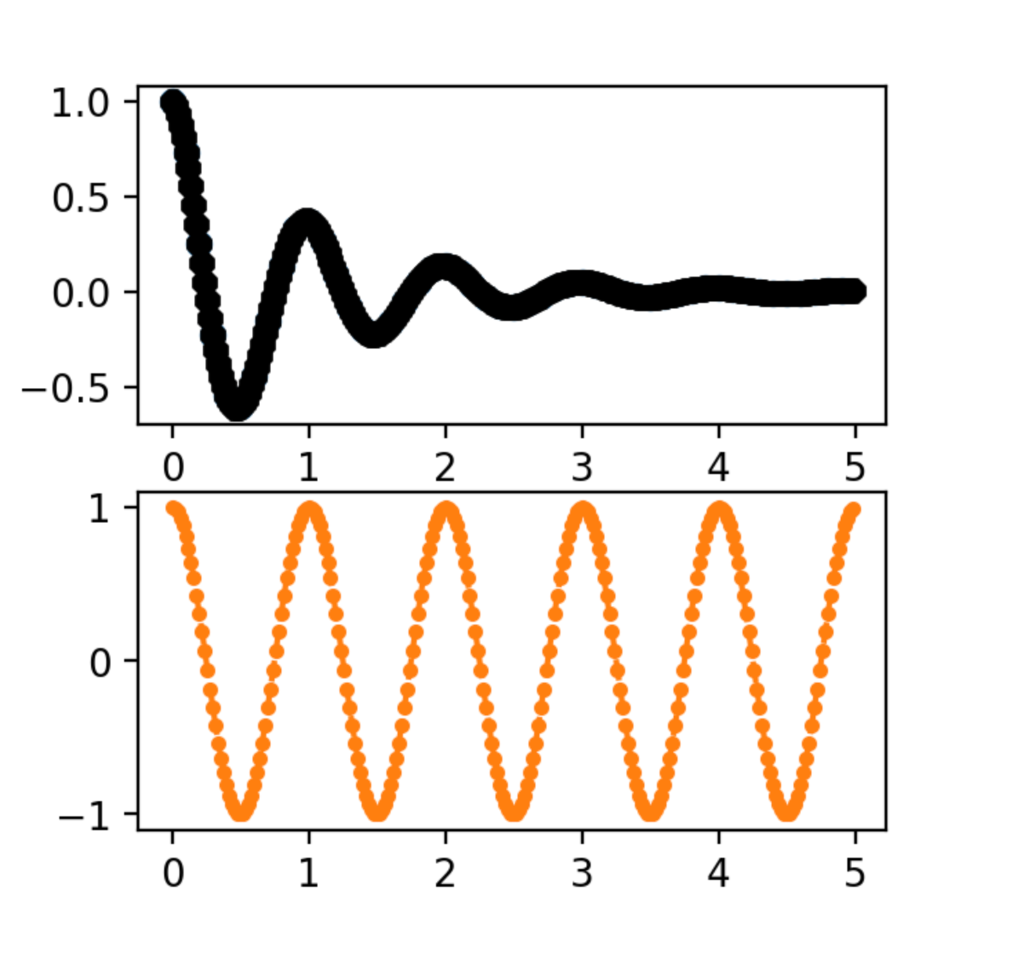
You might be thinking, “Why are we adding markers? It doesn’t look beautiful.” I’ll explain why below!
Step 2. Make the graph interactive with mpld3
Make the static graph interactive with mpld3:
# Replace st.pyplot(two_subplot_fig) with this code below!
fig_html = mpld3.fig_to_html(two_subplot_fig)
components.html(fig_html, height=600)
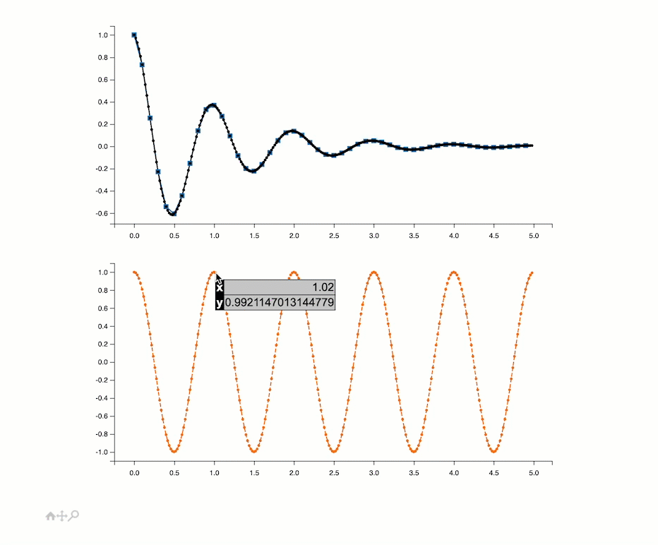
Here is what it’ll look like with panning, zooming, and resetting:

Step 3. Add tooltips for even more interactivity
Add tooltips to see X and Y coordinates for even more interactivity (it’s why we’ve added markers).
Here is what the code will look like:
# CODE TO ADD
# Define some CSS to control our custom labels
css = """
table
{
  border-collapse: collapse;
}
th
{
  color: #ffffff;
  background-color: #000000;
}
td
{
  background-color: #cccccc;
}
table, th, td
{
  font-family:Arial, Helvetica, sans-serif;
  border: 1px solid black;
  text-align: right;
}
"""
for axes in two_subplot_fig.axes:
    for line in axes.get_lines():
        # get the x and y coords
        xy_data = line.get_xydata()
        labels = []
        for x, y in xy_data:
            # Create a label for each point with the x and y coords
            html_label = f'<table border="1" class="dataframe"> <thead> <tr style="text-align: right;"> </thead> <tbody> <tr> <th>x</th> <td>{x}</td> </tr> <tr> <th>y</th> <td>{y}</td> </tr> </tbody> </table>'
            labels.append(html_label)
        # Create the tooltip with the labels (x and y coords) and attach it to each line with the css specified
        tooltip = plugins.PointHTMLTooltip(line, labels, css=css)
        # Since this is a separate plugin, you have to connect it
        plugins.connect(two_subplot_fig, tooltip)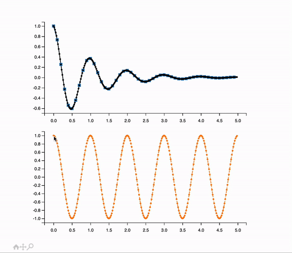
You can adjust HTML, CSS, or anything you want. And if you want to interact with the graph or look at the code, check it out here!
Note: mpld3 limitations
Before I wrap this up, I wanted to note the limitations to mpld3:
- Complex charts sometimes don’t render properly.
- Dark mode isn’t supported.
- 3D charts don’t render properly.
- You need markers for tooltips.
- Some markers don’t work (examples: none or ‘+’).
Wrapping up
Thank you for reading this post! I’d love to know if you found this useful. Your feedback means a LOT. If you have any questions, please leave them in the comments below and check out the forum to see what our vibrant community is creating.
Happy Streamlit-ing! 🎈


Comments
Continue the conversation in our forums →