Written by Jared Stock, a digital consultant at Arup.
One of the many consequences of COVID-19 in the US is that countless families are having trouble keeping up with rent. According to Moody’s, nearly 12 million renters will owe an average of $5,850 in back rent by January 2021. These renters will face the terrifying prospect of losing their homes in the middle of winter during a pandemic.
In early September, the Centers for Disease Control issued a national moratorium on evictions until December 31st, 2020. Under this order, tenants can provide a declaration to their landlord that shows that they meet certain conditions, which then prevents the landlord from evicting them. However, as the CDC notes in the order, “this Order does not relieve any individual of any obligation to pay rent, make a housing payment, or comply with any other obligation…” So, while tenants were protected until then, their rent payments continued to accumulate and they could face eviction if they aren’t able to pay all of the rent back.
One way to help these families is to simply pay their rent, and that’s exactly what New Story, a charity based in the Bay Area, set out to do in the spring of 2020. Our team at Arup helped New Story analyze data in the Bay Area to help them make decisions about how to distribute direct payments to families. We looked at a variety of data sources ranging from economic indicators to how vulnerable a county was to COVID-19. We were able to come up with a relative risk index that we used to compare counties and show where the greatest need was. After that work was done, the next logical step was to share our code and data with the community.
While some NGOs have people with software and data experience, many more don’t have the skills required to use the open data that exists. Our goal is to make that data and the analysis that we’ve done around evictions available to as many people as possible to help drive decisions and ultimately keep more people in their homes.
Empowering users, no code required
When we initially published our repository and data, users had to have some coding experience in order to use it - which can be intimidating! That immediately reduced the number of people who could potentially use the data. This was a clear opportunity to use Streamlit to make the data accessible to everyone without needing to understand SQL queries or how to run Python code. Since our initial release was just vanilla Python code, it was easy to start adding functionality by just marking up our code with Streamlit functions. We were able to adapt our existing Python workflows in just a couple hours and deploy using Streamlit sharing in just a couple minutes.

Right off the bat, we were able to turn what were originally command line prompts into visual inputs for users that update as they go through the process. Since this analysis follows a linear sequence of user inputs, Streamlit inputs allow for a much better user experience and allow us to show data at various steps during the analysis in a much nicer format than writing to a command line. We also provide explanation and details right alongside the inputs and data, rather than in a separate README file.
Streamlit’s input components allowed us to give users a lot more control over what they want to analyze. Instead of making assumptions about housing stock distributions or what features are important to risk, we could surface those assumptions to the user so they could make their own decisions. This level of transparency and control was the inspiration for the other page in the app: the Data Explorer.

This page is meant to give the users the ability to dive into the data in more detail - allowing a user to look at the values of a single feature in the database and compare the values of two different features. Users can also download the raw data as an Excel document and do whatever they want with it. We’re hoping to add more flexibility to this page in the future, like being able to compare counties in multiple different states. If you have ideas you’d like to see implemented, please add a feature request or better yet, contribute a pull request on our GitHub.
Mapping it out
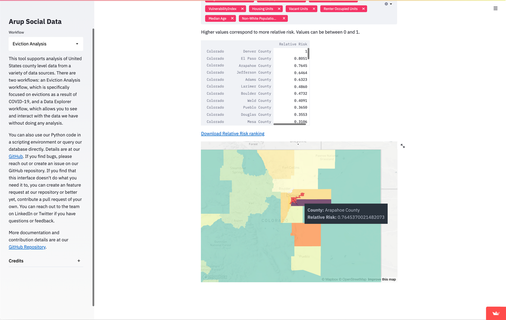
We’ve found that the clearest way for people to understand comparative risk between counties is with a map. Streamlit already has support for simple maps, however, we didn’t just want to plot points; we wanted to show the county shapes. County shapefiles are common and we could get them into our database relatively easily using PostGIS. They get stored in a format called Well Known Binary (WKB), so we need to get them into a format that can be read by pydeck.
First, I load in the geometry data using Shapely with shapely.wkb.loads(). But immediately we have a problem: the data comes in as a Well Known Text (WTK) object, not as geojson that we can parse. GIS isn't my specialty, so like a good programmer, I looked around Stack Overflow and eventually found some snippets that convert it into sets of coordinates that Python could parse as a dict and then clean it up a bit.
geo_df['geom'] = geo_df.apply(lambda row: row['geom'].buffer(0), axis=1)
geo_df['geom'] = geo_df.apply(lambda row: gpd.GeoSeries(row['geom']).__geo_interface__, axis=1)
geo_df['coordinates'] = geo_df.apply(lambda row: clean_coordinates(row), axis=1)def clean_coordinates(row: pd.Series) -> list:
# combine multipolygon into one object as a single polygon
for f in row['geom']['features']:
if f['geometry']['type'] == 'MultiPolygon':
f['geometry']['type'] = 'Polygon'
combined = []
for i in range(len(f['geometry']['coordinates'])):
combined.extend(list(f['geometry']['coordinates'][i]))
f['geometry']['coordinates'] = combined
# flatten coordinates
f['geometry']['coordinates'] = f['geometry']['coordinates'][0]
return row['geom']Now we have coordinates that define each shape! I add those to our DataFrame and then I can turn everything into nice, friendly geojson for our map. I create a feature collection with each county's name, shape coordinates, and the values (in our case just one) that we want to display.
def make_geojson(geo_df: pd.DataFrame, features: list) -> dict:
    geojson = {"type": "FeatureCollection", "features": []}
    for i, row in geo_df.iterrows():
        feature = row['coordinates']['features'][0]
        props = {"name": row['County Name']}
        for f in features:
            props.update({f: row[f]})
        feature["properties"] = props
        del feature["id"]
        del feature["bbox"]
        feature["geometry"]["coordinates"] = [feature["geometry"]["coordinates"]]
        geojson["features"].append(feature)

return geojsonNow we can finally show this data in our Streamlit app. In this case, I want to give pydeck a DataFrame with only what we want to show on the map. I turn this geojson into a DataFrame and add fill colors as another column, and then I can create a layer for our shapes and pass that into the st.pydeck_chart() function along with a tooltip to show the value of the feature.
    polygon_layer = pdk.Layer(
        "PolygonLayer",
        geo_df,
        get_polygon="coordinates",
        filled=True,
        stroked=False,
        opacity=0.5,
        get_fill_color='fill_color',
        auto_highlight=True,
        pickable=True,
    )
    # The brackets here are expected for pdk, so string formatting is less friendly
    tooltip = {"html": "<b>County:</b> {name} </br>" + "<b>" + str(map_feature) + ":</b> {" + str(map_feature) + "}"}

    r = pdk.Deck(
        layers=[polygon_layer],
        initial_view_state=view_state,
        map_style=pdk.map_styles.LIGHT,
        tooltip=tooltip
    )
    st.pydeck_chart(r)
Once our data is properly formatted, turning it into a map is pretty straightforward:

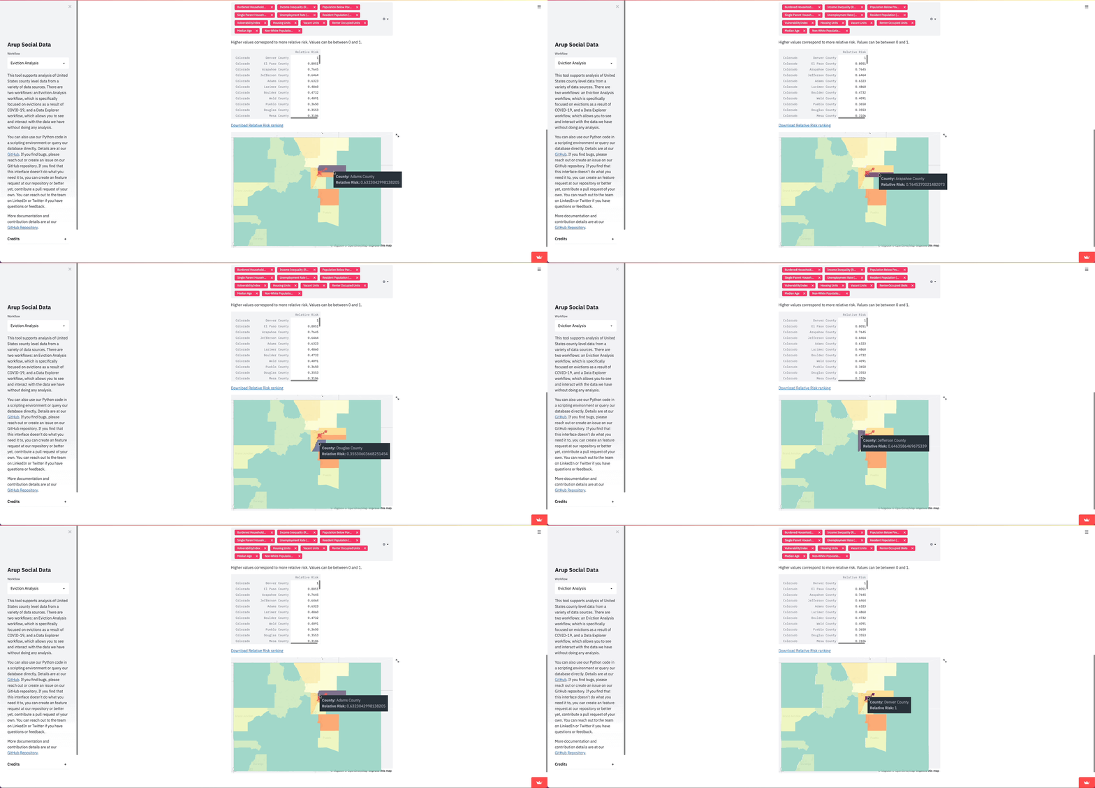
Because the functions to create the map are generalized, it makes expanding on them much easier. For example, if we want to create a map with multiple layers, we could update the existing make_map function to accept a list of features to map and then create multiple of Layers instead of just one. We can use these functions like a component in React or Angular to show different information in multiple places. In fact, I did exactly that to create map view on the Data Explorer page to allow users to see any feature by just changing the inputs to the functions.
Making data accessible
This project initially aimed to collect disparate data sources and make our analysis easier for anyone, but not everyone has the Python and data skills to use it on its own. Streamlit allowed us to replace a scary command line interface with a more familiar and functional web app, hopefully allowing more users to interact with data. It also gave us the ability to show the data in more interactive and intuitive ways than we could if users had to run the project locally. While we hope this will help people address the eviction crisis, we think this data also can help address other social problems in policy-making, planning, and other fields.
Arup decided to make this project open because we believe we can have a bigger impact by working together, so we’re eager to work with the community to make this tool more useful. If you have ideas for new functionality, let us know or better yet, contribute to the repository. You can find the app here. The coming months could be a very scary time for lots of people, and we hope that this tool may help in some way to keep more people in their homes.


Comments
Continue the conversation in our forums →