
Do you think it’s painful to create charts in Streamlit? We think so too. Sometimes it can take longer than coding the rest of the app! On top of that, if you want your charts to look beautiful, you need to use (and customize) Matplotlib, Plotly, or Altair. It’s annoying and time-consuming.
Streamlit has three simple built-in charting commands: st.line_chart, st.area_chart, and st.bar_chart. But they need data in a specific format (impractical for most real-world datasets) and they look pretty average. 😒
So today, we’re excited to release…
A major overhaul of our built-in charts!
The charts get an entirely new look and new parameters x and y to make them more versatile.
Can’t wait to try it? Check out the demo app and the code.
New look
Our design team created a beautiful chart theme that works seamlessly with the rest of Streamlit. It’s sleek and modern, and it uses our official color palette.
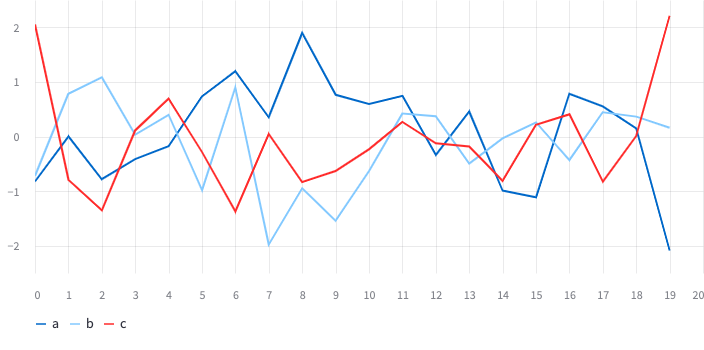
For st.line_chart:
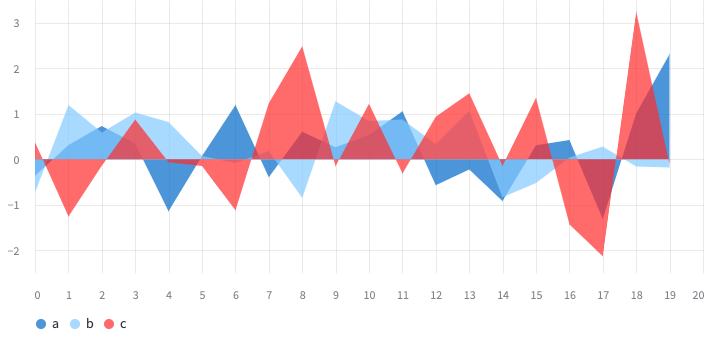
For st.area_chart:
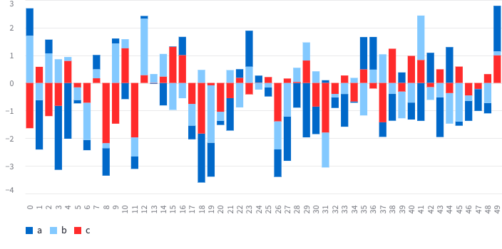
For st.bar_chart:
Psst... 🤫 In the future, we might bring this theme to our built-in charting commands and third-party libraries like Plotly or Altair!
New parameters: x and y
We wanted you to use our built-in charting with any dataset. Today, all three commands get parameters x and y, so you can control what to plot.
For example, if you have this dataframe:
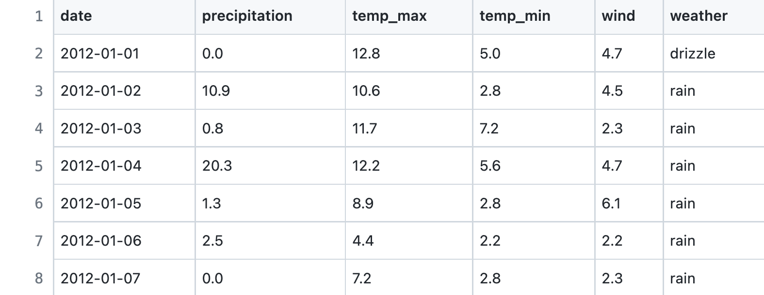
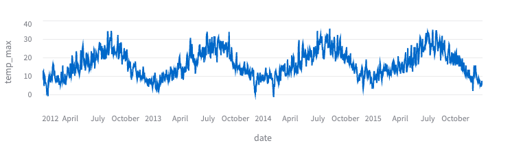
...and you want to plot temp_max over date, simply type:
st.line_chart(df, x="date", y="temp_max")
With one line of code, you get a beautiful chart:
The same works for st.bar_chart and st.area_chart.
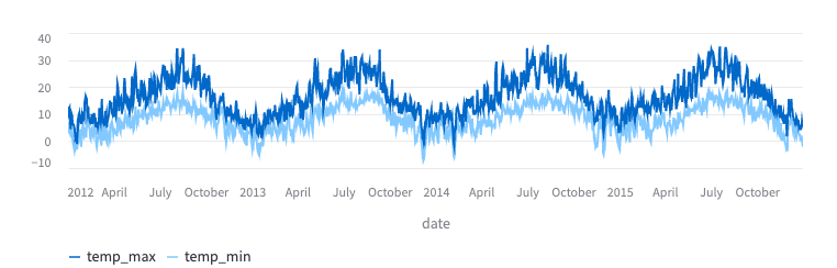
But wait, there’s more! We built in a little magic to create charts with multiple lines. Just pass the column names as a list to the y parameter:
st.line_chart(
    df,
    x="date",
    y=["temp_min", "temp_max"],  # <-- You can pass multiple columns!
)
Bonus feature: charts in cached functions
With 1.12.0, we’re releasing one more feature. You can now put charts and other static elements (dataframes, text, etc.) into functions that are cached via st.experimental_memo or st.experimental_singleton. This lets you cache not only the long computations or the API calls but the entire parts of your user interface! Give it a try and let us know what you think (we'll share more info in the coming months).
Wrapping up
And that's a wrap for built-in chart improvements. The charts are now much more powerful. All it takes is just a few lines of code!
If you want more complex charts or more customization, use any third-party charting library that we support. Got questions? Let us know in the comments below.
Oh, and don't forget to check out other cool features in our 1.12.0 release.
Happy Streamlit-ing! 🎈


Comments
Continue the conversation in our forums →